Formatting a DNA Histogram
There are many formatting features in FCS Express that aid the user in the visual assessment of a MultiCycle analysis of a DNA histogram. The different cell cycle populations can be shaded in different ways and markers can be displayed indicating the location of the mean of a specific population. In addition, the user can zoom in on a specific area on the histogram for a more detailed view of the analysis.
We will begin by changing the pattern of the diploid population on the MultiCycle histogram to a solid color.
| 1. | Click inside the MultiCycle histogram to select it. |
| 2. | Select the Format→Plot Options→Overlays command. |
The Formatting Overlays dialog window appears, shown in Figure T19.24. Please refer to Figure T19.24 for the following steps.
| 3. | Select Diploid G1 from the category on the left, shown highlighted in blue. |
| 4. | Select the solid fill pattern from the Fill Style drop down menu, indicated by the cursor. |
| 5. | Click OK. |
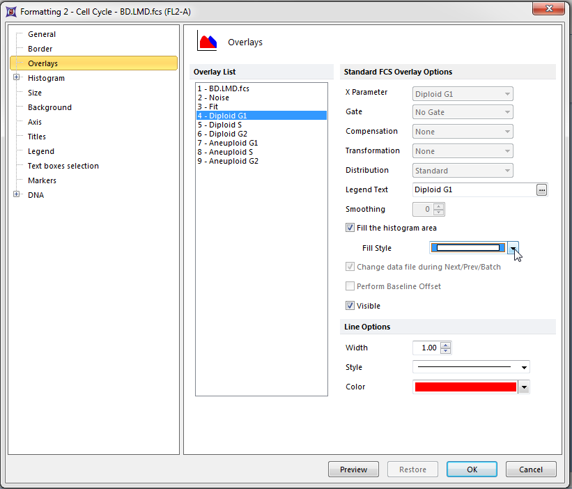
Figure T19.24 Formatting Overlays Dialog for a MultiCycle DNA Histogram
The MultiCycle histogram will now update to reflect the changes as shown in Figure T19.25. Alternatively, we could have accessed the histogram Overlay menu by right-clicking on the DNA histogram to bring up the pop-up menu and selecting Format and then Overlays.
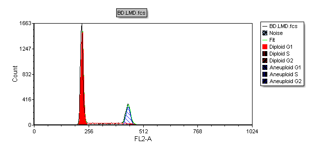
Figure T19.25 MultiCycle DNA Histogram Updated with Solid Fill on the Diploid Peak
We will now add a marker on the histogram to indicate the location of the aneuploid G2 peak.
| 6. | Right-click inside the DNA histogram to bring up the pop-up menu. |
| 7. | Select DNA Position Markers→A2 Mean from the menu, indicated by the cursor in Figure T19.26. |
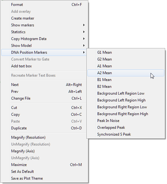
Figure T19.26 Selecting DNA Position Markers on the Pop-up Menu
Alternatively, the DNA Position Markers can be accessed from the Format item on the pop-up menu.
| • | Right-click inside the histogram to bring up the pop-up menu. |
| • | Select Format from the menu. |
The histogram formatting window appears, please refer to Figure T19.27 for the following steps.
| • | Select DNA→Position Markers from the category on the left, shown outlined in blue. |
| • | Select the box Show position marker on the plot, indicated by the cursor. |
| • | Select A2 Mean, shown highlighted in blue. |
| • | Click OK. |
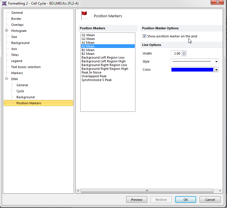
Figure T19.27 Formatting DNA Histogram Position Markers
A vertical line marking the location of the mean of the aneuploid G2 peak appears on the Multicycle DNA histogram (Figure T19.28).
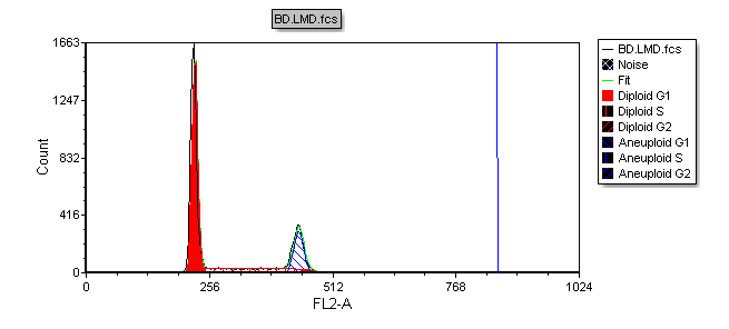
Figure T19.28 MultiCycle Histogram Updated with a DNA Position Marker on the Aneuploid G2 Mean
We will now zoom in to the DNA histogram to more closely examine the aneuploid population.
| 8. | Right-click inside the DNA histogram to bring up the pop-up menu. |
| 9. | Select Magnify (Axis) from the pop-up menu (Figure T19.26). |
Please refer to Figure T19.29 for the following steps.
| 10. | Place the cursor to the left of the aneuploid G1 peak on the DNA histogram, shown by left arrow. |
| 11. | Press and hold the left mouse button and move the mouse to the right. |
| 12. | Release the left button when the right arrow is to the right of DNA Position Marker, indicated by the cursor. |
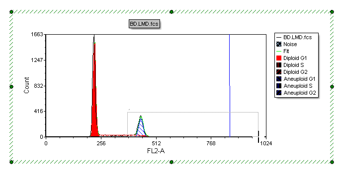
Figure T19.29 Selecting an Area on the X-axis to Zoom
The histogram now updates to zoom in on the area of the x-axis that was selected in the previous steps, as shown in Figure T19.30.
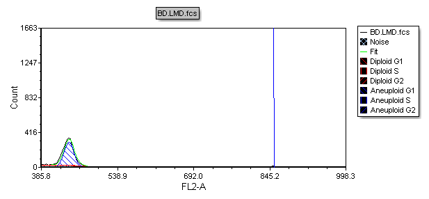
Figure T19.30 Histogram Zoomed
We will now change the y-axis scale on the histogram.
| 13. | Click inside the histogram to select it. |
| 14. | Select the Format→Plot Options→Axes command. |
The Formatting Axes dialog appears. Please refer to Figure T19.31 for the following steps.
| 15. | Select Y-Axis, highlighted in blue. |
| 16. | Deselect the box next to Automatic, indicated by the cursor. |
| 17. | Enter '300' as the maximum value for the Y-axis, shown highlighted in blue. |
| 18. | Click OK. |
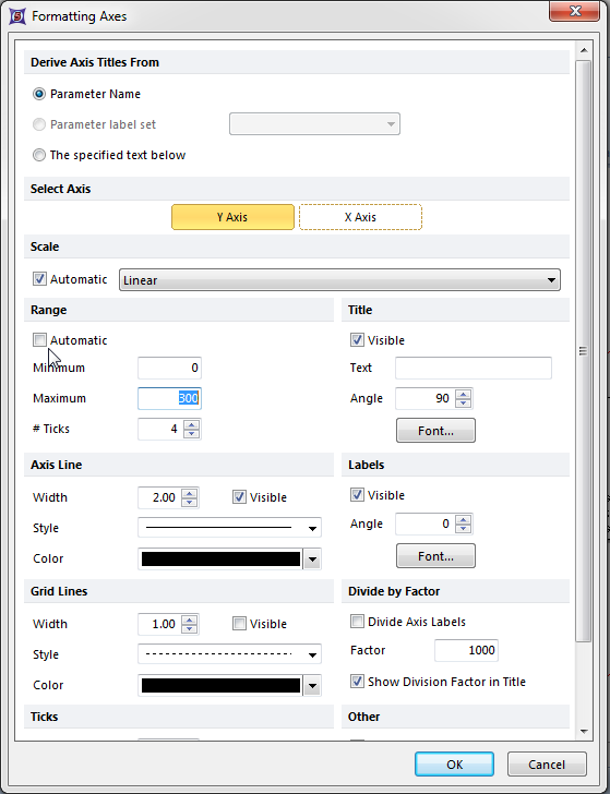
Figure T19.31 Formatting Axes Dialog
The MultiCycle histogram updates, scaling the y-axis from 0 to 300 as shown in Figure T19.32.
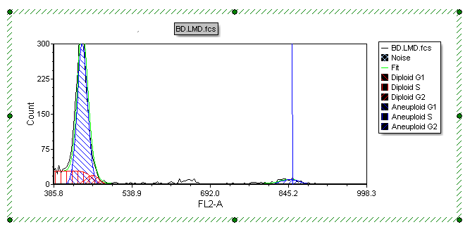
Figure T19.32 MultiCycle Histogram with Rescaled Y-axis
Next, we will perform MultiCycle analysis of 3 cycle data.
