Creating Bar Plots
In this section we will learn to populate a Bar Plot with data from a Spreadsheet. Please also see our Bar Plots webpage for additional videos and tips on creating Bar Plots.
1.Select File tab→Open.
2.Open the layout titled "Bar Pie Scatter begin.fey" within the Tutorial Sample Data archive.
The layout contains Color Dot Plots and a Spreadsheet from which the Bar Plot will be derived (Fig. 1). See this section of the manual to see how the Spreadsheet was added to the layout.
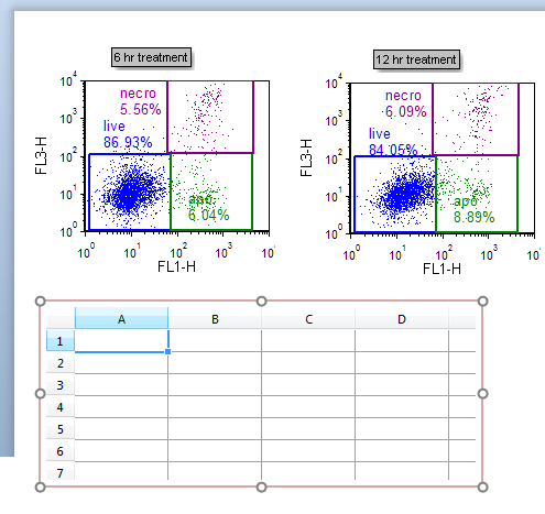
Figure 1. Spreadsheet on the layout
| We will now fill the Spreadsheet with both freetext and live-updating tokens. First, we will manually enter freetext values that will be used for our bar plot axis labels. |
3.Click on Cell A1 in the Spreadsheet to highlight it.
4.Type "live" (Fig. 2, ![]() ).
).
5.Press Enter on the keyboard.
6.Repeat steps 3-5 for Cells A2 and A3 in the Spreadsheet, typing in "apo" and "necro", respectively. The Spreadsheet will now appear as below (Fig. 2).
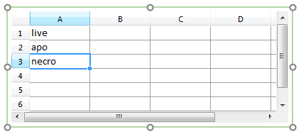
Figure 2. Entering freetext into a Spreadsheet
We will now select statistic tokens to plot in the Bar Plot or Pie Chart and place them in the Spreadsheet. Using tokens will allow live-updating of plots as you adjust your gates or advance through your dataset.
7. Drag and drop the "live" gate from the 6 hr treatment plot at upper left into Cell # B1 of the Spreadsheet. While dragging, the gate outline will move (Fig. 3, ![]() ).
).
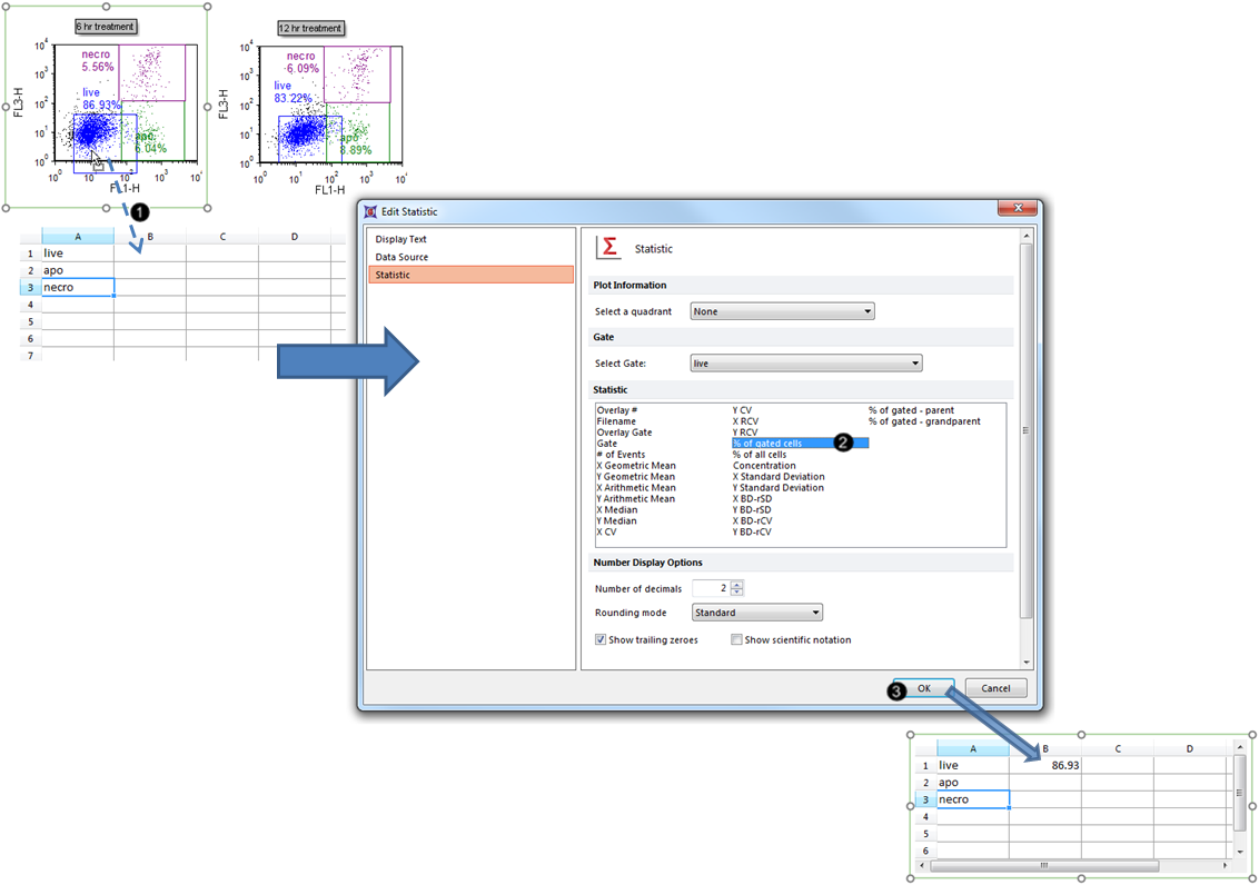
Figure 3. Dragging and dropping a statistic token into the Spreadsheet.
8. Select % of gated cells from the Statistic list box in the Edit Statistic dialog (Fig. 3, ![]() ).
).
9. Click OK (Fig. 3, ![]() ).
).
The B1 cell of the Spreadsheet will now contain the %-gated statistic for the "live" gate, as shown in Fig. 3, bottom.
10. Repeat steps 7-9 for the "apo" and "necro" gates of the 6 hr treatment plot respectively into Cell #s B2 and B3. The Spreadsheet will now appear as in Fig. 4.
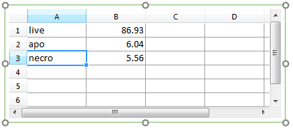
Figure 4. Spreadsheet with B column filled with %-gated statistic tokens
Note: Steps 1-10 can also be accomplished via drag-and-drop of statistics, gates, or plots directly to the Bar Plot, without using a Spreadsheet. Please see this section of the manual for a pictorial guide.
11. Select the Insert tab → 1D Plots→ Bar command (Fig. 5).

Figure 5. Inserting a Bar Plot
12. Click on an empty space on the layout (e.g., to the right of the Spreadsheet) to insert a Bar Plot (Fig. 6).
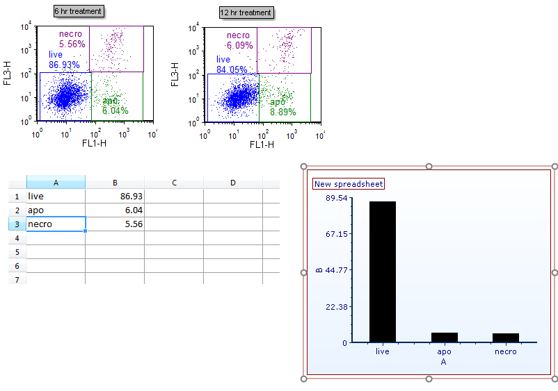
Figure 6. Bar Plot inserted on the layout
We will now rename the Bar Plot axes.
13. Double-click the Bar Plot to open the Formatting dialog.
14. Click on the Axis category (Fig. 7, ![]() ).
).
15. Click the The specified text below radio button (Fig. 7, ![]() ).
).
16. Type "%-gated" into the Text box under Title (Fig. 7, ![]() ).
).
17. Click X Axis under Select Axis (Fig. 7, ![]() ).
).
18. Type "subset" into the Text box under Title.
19. Click OK (Fig. 7, ![]() ).
).
The Bar Plot will now appear as in Fig. 7, right.
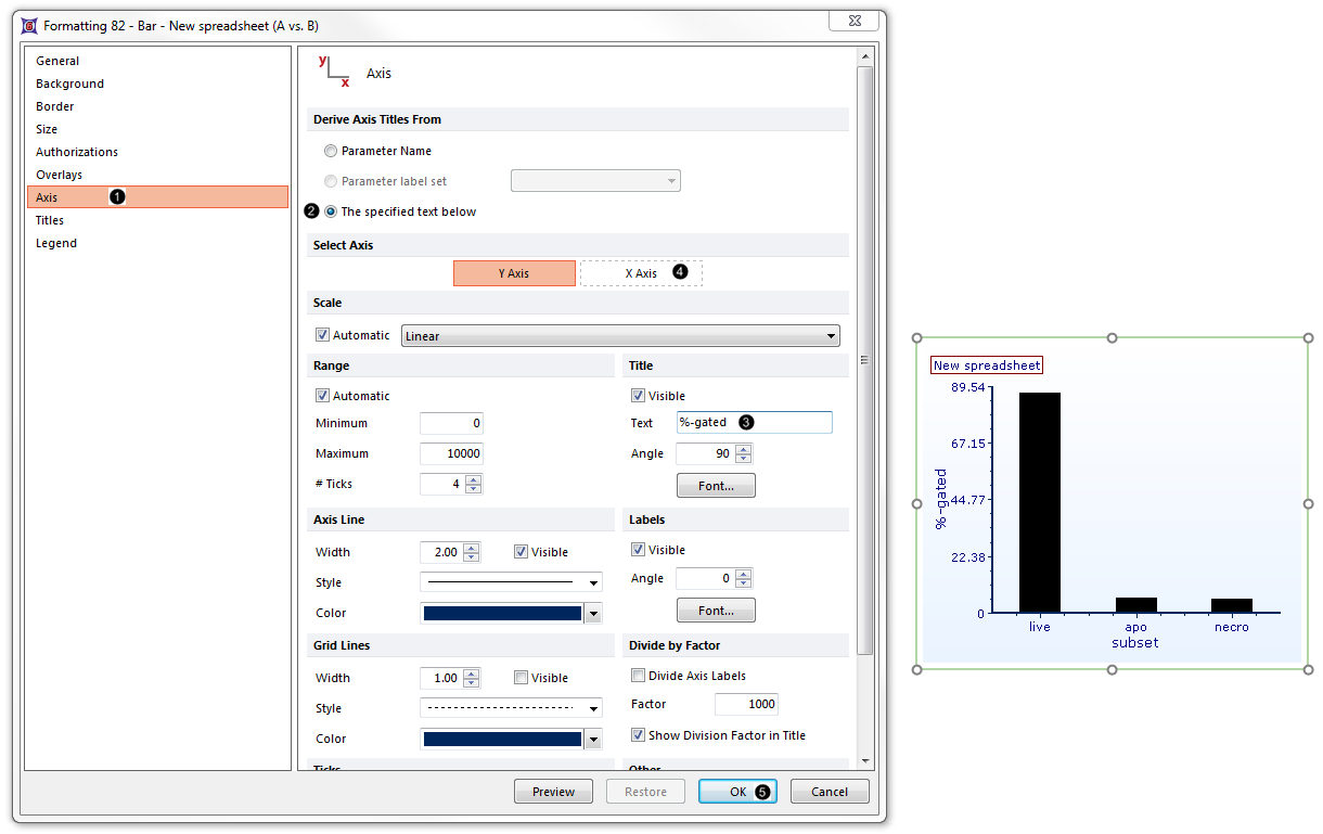
Figure 7. Bar Plot with Renamed Axes.
Note: Bar color, style, and other attributes of a Bar Plot can be customized. See the Formatting Bar Plots section of the manual for details.
20. Optional:
•Click the Data tab→Change Data on All→ Next/Previous buttons to advance through the set of files in the Data List and watch as the Bar Plot updates with the new data.
•Adjust the gates on the plots and watch the Bar Plot update in real-time.
Go on to the next section to create a Pie Chart from the same raw data. Or, jump to the section on Formatting Bar Plots.
