Displaying Additional Datasets
Additional datasets and parameters can be displayed on Bar and Scatter Plots as well as on Pie Charts. Bar and Scatter Plots can display multiple additional datasets as Overlays, while Pie Charts can display one additional dataset as a Ring.
In this section of the tutorial, we will enter an additional dataset into a Spreadsheet which can be subsequently displayed on a Bar Plot, Scatter Plot, or Pie Chart.
1.Select File tab→Open.
2.Open the layout titled "Displaying Additional Datasets.fey" within the Tutorial Sample Data archive.
The layout a contains a Spreadsheet and its associated Bar Plot, Scatter Plot, and Pie Chart. The %-gated statistic for the "apo" gate is being plotted. We will now add a %-gated statistic for the "necro" gate to the Spreadsheet.
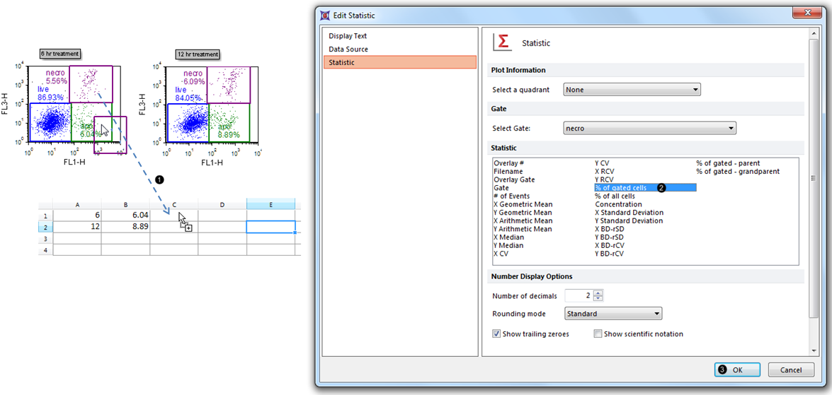
3.Drag and drop the "necro" gate from the 6 hr treatment Color Dot Plot to cell C1 of the Spreadsheet. While dragging, a ghost of the gate outline will move (Fig. 1, ![]() ).
).

Figure 1. Entering the first member of an additional dataset into an empty column in the Spreadsheet.
4.Select % of gated cells from the Statistic list box in the Edit Statistic dialog (Fig. 1, ![]() ).
).
5.Click OK (Fig. 1, ![]() ). The C1 cell of the Spreadsheet will now contain the %-gated statistic for the "necro" gate, as shown in Fig. 2, left.
). The C1 cell of the Spreadsheet will now contain the %-gated statistic for the "necro" gate, as shown in Fig. 2, left.
6.Repeat steps 3-5 for the "necro" gate of the 12 hr treatment plot. The Spreadsheet will now appear with the %-gated statistic in Cell C2 (Fig. 2, right).

Figure 2. Populating the Spreadsheet with statistics from the 12-hr treatment plot.
The "necro" dataset is now complete within Column C of the Spreadsheet (Fig. 2, right). We will now format the Bar Plot, Scatter Plot, and/or Pie Chart to display this additional dataset from the appropriate column of the Spreadsheet.
