Creating Scatter Plots
1.Select File tab→Open.
2.Open the layout titled "Bar Pie Scatter begin.fey" within the Tutorial Sample Data archive.
The layout contains Color Dot Plots and a Spreadsheet from which the Scatter Plot will be derived (Fig. 22). See this section of the manual to see how the Spreadsheet was added to the layout.
We will now fill the Spreadsheet with both freetext and live-updating tokens. First, we will enter the independent parameters for the Scatter Plot. Note that in contrast to Bar Plots and Pie Charts, the x-axis values in a Scatter Plot must be numeric. We will enter the hours of treatment indicated in the title for each Color Dot Plot as this parameter.
3.Click on Cell A1 in the Spreadsheet (Fig. 1, ![]() ) to highlight it.
) to highlight it.
4.Type "0" in the Custom Data Grid formula editor (Fig. 1, ![]() ).
).
5.Press Enter on the keyboard.
6.Repeat steps 3-5 for Cells A2 and A3 in the Spreadsheet, typing in "6" and "12", respectively. The Spreadsheet will now appear as in Fig. 1, right.
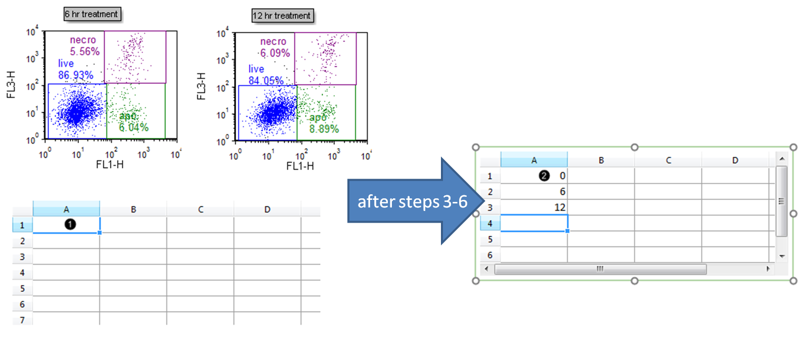
Figure 1. Typing freetext into a Spreadsheet
| We will now insert tokens into the Spreadsheet to display on the Scatter Plot. |
7.Drag the "live" gate from the 6 hr treatment plot onto cell B2 of the Spreadsheet. While dragging, the gate outline will move (Fig. 2, ![]() ).
).
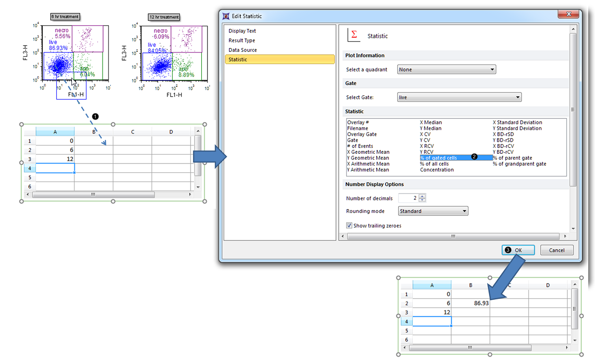
Figure 2. Dragging and dropping a statistic token into a Spreadsheet
8.Select % of gated cells from the Statistic list box in the Edit Statistic dialog (Fig. 2, ![]() ).
).
9.Click OK (Fig. 2, ![]() ). The B2 cell of the Spreadsheet will now contain the %-gated statistic for the "live" gate of the 6 hr treatment Color Dot Plot (Fig. 2, bottom).
). The B2 cell of the Spreadsheet will now contain the %-gated statistic for the "live" gate of the 6 hr treatment Color Dot Plot (Fig. 2, bottom).
10. Repeat steps 7-9 for the 12 hr treatment and Control (no treatment) Color Dot Plots, dragging the "live" gate from each plot into cell #s B1 and B3, respectively. The Spreadsheet will now appear as in Fig. 3.
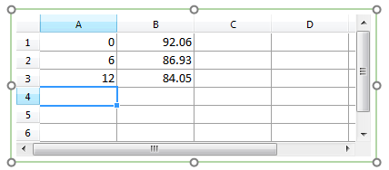
Figure 3. Completed Spreadsheet
11. Select the Insert tab → 2D Plots→ Scatter command (Fig. 4).

Figure 4. Inserting a Scatter Plot
12. Click on an empty space on the layout (e.g., to the right of the Spreadsheet) to insert a Scatter Plot (Fig. 5).
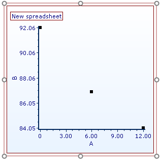
Figure 5. Inserted Scatter Plot
We will now rename the Scatter Plot axes.
13. Double-click the Scatter Plot to open the Formatting dialog.
14. Click on the Axis category (Fig. 6, ![]() ).
).
15. Click the The specified text below radio button (Fig. 6, ![]() ).
).
16. Type "%-gated" into the Text box under Title (Fig. 6, ![]() ).
).
17. Click X Axis under Select Axis (Fig. 6, ![]() ).
).
18. Type "treatment time (hr)" into the Text box under Title.
19. Click OK (Fig. 6, ![]() ).
).
The Scatter Plot will now appear as in Fig. 6, right.
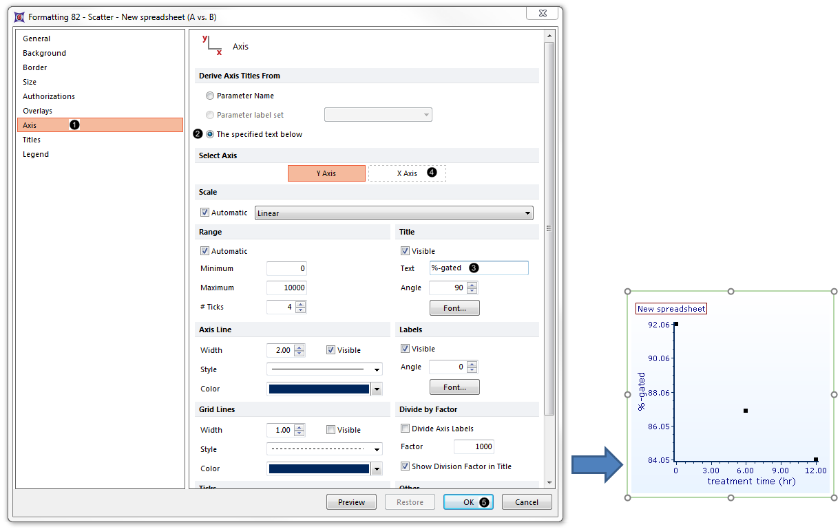
Figure 6. Scatter Plot with Renamed Axes
We will now adjust the range of the Scatter Plot so that the points are more readily visible.
20. Double-click the Scatter Plot to open the Formatting dialog from the pop-up menu.
21. Select the Axis category (Fig. 7, ![]() ).
).
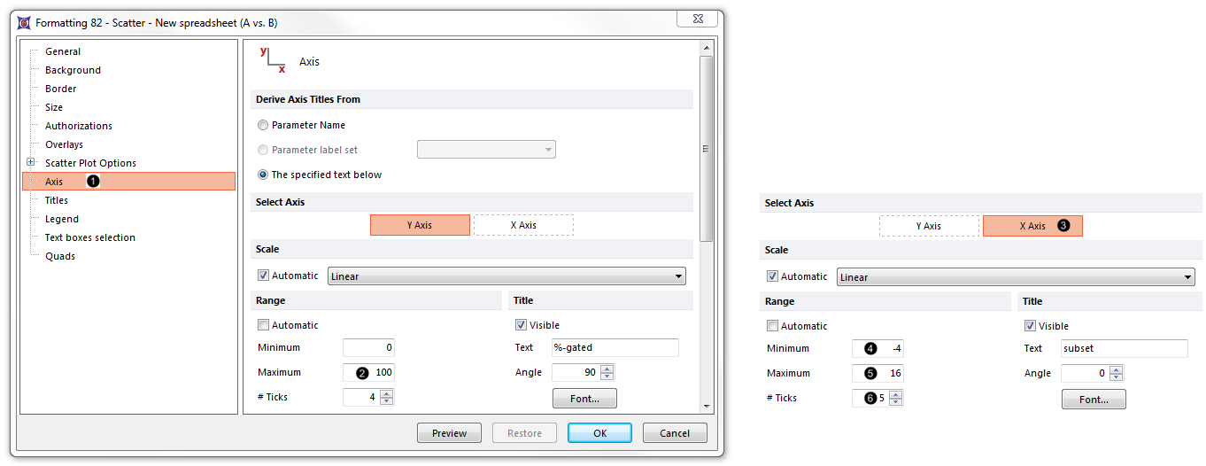
Figure 7. Adjusting range of the Scatter Plot from the Formatting dialog
22. Enter "100" as the Maximum (Fig. 7, ![]() ).
).
23. Click on X-axis of the Select Axis section (Fig. 7, ![]() ).
).
24. Enter "-4" as the Minimum (Fig. 7, ![]() ).
).
25. Enter "16" as the Minimum (Fig. 7, ![]() ).
).
26. Increase the # Ticks to 5 (Fig. 7, ![]() ).
).
27. Click OK.
The Scatter Plot will now appear as in Fig. 8.
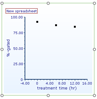
Figure 8. Completed Scatter Plot with adjusted range
Note: Point color, shape, connecting lines, and other attributes of a Scatter Plot can be customized. See the Formatting Scatter Plots section of the manual for details.
28.Optional:
•Click the Data tab→Change Data on All→ Next/Previous buttons to advance through the set of files in the Data List and watch as the Scatter Plot updates with the new data.
•Adjust the gates on the Color Dot Plots and watch the Scatter Plot update in real-time.
