Choosing a Color Scheme
To choose the color scheme on a heat map, select the Heat Map, and either:
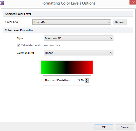
•Select the Format tab→2D Options→Color Levels command (Figure 32.8), or
•Right-click on the Heat Map, select Format from the pop-up menu, then choose Heat Map→Color Levels.

Figure 32.8 Formatting Color Level Options
The default settings are a Green-Red color scheme, a Style of Mean ± SD, and 3.5 standard deviations on either side of the scale. This means that wells close to the average for the statistic being displayed are colored black, wells that are +3.5 SD from the average are pure red, and wells that are -3.5 SD are pure green.
You can select another color scheme using the Selected Color Level drop-down list.
Available color schemes are:
•Rainbow
•Threshold
•Green-Red
•Green-Blue
•Greyscale
•Inverse Greyscale
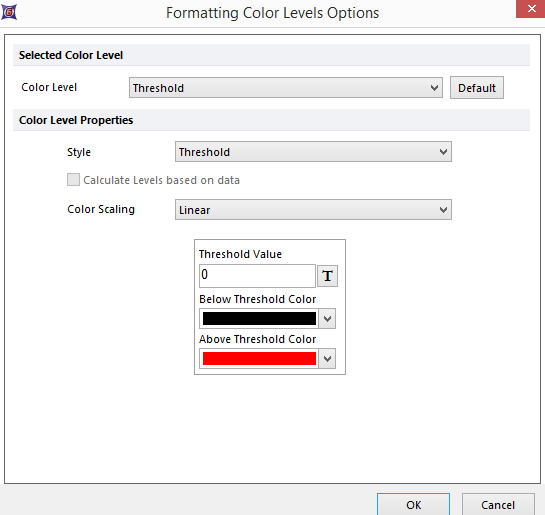
The Threshold scheme has specific Color Level Properties related to the threshold value (Figure 32.9).

Figure 32.9 Threshold Color Scheme
When the Selected Color Level or Style are set to Threshold, you can choose a token (e.g., a statistic based on a control well) to represent the Threshold Value by clicking on the ![]() button, or simply type in an arbitrary freetext value. Then, set the Below Threshold and Above Threshold colors using the drop-down lists. Wells whose value is below the threshold value will be displayed in the first color, and wells with a value above the threshold value will be displayed in the other color.
button, or simply type in an arbitrary freetext value. Then, set the Below Threshold and Above Threshold colors using the drop-down lists. Wells whose value is below the threshold value will be displayed in the first color, and wells with a value above the threshold value will be displayed in the other color.
