Overlays on Bar and Scatter Plots
In this section of the tutorial, we will display an additional dataset as an Overlay on a Bar Plot and/or Scatter Plot. Please complete the preceding section of the tutorial (Displaying Additional Datasets) before proceeding.
1.Click on the border of the Spreadsheet so it is highlighted in red.
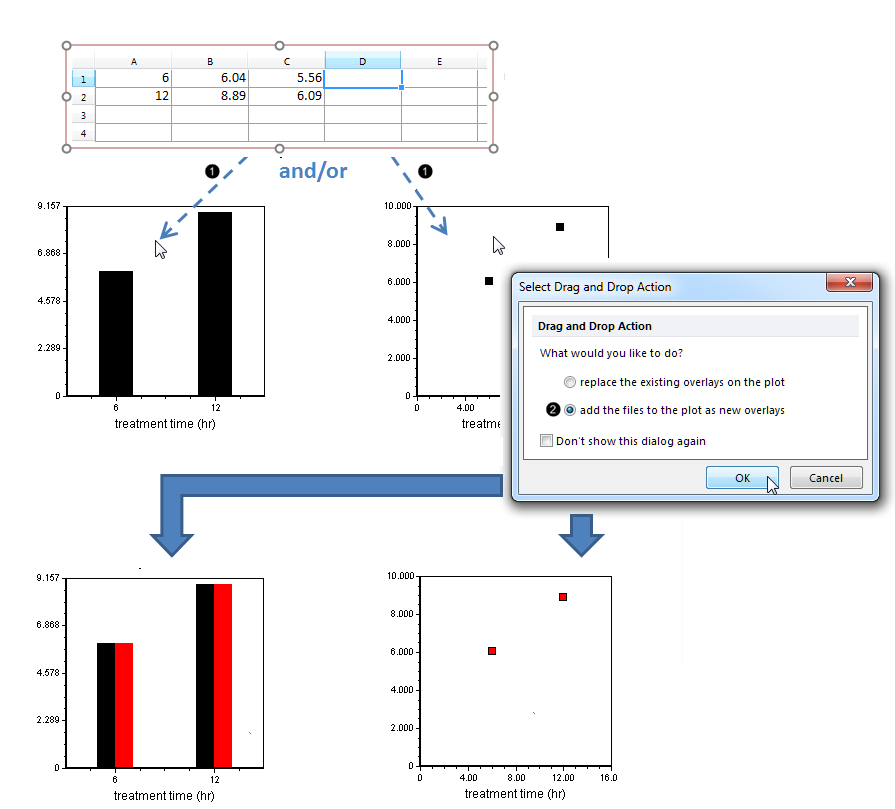
2.Drag and drop the Spreadsheet onto the Bar Plot or Scatter Plot (Fig. 1, ![]() ).
).

Figure 1. Dragging and dropping a Spreadsheet onto a Bar or Scatter Plot to create an overlay
3.Click the add the files to the new plot as new overlays radio button (Fig. 1, ![]() ).
).
4.Click OK (Fig. 1, mouse pointer).
The Bar Plot or Scatter Plot will now appear as in Fig. 1, bottom.
The new Overlay has defaulted to the second ("apo") column of the Spreadsheet for its values. We will now reformat the plot to derive the values from the third ("C") column, in order to plot the "necro" gate-derived values.
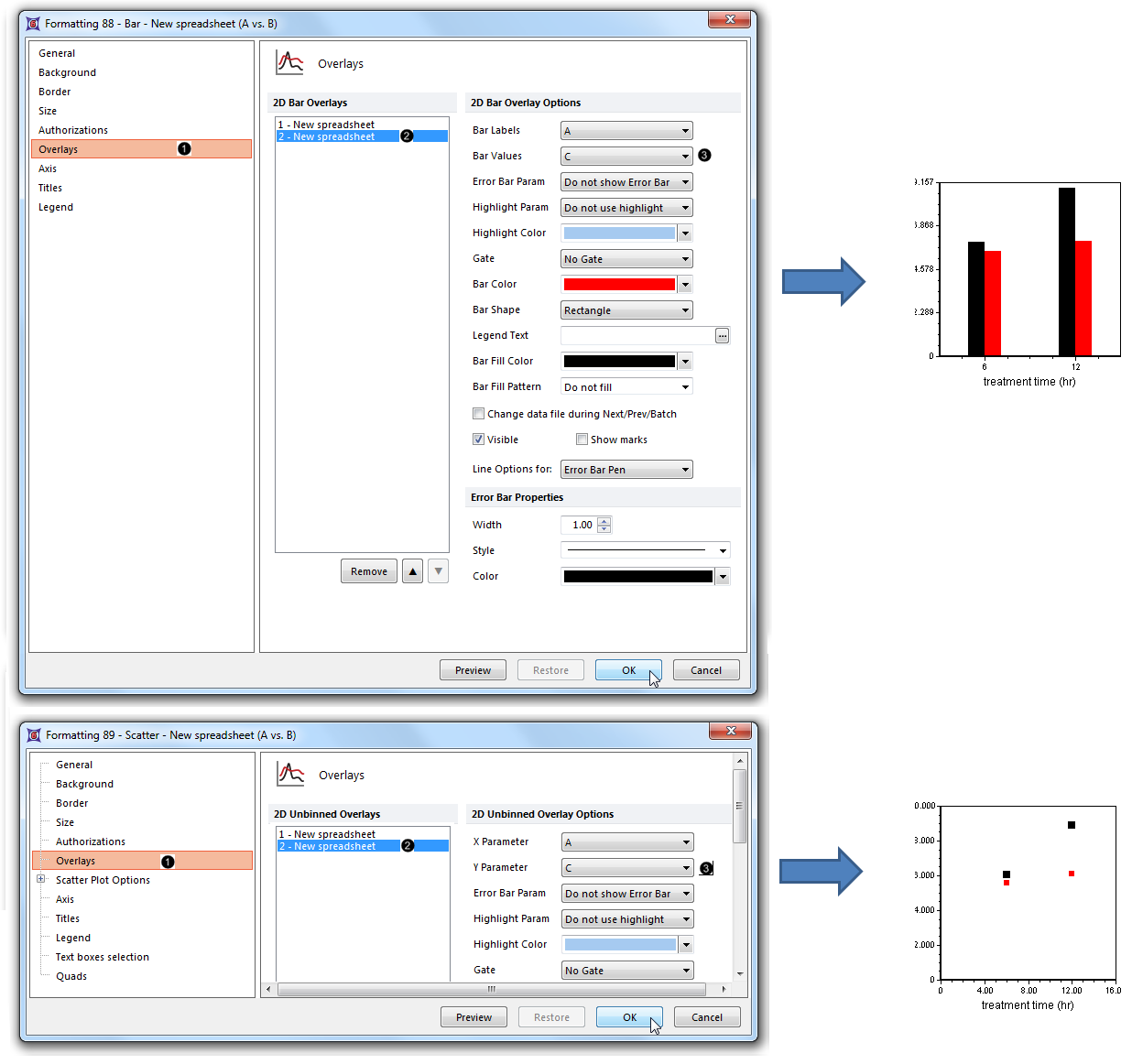
5.Double-click the Bar or Scatter Plot to open the Formatting Bar or Formatting Scatter dialog (Fig. 2, upper or lower pane, respectively).
6.Click the Overlays category (Fig. 2, ![]() ).
).

Figure 2. Designating the Spreadsheet column from which the new overlay will be derived
7.Click 2- New spreadsheet from the 2D Bar Overlays or 2D Unbinned Overlays list (Fig. 2, ![]() )
)
8.Choose "C" from the Bar Values or Y Parameter dropdown list of the Formatting Bar or Formatting Scatter dialog, respectively (Fig. 2, ![]() ).
).
9.Click OK (Fig. 2, mouse pointer). The Bar Plot or Scatter Plot now appears as in Fig. 2, right.
Note: Color, style, size, and other attributes of bars on a Bar Plot and points on a Scatter Plot can be customized independently for each overlay. See the following sections of the manual for details:
10. Optional:
•Click the Data tab→Change Data on All→ Next/Previous buttons to advance through the set of files in the Data List and watch as the Bar Plot, Scatter Plot, and Pie Chart update with the new data.
•Adjust the gates on the plots and watch the Bar Plot, Scatter Plot, and Pie Chart update in real-time.
