Fitting Proliferating Cells
In the course of this tutorial, we will:
•Learn how the curve fitting algorithm and parameters are fitted to a histogram.
•Use tokens to define a Fixed Starting Generation and Background.
•Insert proliferation position markers.
We will begin by navigating through the data to get an idea of what the experiment looks like and what the color coded overlays represent.
1. Open the "Proliferation Tutorial Fitting Proliferating Cells Section.fey" layout in the Proliferation Tutorial folder within theTutorial Sample Data folder.
2. Navigate to the Proliferation Data page tab.
You will notice a proliferation plot on the Proliferation Data page tab for the 10 uM CellTrace Violet Stimulated Control.fcs sample (Figure T22.17a). This is the curve fitting result on the positive control, proliferating cells. There are four samples in the Data List.
We will switch to our control sample in which cells are not proliferating.
3. Select the Data tab→Change Data on All group→Previous command to load the previous file in the Data List, such as 10 uM CellTrace Violet Control.fcs (Figure T22.17b).
Notice that the 10 uM CellTrace Violet Control.fcs file represents the stained yet undivided control sample and can serve as our starting generation peak.
We will switch to our Stimulated Sample.
4. Select the Data tab→Change Data on All group→Next command to advance two files to 10 uM CellTrace Violet Stimulated Sample.fcs (Figure T22.17c)
Notice that the 10 uM CellTrace Violet Stimulated Sample.fcs file represents our stimulated (dividing) sample in which we would like to measure the degree of proliferation.
We now will switch to our final Unstained Control sample.
5. Select the Data tab→Change Data on All→Next command to the end of the Data List to Unstained Control.fcs (Figure T22.17d).
Notice that the Unstained Control.fcs file represents the sample as it appears without any proliferation staining and can serve as our background noise peak. Please note FCS Express is fitting the background peak as it was a population of proliferating cells. We will modify the fitting parameters later to define how to treat these as background.
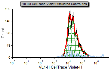 Figure T22.17a Proliferation Positive Control |
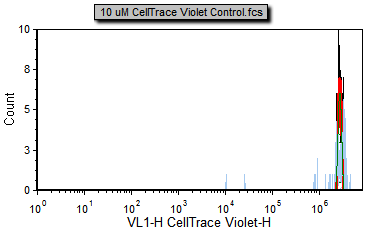 Figure T22.17b Proliferation Negative Control |
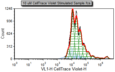 Figure T22.17c Proliferation Stimulated Sample |
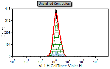 Figure T22.17d Proliferation Unstained Control |
You will notice many different color overlays on the different proliferation samples. The default colors for the proliferation curve fitting are as follows:
Black – Raw histogram contour. This includes all the data and does not represent an output of the fitting algorithm and would be the same histogram you would see if you plotted the data on a regular histogram.
Red – Overall contour of the fitted data. This excludes what the algorithm determines to be noise.
Light blue – Noise. This is the data that the algorithm determines to be noise, and is not included in the statistics.
Green – Modeled populations of proliferating cells. These are the actual curves fitted to the data, representing the parent, undivided population, and all of the proliferating generations.
Note that there are cells in the proliferation stimulated sample (Figure T22.17c) in the 106 to 107 range, shown in light blue, that have been determined by the model to be noise. We will now modify the Proliferation Fit Parameters to see if we can improve the model's fit by specifying where the starting generation is located. Notice on the Gating page there is a histogram with the marker M1 visible. M1 defines the starting generation based on the negative control and we will use a token representing the geometric mean of the data under the marker to define our starting generation more accurately.
6. Change the data using the Data tab→Change Data on All group→Next/Previous commands until you display the 10 uM CellTrace Violet Stimulated Control.fcs sample.
7. Double-click the proliferation plot.
The Formatting dialog now appears (Figure T22.18).
9.Choose Proliferation Fit category (Figure T22.18).
10. Check the Use Fixed Starting Generation check box (Figure T22.18, ![]() ).
).
11. Delete the numbers in the edit field for the Use Fixed Starting Generation option (Figure T22.8, ![]() ). With the empty field, a warning will appear at the bottom of the Formatting dialog, this (nothing) is not a valid number (Figure T22.18, red outline).
). With the empty field, a warning will appear at the bottom of the Formatting dialog, this (nothing) is not a valid number (Figure T22.18, red outline).
12. Click on the ![]() token symbol next to the text box (Figure T22.18,
token symbol next to the text box (Figure T22.18, ![]() ).
).
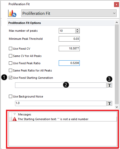
Figure T22.18 Formatting Proliferation Fit Options
The Insert a Token dialog will appear.
13. Double-click Statistic from the Insert a Token dialog.
14. Choose Plot 4 - Histogram - 10 um CellTrace Violet Stimulated Control.fcs [...] from the Select a Plot subcategory under the Data Source category (Figure T22.19, ![]() ).
).
15. Click the Statistic category on the left (Figure T22.19, ![]() ).
).
16. Choose M1 from Plot Information - Select a marker list box (Figure T22.19, ![]() ).
).
17. Select Geometric Mean from the Statistic list box(Figure T22.19, ![]() ).
).
18. Click OK (Figure T22.19, ![]() ).
).
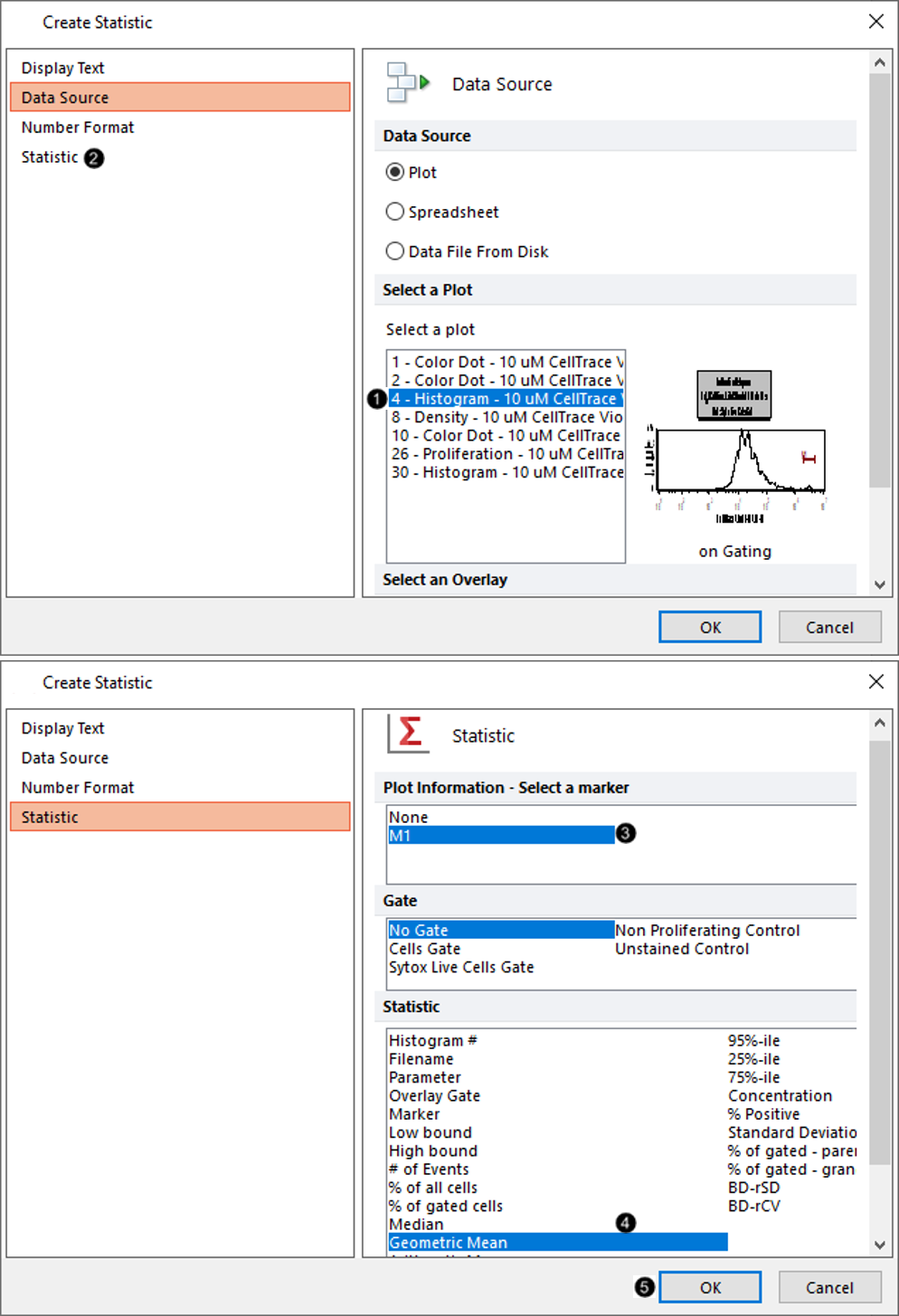
Figure T22.19 Defining Data Source and Statistic for Starting Generation Used in Proliferation Plot
19. Select the Position Markers category in the Formatting dialog (Figure T22.20).
20. Check the box next to Show position marker on the plot with Undivided cells peak highlighted in blue (Figure T22.20, red outline).
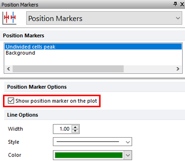
Figure T22.20 Showing Position Marker for Undivided Cells Peak on Proliferation Plot
The proliferation histogram should resemble Figure T22.21.
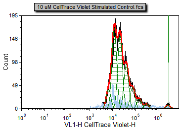
Figure T22.21 Proliferation Plot Using Defined Starting Generation and Showing Position Marker for Undivided Cells Peak
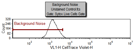
Notice on the Gating page there is a histogram labeled "Background Noise" with a marker of the same name. The area under this marker has been defined as the background noise based on the Unstained Control.fcs sample which is being displayed in the histogram. We will now use steps similar to those above for defining a starting generation to define the background noise.
21. Go to the Proliferation Fit category in the Formatting dialog.
22. Check the Use Background Noise check box.
23. Delete the numbers in the white text box next to the Use Background Noise option.
24. Click on the ![]() token symbol next to the edit field for Use Background Noise.
token symbol next to the edit field for Use Background Noise.
The Insert a Token dialog will appear.
25. Double-click Statistic from the Insert a Token dialog.
26. Choose 30 - Histogram - 10uM CellTrace Violet Stimulated Control.fcs [...] from the Select a Plot subcategory under the Data Source category.
27. Click the Statistic category in the left pane.
28. Choose Background Noise for Plot Information - Select a marker list box.
29. Select Geometric Mean from the Statistic list.
30. Click OK.
31. Select Position Markers category in the Formatting dialog.
32. Click Background in Position Markers list box.
33. Check the box next to Show position marker on the plot while Background is highlighted in blue.
The proliferation histogram should now look like Figure T22.22a with the Starting Generation and Background noise based on the markers from the histogram in Figure T22.22b.
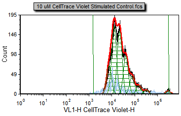 Figure T22.22a Proliferation Plot with Background Noise Position and Starting Generation Markers Defined |
|
Now, the fit is better since the starting generation and background noise (now indicated by the green vertical lines on the right and left respectively) are based on cells that fall within the Sytox Live Cells gate in M1 or the Background Noise marker. Notice how the red, fitted contour, more closely follows the black, raw data contour towards the high end of the data; the R-Chi Square value is also lower. Although the fit is better for the high end of the data you can see for most of the curve it has changed very little. That is because the curve fitting algorithm correctly found a good approximation of the starting generation before adding the more correct token value for the starting generation. Nevertheless, in some cases, it is important to manually set the starting generation and background from control samples. On the other hand, sometimes in proliferation experiments, the control sample can have a slightly different peak fluorescence value than the undivided cells from the experimental samples. These differences can be enough to preclude the use of control histograms to set the position of the undivided cells.
You may notice if you adjust the markers' widths or positions, the proliferation plot fit will update in real-time since the starting generation and background noise are now based on the statistics for the geometric mean under the M1 and Background noise markers. For a description of how the fit is being calculated please see the technical note below.
Technical Note: This is a brief technical note to describe how the fitting process works. This information is to help you have an understanding of how adjusting the parameters affects your data. If you wish to skip this, you may do so.
•The fitting process starts by determining where the population of cells that have not divided is located. The fitting process attempts to find this peak automatically, although you can specify it manually, as described above. In some cases, you have to specify it manually because your cell population may no longer include cells that have not divided. •Once the undivided population is found, the model attempts to find populations that have decreased in fluorescence by 50% from each other. Since not all experiments work according to theory, the model starts looking at the 50% point but can move left or right to find the true peak. You can control this by selecting the Same Peak Ratio for All Peaks option (Figure T20.6). •In order to find a peak, the model makes certain assumptions about the width of each peak compared to the undivided control. You can also control these settings, selecting or deselecting the Same CV for All Peaks option, as shown above (Figure T20.6). •The model can also subtract background fluorescence from all the calculations, if you provide a value for the background fluorescence. •Since the algorithm uses the actual histogram contour to model the fit, the histogram data should not be smoothed. Only in special cases, when the original data is very noisy, should a little smoothing be applied to allow the model to better fit the data. •These options exist in order to accommodate the wide range of data sources and biological behaviors that the model has to encompass. Thus, in order to obtain the best fit, it is important that the correct initial settings be selected. In practice, this is usually performed by trial and error until the settings providing the best fit are found. •There are two ways to assess the goodness of the fit; the first is visual inspection, which gives a rough measure, and the second is fit statistics, which are discussed here. |
