Density and Contour Plot Overlays
All 2D plots have at least one overlay representing a file and two parameters to display. With certain 2D plots (e.g., Dot, Color Dot, Contour and Scatter), you can add additional overlays, by any of the following methods:
•Right-click on the plot and select Add overlay from the pop-up menu. This launches either the Select Data File or the Open Data File dialog depending on the Open Data Dialog user Options; or
•Right-click on the plot and select Add Overlay using Advanced Open Data Dialog (launches the Open Data File dialog), or
•Drag-and-drop file(s) from the Data List onto the plot you wish to overlay, or
•Drag-and-drop a plot from the layout onto the plot you wish to overlay.
Note that Density plots only allow one overlay representing a single data file to be displayed.
The Formatting Overlays dialog controls the parameters and appearance of 2D overlays. You can access the format dialog by:
•right-clicking on a plot (or double-clicking on it if it is already selected), selecting Format from the pop-up menu, and choosing Overlay from the drop down.
•select the plot and choose the Overlay category from the Format tab of the Ribbon.
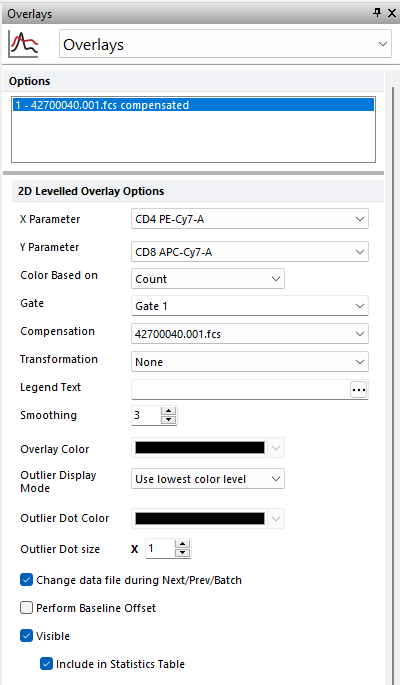
In the Formatting Overlay dialog (Figure 5.40), a list of all the overlays on the plot will appear in the Options box at the top. When multiple overlays are present, you can select one or more overlays using standard Microsoft Windows techniques, including Shift-Click and Cmd-Click. You may also multiple select all overlays via the Cmd+A command, or right clicking and choosing to Select All or Invert Selection.
The properties on the bottom of the window pertain to the currently selected overlay(s). If multiple overlays are selected, the information will appear blank for those properties that are not identical in all selected overlays. If the properties are not blank, then they are identical for all selected overlays. Changing an option will change that property for all selected overlays. For instance, if you select three overlays and change the Gate, the Gate for all three overlays will be modified.
To remove an overlay from a plot, select the overlay (or multiple overlays) and press the Remove button.
To change the order of selected overlay(s) in the legend, use the blue up and down arrows (![]() ).
).
For a brief tutorial on how to use overlays, visit us at https://youtu.be/nVqwvDo1RmA.
For Contour and Density plots, the following overlay options are available (see table below).

Figure 5.40 Formatting Contour or Density Plots
Option |
Explanation |
|---|---|
X Parameter |
Change the parameter displayed on the X axis. |
Y Parameter |
Change the parameter displayed on the Y axis. |
|
|
Choose from Count or available parameters to base the density display color palette on. For instance if FSC and SSC are displayed on the X and Y and FL1 is chosen for Color Based on then the density display will represent the distribution of FL1 fluorescence on the FSC vs SSC plot. Using Color Based on is a common and useful display type for working with tSNE transformed data sets where it is useful to view tSNE X vs tSNE Y parameters on separate plots for each measured parameter with the Color based on for each plot representing a different parameter. The parameter used by this option, can also be selected via the legend title. |
Gate |
If gates are defined, select the gate that will be used to limit the data that is displayed on the 2D plot overlay. |
Compensation |
If compensation definitions are set, select the definition to use when compensating the data in the overlay. |
Transformation |
If transformations are defined, select the transformation to use when displaying the data in the overlay. |
Legend Text |
The text that will appear in the legend beside the symbol for the overlay. If this field is blank the file name of the overlay will appear. Insert keywords from the header of the FCS file by pressing the ellipsis next to the legend text. You can also display the current gate applied to the overlay by inserting "<$FCSE_GATEFORMULA>" into the legend text. |
Smoothing |
Set the degree of smoothing for the presentation of your data. Smoothing is performed with a box-filter algorithm. The Smoothing parameter controls how many iterations of smoothing are performed. |
Overlay Color (only available for Contour Plots)
|
The color that the overlay will be drawn in. The default overlay color for the first overlay can be set on the 2D plot preferences page of the FCS express User Options Dialog. |
Outlier Display Mode |
Choose from Do not show, Use color below, Use lowest color level. Do not show will not display any outliers; Use color below will use the Outlier Dot Color chosen in the drop down below for the outlier color; Use lowest color level will set the color of the outliers to the lowest color level displayed in the density plot. |
Outlier Dot Color |
If Use color below is chosen then the Outlier Dot Color selected in the color palette will be used to display outliers. |
Outlier Dot size |
Choose the size of the dots used to display outliers. |
Change data file during Next/Prev/Batch |
If this option is checked, the data file for this overlay will change when doing batch processing, or selecting Previous File or Next File. This option is usually only disabled for control histograms, where you have multiple overlays, and want the control to stay the same all of the time. |
Perform Baseline Offset |
If the value of the cell is zero, a random offset will be added so that the dot appears off the axis. This will not affect the statistics. This option is typically used when analyzing LMD files from Beckman Coulter. |
Visible |
Controls whether or not to display this overlay on the 2D plot. |
Include in Statistics Table |
Allows the user to determine if the statistics for a given overlay are displayed in the Statistics table of the selected plot. |
Examples
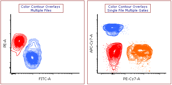
Figure 5.41 below depicts some examples of contour plots with different combinations of colored overlays, based on different gates or multiple files:

Figure 5.41. Example of Contour Plot Overlays. (Left) Each overlay represents data from different files, with each files data colored uniquely. (Right) Each overlay represents data from the same file, with each color corresponding to a different gated population.
