Inserting a Kinetics Plot
In Kinetics analysis, the X-axis value is Time. Cells are usually stimulated by adding one or more drugs after a baseline is established at the beginning of the experiment.
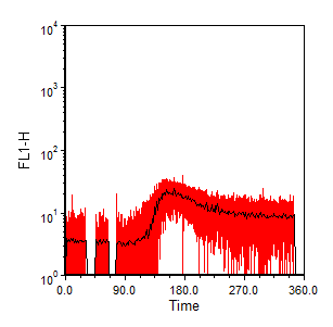
Kinetics plots are a special subset of one dimensional plot that automatically average all of the Y-axis values per unit of Time and displays one dot (chosen from Mean, Geometric Mean, Median or % Above Threshold) for each X-axis value (along with the option of displaying the standard deviation of the Y-axis value in color).
To insert a Kinetics plot, use the Insert→2D Plots→Kinetics command. If necessary, change the X-axis parameter to Time and format the X-axis range or resolution to suit your experiment (right-click on the histogram, choose Format from the pop-up menu, and select Axis from the dropdown to adjust the range or the Binned Plot Specific Options to set the resolution).
An example of a Kinetics plot is shown in Figure 5.44.

Figure 5.44 Kinetics Histogram (Median FL1-H vs Time). Standard Deviation shown in red.
