NxN Plots
In this tutorial, we will utilize the multi plot feature in FCS Express to create NxN plots for parameters involved in the compensation matrix. A plot will be created displaying the fully-stained sample in two overlays, black and red, to compare compensations created in the software or on the instrument during acquisition, respectively.
1. Click File tab→Open and select NxNComp.fey layout from the Tutorial Sample Data folder.
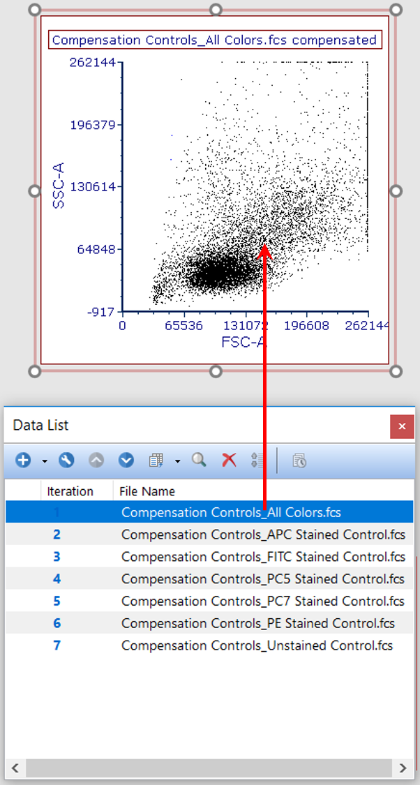
2. Drag and drop CompensationControls_AllColors.fcs by its File Name from the Data List to the plot on Page 1 (Figure T8.42).

Figure T8.42 Dragging and Dropping Second Data File to Overlay with Negative on Plot from Data List
3. Click radio button next to add the files to the plot as new overlays and click OK in Select Drag and Drop Action window.
4. Click plot to place it in edit mode (i.e. green border).
5. From the Multi Plot tab → Multi Plots group in the ribbon bar, select the NxN Compensation Viewer command  .
.
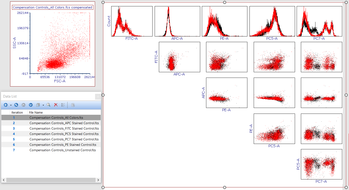
6. Click and drag resizing anchors to enlarge NxN plot. It should now resemble Figure T8.44.

Figure T8.44 Resized NxN Plot
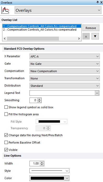
Note: The black overlay (i.e. Overlay 1 in the dialog below) represents the software compensation (called New Compensation), while the red overlay represents the compensation created and written to the file during acquisition, which can be confirmed by reviewing the Compensation selected for each overlay in the Formatting dialog's Overlays category (Figure T8.45). To access this information, double-click or right-click the plot from Step 2 and choose Format.

Figure T8.45 Overlays Category for Parent Plot Used to Create NxN Plots
