Using Data Grids for Analysis
FCS Express allows the user to insert a data grid for any plots. Data grids typically display cell-by-cell parameter data. In the context of image cytometry, the data grid can be used as an image gallery to view images of individual cells and their associated parameters.
In the course of this section, you will learn how to:
•Insert a data grid/cell gallery
•Format a data grid/cell gallery to display individual cell images and parameters
•Apply gates to a data grid/cell gallery
•Create gates in a data grid/cell gallery
1. Click File tab→New→New to open a new layout.
2. Choose the Data tab→Organize Data Sets tab→Data List command ![]() . A Data List window will appear.
. A Data List window will appear.
3. Click the blue plus to add files ![]() to choose Add Data File.
to choose Add Data File.
4. Choose DNS data Stream files (*.dns) from the Files of type: drop-down list.
5. Navigate to the FCS Express Tutorial Sample Data archive.
6. Select pictureplotsample1.dns.
7. Click Open to load it into the Data List.
8. Drag and drop pictureplotsample1.dns by its file name from the Data List to the blank, white space of the layout.
9. While holding CMD select only the Color Dot, Picture Plot and Data Grid in the Select Plot Types... dialog (Figure T29.23).
10. Click OK.
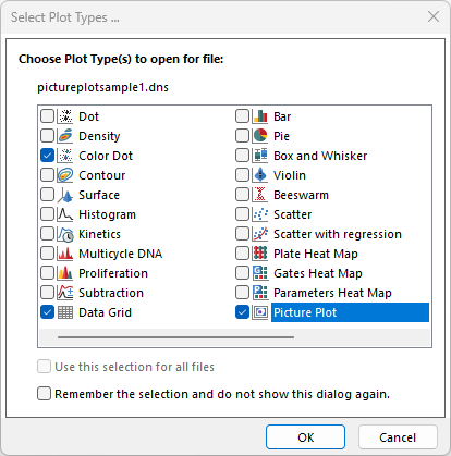
Figure T29.23 Inserting a Data Grid and Two Plots
A color dot plot, data grid, and picture plot will appear on the layout. Arrange these plots and grid to resemble Figure T29.24.
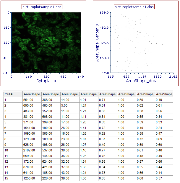
Figure T29.24 Picture Plot, Data Grid, and Color Dot Plot Arranged on the Layout for Analysis
The data grid can be used as a cell gallery to view individual cells from the picture plot and gates.
We will format the grid to show cell cutouts, a few parameters, and gates from the data.
11. Right-click on the data grid.
12. Choose Format from the pop up menu. The Formatting dialog will appear, docked to the right.
13. Choose the Parameters to Display category (Figure T29.25).
14. Click the Only the items check below radio button (Figure T29.25).
15. Check the following boxes found by scrolling to the bottom of the list (Figure T29.25):
a.Intensity_UpperQuartileIntensity_DNA
b.Number_Object_Number
c.Cytoplasm
d.DNA
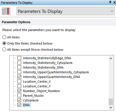
Figure T29.25 Formatting the Parameters to Display for the Data Grid
16. Choose the Gates to Display Category.
17. Click the All gates radio button.
The data grid is now displaying parameter values, images, and column for Gates for all events (Figure T29.26).
We will create gates on the dot plot and picture plot, and use these gates to view individual events within the data grid.
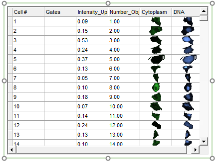
Figure T29.26 Data Grid Displaying a Gate Column, Chosen Parameters, and Individual Cell Images
18. Create a rectangle gate on the picture plot, similar to the one in Figure T29.27, and name it Picture Plot Gate in the Create New Gate dialog.
19. Create a rectangle gate on the dot plot, similar to the one in Figure T29.27, and name it Dot Plot Gate in the Create New Gate dialog.
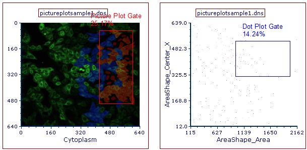
Figure T29.27 Gates Created on the Picture and Dot Plots
Scroll down the data grid and notice it is now displaying colored rectangular boxes in the gates column (Figure T29.28). These boxes represent which gates the individual cells fall within. If a cell falls into multiple gates, then multiple colored bars will appear next to the cells in the "Gates" column. If the "Gates" column is empty, then the cell does is not found in any gates currently being displayed.
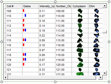
Figure T29.28 Data Grid Displaying Dot Plot and Picture Plot Gates as Colored Rectangular Boxes
We will apply the Picture Plot Gate and Dot Plot Gate to the data grid to view the individual cells that fall within these gates.
20. Click on the data grid to select it.
21. Navigate to Gating tab→Create Gates group→Current Gate drop-down list and choose Picture Plot Gate (Figure T29.29). Alternatively, you can drag and drop the Picture Plot Gate directly from the Picture Plot onto the Data Grid.
22. Adjust the Picture Plot Gate to select fewer cells as shown in Figure T29.29.
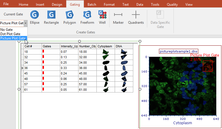
Figure T29.29 Apply Picture Plot Gate to the Data Grid
Notice how the cell gallery updates in real-time to display only the events found within the chosen Picture Plot Gate. This is an example of "drilling down" to cells of interest.
23. Click on the data grid to select it.
24. Navigate to Gating→Create Gates→Current Gate and choose the Dot Plot Gate from the Current Gate drop-down list (Figure T29.30). Alternatively, you can drag and drop the Dot Plot Gate directly from the Dot Plot onto the Data Grid.
25. Adjust the Dot Plot Gate to select fewer cells as shown in Figure T29.30.
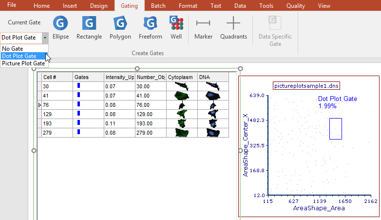
Figure T29.30 Apply Dot Plot Gate to Data Grid
We now will create on the data grid to display those events in the picture plot and scatter plot.
26. Click on the data grid to select it.
27. Navigate to Gating→Create Gates→Current Gate and choose No Gate from the Current Gate drop-down list.
28. Right-click on the data grid.
29. Choose Create Gate from the pop up menu. A Range Gate selection area will appear as shown in Figure T29.31.
30. Click on Range.
31. Select Add Range to Gate... from the drop-down list (Figure T29.31).
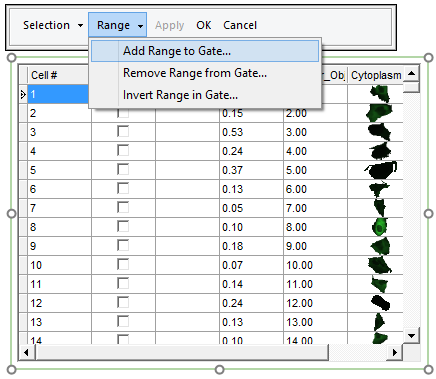
Figure T29.31 Range Gate Selection
32. Enter the range as From 1 To 100 in order to select the first 100 cells of the sample (Figure T29.32).
33. Click OK.
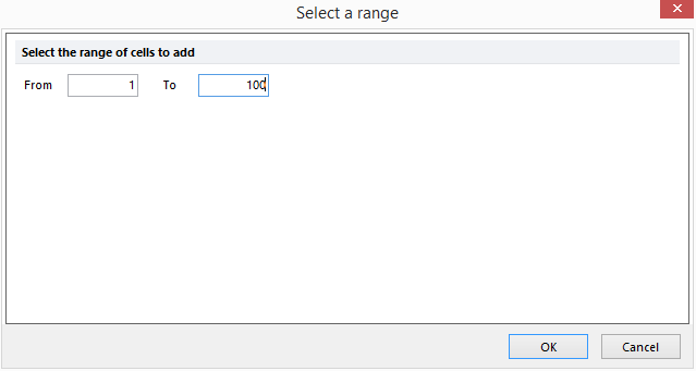
Figure T29.32 Select a Range Dialog
34. After the Select a range window closes, click OK in the Range Gate Selection window above the data grid (figure T29.33, red outline).
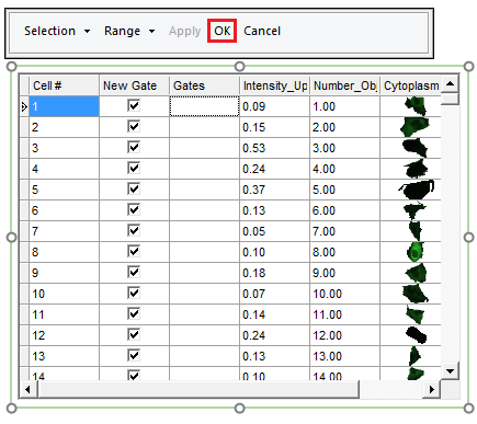
FIgure T29.33 Range Gate Selection Window
35. Name the new gate Range Gate in the Create New Gate dialog.
36. Click OK.
The new gate is now visible in the Gates column of the Data Grid (Figure T29.34).
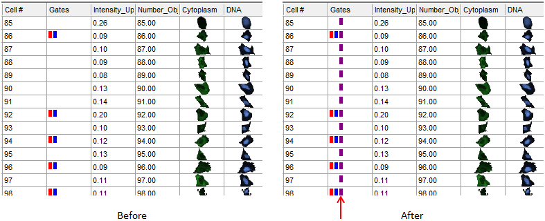
Figure T29.34 Before (Left) and After (Right) Creating a Range Gate
We now will add more events to the Range Gate.
37. Right-click the data grid and select Edit Gate→Range Gate.
38. Click Range in the Range Gate Selection window above the data grid.
39. Select Add Range to Gate... from the drop-down list.
40. Enter the range as From 180 To 250.
41. Click OK.
42. Click OK in the Range Gate selection area.
Note the Range Gate contains cells 1-100 and cells 180-250 now.
Notice that the picture plot and scatter plot are now displaying the events that were selected in the range gate as dots or cells highlighted by the range gate color, purple in this example (Figure T26.30).
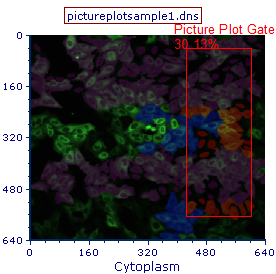
Figure T29.35 Picture Plot Displaying the Events in the Range Gate as Purple Highlighted Cells
Individual cells may also be selected in a range.
43. Right-click the data grid.
44. Choose Create Gate.
45. Select cells 5 through 10 in the data grid by checking the respective boxes in the New Gate column (Figure T29.36, red outline ![]() ).
).
46. Click OK in the Range Gate Selection window (Figure T29.36, red outline![]() ).
).
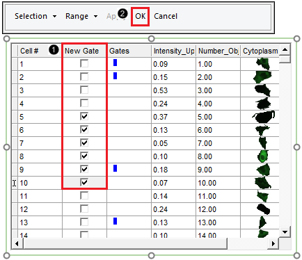
Figure T29.36 Selecting Individual Cells for Gating by Checking the Boxes in the New Gate Column
47. Name the gate "Selected Cells" in the Create New Gate dialog.
48. Click OK.
A new range gate will be created for these cells (Figure T29.37).
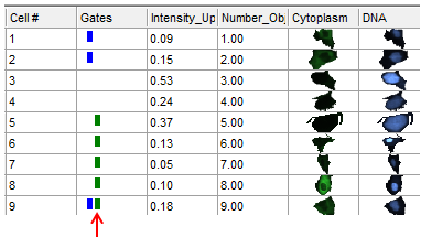
Figure T29.37 Selected Cells Range Gate Displayed as a Green Box in the Gates Column
To view the individual cells in this gate on the picture plot and dot plot, we will format both plots to make it easier to view a small number of cells.
49. Click the picture plot.
50. Choose the Overlays category in the Formatting dialog.
51. Uncheck the Show Background Image box.
52. Click the color dot plot.
53. In the Formatting dialog, change the Dot size to 5 under the Overlays category.
We now will apply the Selected Cells gate to view only these events in each plot.
54. Multiple-select both the dot plot and picture plot.
55. Click Gating tab→Create Gates group→Current Gate drop-down list and choose Selected Cells.
The dot plot and picture plot will display only cells that fall within the manually checked range boxes (Figure T29.38). A new range or individual cells may be added to the gate at any time.
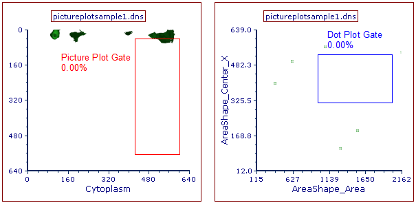
Figure T29.38 Plots Displaying Only Events from the Range Gate
56.Right-click the data grid.
57. Choose Edit Gate→Selected Cells.
58. Click on Range.
59. Select Add Range to Gate from the drop-down list.
60. Enter the range as From 1 To 50.
61. Click OK.
62. Click Apply in the Range Gate Selection window to see the changes to the gate in real-time.
63. Click OK in the Range Gate Selection window.
The picture plot and dot plot will now display the newly edited range that was entered (Figure T29.39). Also notice since events are now falling within the Dot Plot Gate, the percent gated statistic updates automatically.
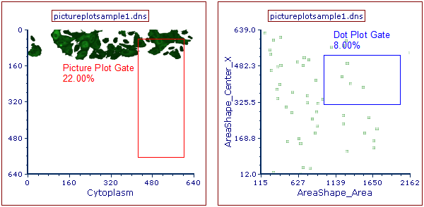
Figure T29.39 Picture Plot and Dot Plot After Adding a New Range to the Selected Cells Gate
