Analyzing Data in Heat Maps
In this section you will learn how to:
•Create a gate on a plate heat map
•Use well gates to view events in 2D plots from single and multiple wells
•Create plate heat map overlays to view events from multiple wells on a single plot as an overlay
We will use a data set, screening for "hits" that are positive in the FL2-A channel. We will be using the HighContentAnalysis.fey layout and the HighContent96wellData.dns data file (.dns is special file format created by FCS Express), which are both located in the Tutorial Sample Data archive. The original data set contains 96 FCS Files acquired on a plate-based acquisition system.
1.Load the HighContentAnalysis.fey layout.
2.Choose the Data tab→Organize Data Sets group→Data List command.
3.In the Data List, click the ![]() symbol and choose Add Data File.
symbol and choose Add Data File.
4.Choose DNS data Stream files (*.dns) from the Files of type: drop-down list (Figure T20.21, red outline).
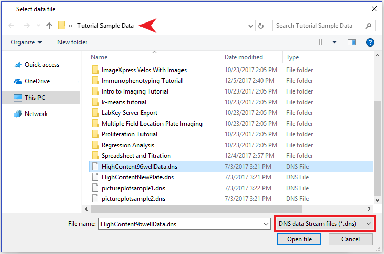
Figure T20.21 Choosing DNS Data Stream Files
5.Navigate to the FCS Express Tutorial Sample Data directory (Figure T20.21 above, red arrow).
6.Choose the file "HighContent96wellData.dns"
7.Click Open file.
The file will appear in the data list as a file. This file contains data from all 96 wells stored in .dns format. We will now load the data into the plots on the layout before we insert a plate heat map.
8. Choose the Data tab→Change Data on All group→Select down arrow→Select using Advanced Open Data Dialog command (Figure T20.22, red arrow).

Figure T20.22 Select Using Advanced Open Data Dialog Command
9. Choose the Data List tab in the resulting Change Data File dialog.
10. Highlight the HighContent96wellData.dns file and click OK.
Note: Alternatively, you can select the "HighContent96wellData.dns" item in the Data List and click "Change Data On All Plots" (Figure T20.23).
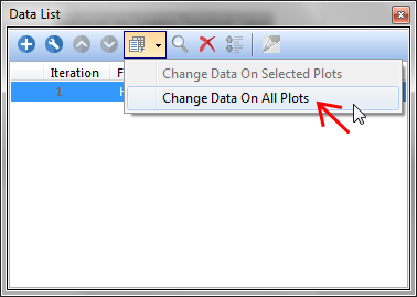
Figure T20.23 Change Data On All Plots Button in Data List
The layout will resemble Figure T20.24.
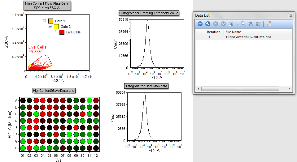
Figure T20.24 High Content Analysis Layout after Loading HighContent96wellData.dns File
The color dot plot in the layout is showing all the events within the .dns file (Figure T20.24). The Live Cells gate is applied to the plate heat map, so it will only display cells falling within the gate, which is defined on the 2D plot.
Wells that are "hot" for FL2-A are displayed in red and wells that are "cool" for FL2-A are displayed in green. Varying degrees of heat are represented by the transition from Red to Black to Green.
We now will create gates on the plate heat map.
12. Right-click the plate heat map.
13. Choose Create Gate→Well from the pop up menu.
14. Click in the white space surrounding the plate but within the green border as in Figure T20.25 (Clicking directly on a well will immediately select the well for gating).
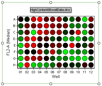
Figure T20.25 Creating a Well Gate
The Editing New Well Gate window will appear (Figure T20.26).

Figure T20.26 Editing a New Well Gate
15. Click the well in position H12.
The Create New Gate dialog will appear (Figure T20.27).
16. Enter "Negative Control" for the Create a new gate named edit field (Figure T20.27,![]() ).
).
17.Change the Gate color to "Green" (Figure T20.27, ![]() ).
).
18. Click OK (Figure T20.27, ![]() ).
).
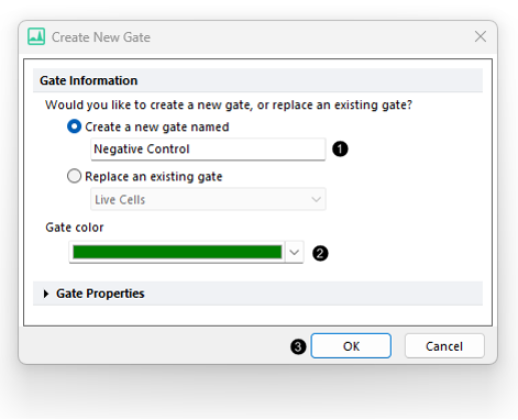
Figure T20.27 Create New Gate Dialog
We now will create a second gate into the plate heat map called "Experimental." For training purposes, we will use an alternative procedure to steps 12 through 18.
19. Choose the Gating tab→Create Gates group→Well command ![]() .
.
20. Click directly on Well A4. The Create New Gate dialog will appear (similar to Figure T20.27).
21. Enter "Experimental" for the gate name, change the Gate color to "Blue" (similar to Figure T20.27).
22. Click OK (similar to Figure T20.27).
The layout and gate view should resemble Figure T20.29.
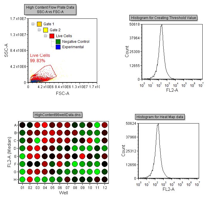
Figure T20.29 Layout with Gate View Indicating Hierarchical Gating of the Negative Control and Experimental Gates
We now will create a histogram overlay to view data from separate wells.
23. Drag and drop the entire Plate Heat Map to the plot labeled Histogram for Plate Heat Map data on the layout (Figure T20.30).

Figure T20.30 Creating New Overlay by Dragging and Dropping
The Select Drag and Drop Action dialog appears (Figure T20.31).
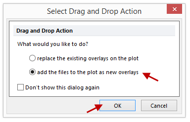
Figure T20.31 Select Drag and Drop Action Dialog
24.Select the option to Add the files to the plot as new overlays and click OK (Figure T20.31, red arrows).
25. Double-click the histogram. The Formatting dialog will appear, docked to the right.
24. Select the Overlays category (Figure T20.32).
Two overlays for the same FCS Plate folder file will be displayed in the Overlay List.
25. Select the first overlay, 1 - Highcontent96wellData.dns, in the Overlay List if necessary (Figure T20.32, ![]() ).
).
26. Change the Gate drop-down list to "Negative Control" (Figure T20.32, ![]() ).
).
27. Change the Color under Line Options to Green (Figure T20.32, ![]() ).
).
28. Highlight the second overlay in the list (Figure T20.32, ![]() ).
).
29. Change the Gate drop-down option to "Experimental" (Figure T20.32, ![]() ).
).
29.Change the Color under Line Options to Blue (Figure T20.32, ![]() ).
).
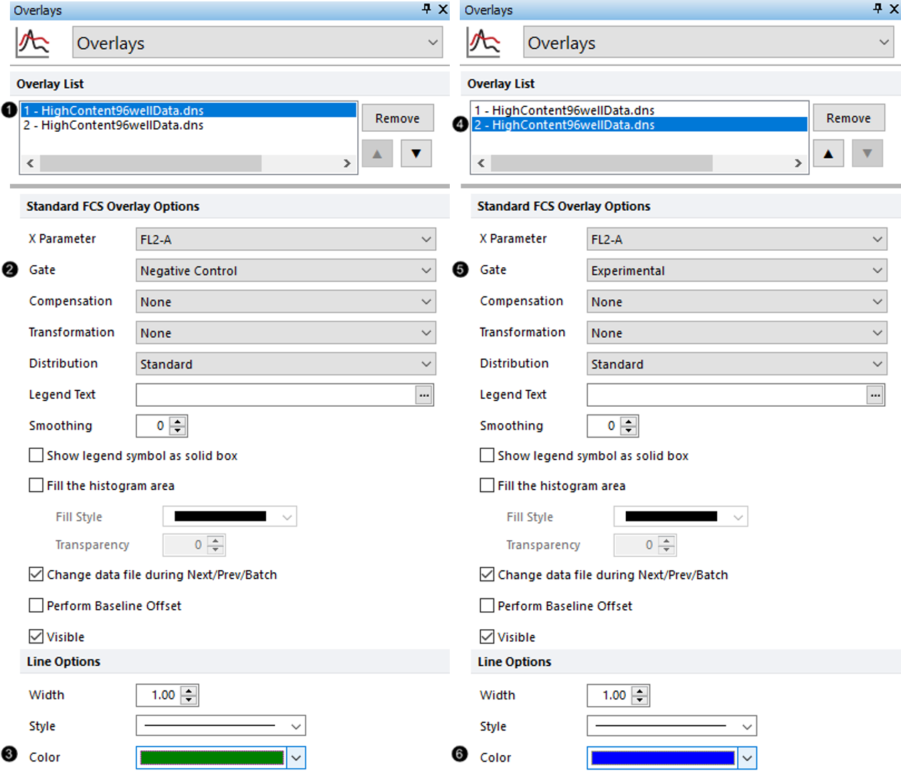
Figure T20.32 Formatting Overlays of Histogram for Plate Heat Map Data
The histogram should resemble Figure T20.33, displaying the cells in the "Negative Control" well gate as green, and the cells from the "Experimental" well gate as blue.
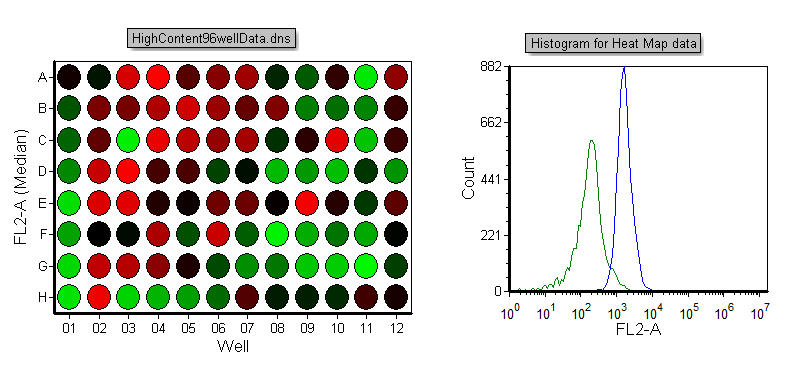
Figure T20.33 Histogram Displaying Events from Well Gates
We now will edit the well gates to select different wells.
30. Right-click the plate heat map.
31. Choose Edit Gate→Experimental from the pop up menu. The Editing well gates window will appear, and well A4 will be highlighted in blue (Figure T20.34).
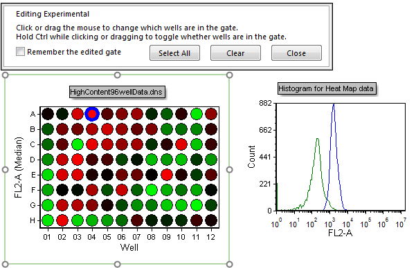
Figure T20.34 Editing the Experimental Well Gate (A4)
32. Click the well in position C12. Notice how the experimental histogram peak shifts showing only the cells in the newly selected well (Figure T20.35). Well C12 shows heterogeneous staining for FL-2A while "cooler" wells, such as G9. Click well G9 to view) overlap with the negative control.
33. Click Close in Editing Experimental window above plate heat map.
We now will select multiple "Negative" wells to create a better representation of the negative population displayed on the histogram.
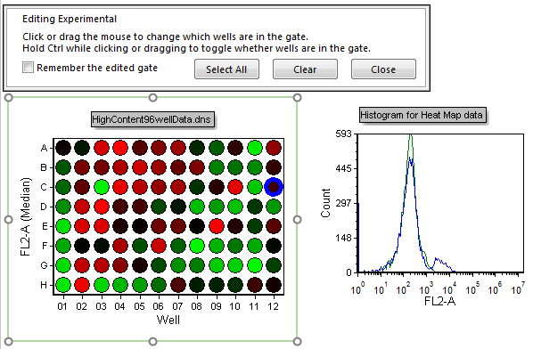
Figure T20.35 Experimental Well Gate Changed to C12
34. Key Ctrl+Z to undo the gate change.
35. Right-click the plate heat map.
36. Choose Edit Gate→Negative Control from the pop-up menu.
37. Press and hold down the Ctrl button to allow multiple non-consecutive selection.
38. Click wells C1 and F1 (Figure T20.36).
39. Release the Ctrl button.
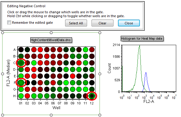
Figure T20.36 Selecting Multiple Non-consecutive Wells (C1, F1, and H12)
Multiple non-consecutive wells can be chosen in this manner. Notice how the histogram updates to reflect selection of the multiple wells (C1, F1, and H12 in Figure T20.36).
We will now select multiple wells using a selection box.
40. Left-click and hold the mouse button down slightly above and to the right of well B1.
41. Drag the mouse down and to the left to select wells B1-F1. Notice how the selection box appears and indicates which wells are being selected (Figure T20.37).
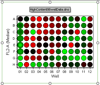
Figure T20.37 Selecting Multiple Continuous Wells
42. Release the mouse button to select the wells.
Multiple wells can also be selected by a combination of using the selection box and Ctrl+Clicking.
43. Hold down the Ctrl key.
44. Select wells B1-F1.
45. Click on well G9 to select it (continue holding down the Ctrl key).
46. Create a new selection box (with the Ctrl key still being held down) to encompass wells A8-A11.
47. Release the Ctrl key.
48. Click Close from the Editing Negative Control window above plate heat map.
Wells B1-F1, A8-A11, and G9 are now selected and contributing to the Negative Control histogram peak (Figure T20.38).
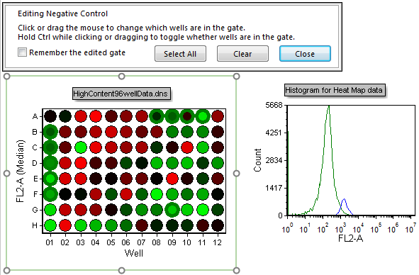
Figure T20.38 Multiple Well Selection for Negative Control Gate
Gates also may be deselected from the well gating dialog in a similar manner.
49. Right-click the plate heat map.
50. Choose Edit Gate→Negative Control from the pop-up menu.
51. Ctrl+Click on well A8. Notice how the well gate is removed.
52. Repeat step 51 for wells B1-F1. The continuous column well gates will be removed.
53. Click Close in Editing Negative Control window above plate heat map.
Although selecting wells for gating and displaying them in histograms or 2D plots is useful, some users may be only interested in which wells contain the highest channel values. In the following steps, we will format the plate heat map to display wells above a defined threshold value.
54. Choose Color Levels category in the Formatting dialog (Figure T20.39).
55. Change the Style to Threshold from the drop-down list (Figure T20.39, ![]() ).
).
56. Change the Below Threshold Color to Black (Figure T20.39, ![]() ) and Above Threshold Color to Red (Figure T20.39,
) and Above Threshold Color to Red (Figure T20.39, ![]() ).
).
57.Click on the ![]() symbol in the Threshold Value field to insert a token (Figure T20.39,
symbol in the Threshold Value field to insert a token (Figure T20.39, ![]() ).
).
58. Double-click Statistic from the Insert a Token dialog (Figure T20.39, ![]() ).
).
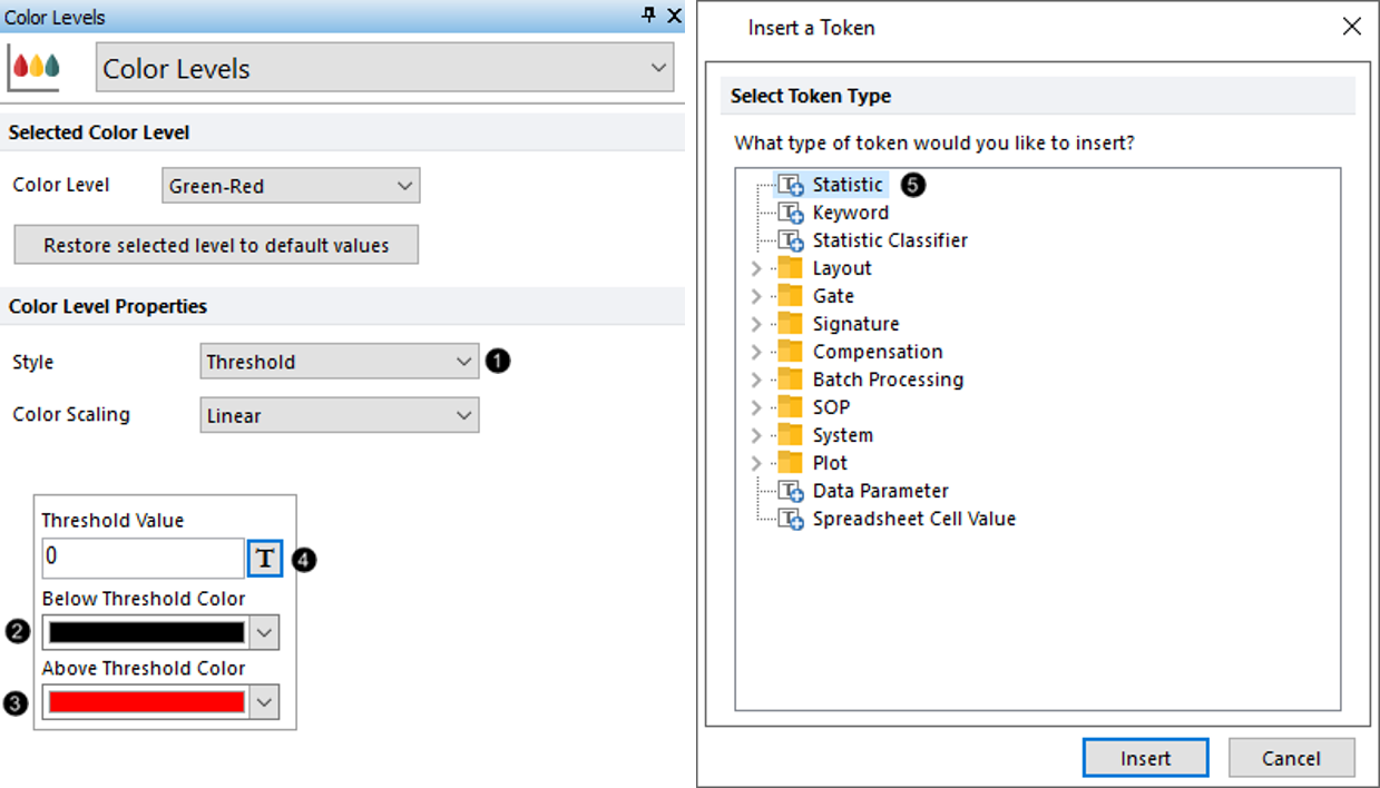
Figure T20.39 Formatting Style and Colors Used in Threshold for Color Levels of Plate Heat Map
59. Choose the "Histogram for Creating Threshold Value" in the Select a plot list box (Figure T20.40, ![]() ).
).
60. Choose the Statistic category on the left of the Create Statistic dialog (Figure T20.40, ![]() ).
).
61. Set the Gate to Live Cells from the drop-down list (Figure T20.40, ![]() ).
).
62. Highlight Median in the Statistic list box (Figure T20.40, ![]() ).
).
63. Click OK (Figure T20.40, ![]() ).
).
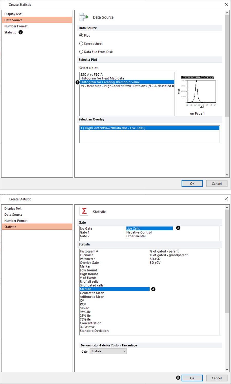
Figure T20.40 Selecting the Plot and Statistic to Be Used for Threshold Value of Color Level Settings
The plate heat map should resemble T20.41. The red wells indicate those with a median value for FL2-A fluorescence above the median FL2-A fluorescence of the entire plate.
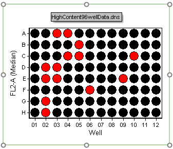
Figure T20.41 Threshold Defined as Median Value for Plate Heat Map
In the next section, we will use batch analysis to analyze multiple plates.
