Creating Pie Charts
Creating Pie Charts in FCS Express is much like creating Bar Charts - they can be populated via a spreadsheet or by drag-and-drop.
1.Select File tab→Open.
2.Open the layout titled "Pie begin.fey" within the Tutorial Sample Data archive.
This layout contains Color Dot Plots and a spreadsheet with free text and a statistic token in cells A1 and B1, respectively.
3.Click the Insert tab→Spreadsheet and Charts group→Charts→Pie command (Figure T19.10).
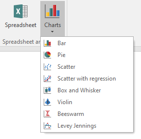
Figure T19.10 Inserting a Pie Chart
4.Click on the blank, white space of the layout to insert a Pie Chart (Figure T.19.11).
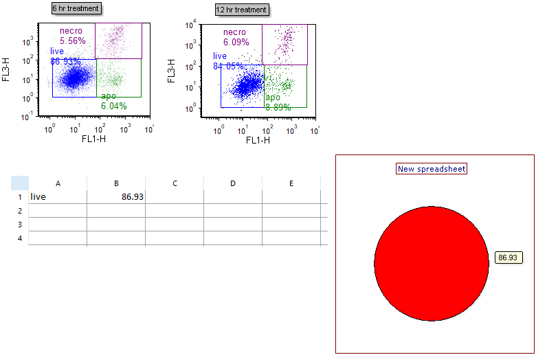
Figure T19.11 Inserted Pie Chart
We will use the drag-and-drop functionality of FCS Express to add new sectors (slices) and replace old ones to the Pie Chart.
5.Type "apo" and "necro" into cells A2 and A3, respectively.
6.Drag and drop the green "apo" gate from the 6 hr treatment plot at left to an empty spot on the Pie Chart (not on the pie itself) (Figure T19.12).
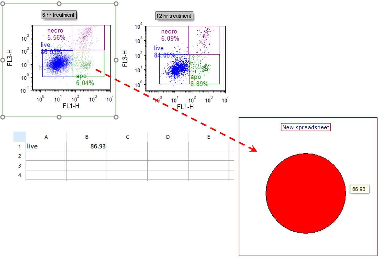
Figure T19.12 Dragging and Dropping Gate to Pie Chart to Add New Slice
7.Select "% of gated cells" from the Statistic box in the Edit Statistic dialog (Figure T19.13, red outline).
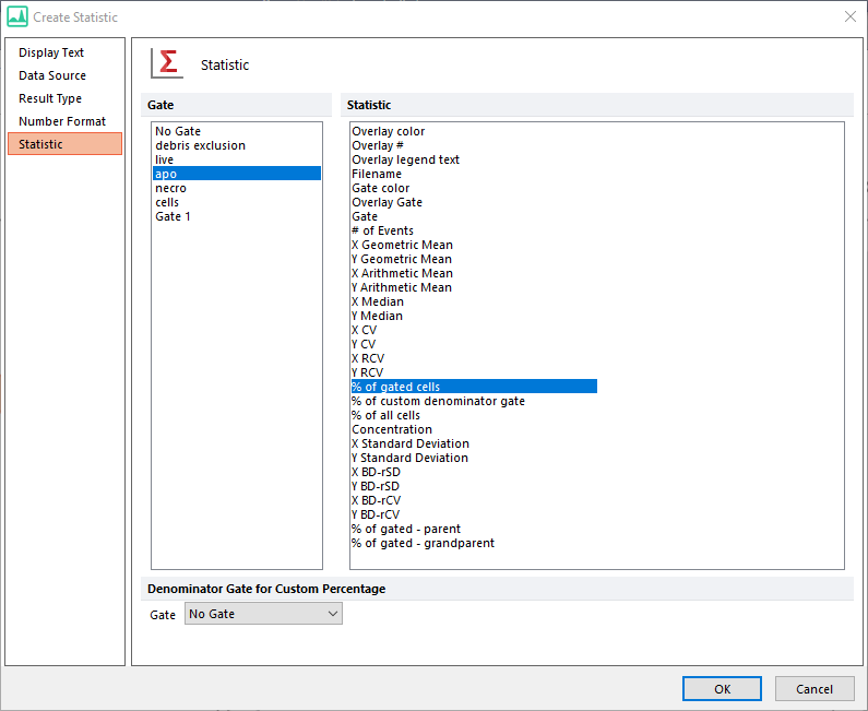
Figure T19.13 Choosing to Plot after Drag and Drop
8.Click OK. A new sector (slice) displaying this statistic now appears as in Figure T19.14.
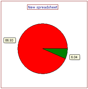
Figure T19.14 Updated Pie Chart
9.Repeat steps 6 through 8 for the purple "necro" gate of the 6 hr treatment plot at left, so that the Pie Chart will have a total of three sectors (slices).
We now will format the Pie Chart.
10. Double-click the Pie Chart. The Formatting dialog will appear, docked to the right.
11. Choose the Legend category (Figure T19.15).
12. Check the Visible box (Fig. 19.15, red outline).
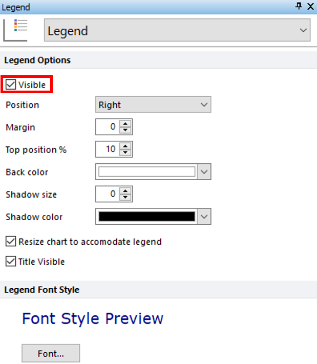
Figure T19.15 Adding Legend to Pie Chart
13. Choose the Overlays category (Figure T19.16).
The Name Parameter is derived by default from the first column of the Custom Data Grid on your layout. It appears as "subset" or as "A", depending on the appearance of your Custom Data Grid. The Value parameter is derived by default from the second column of the Custom Data Grid. It appears as "%-gated" or as "B", depending on the appearance of your Custom Data Grid. It is displayed by default as a Caption for each slice of the Pie Chart (Fig 18, upper right). The Caption can be formatted to display any combination of Name, Value, or Percentage for each sector (slice) of the Pie.
14. Check any combination of boxes next to Value, Percentage, and Name from the Caption Style section of the Overlays category to customize with the desired information (Figure T19.16, red outline).
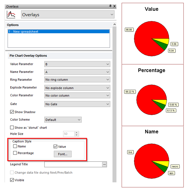
Figure T19.16 Editing the Caption Style of the Pie Chart
Note: Pie shadow, donut vs. pie appearance, color scheme, and other attributes can also be customized. See the Formatting Pie Charts section of the manual for details.
15. Optional:
•Click the Data tab→Change Data on All group→ Next/Previous commands to advance through the set of files in the Data List and watch as the Pie Chart updates with the new data.
•Adjust the gates on the plots and watch the Pie Chart update in real-time.
Optional: Go to the Formatting section of this tutorial to learn how to Explode slices for emphasis and display an additional dataset as a Ring at the periphery of the Pie.
16.Select Modern from the Color Schemes drop down list (Figure T19.17, red outline).
Note: there are many predefined color schemes that may be chosen for display.
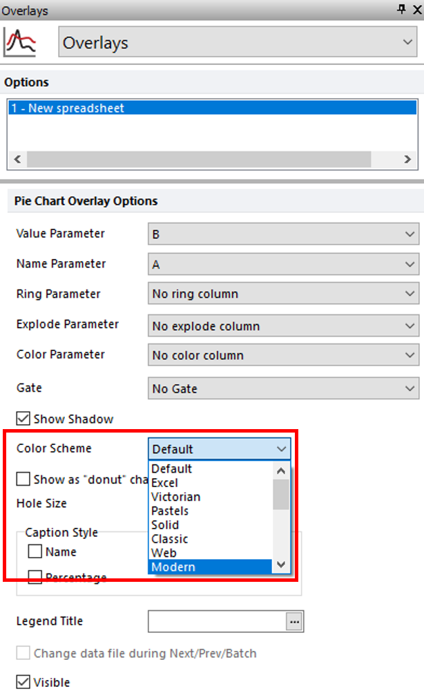
Figure T19.17 Changing the Color Scheme
The Pie Chart colors have now been reformatted with the Modern color scheme (Figure T19.18).
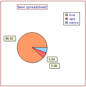
Figure T19.18 Updated Color Scheme of Pie Chart
Go on to the next section to create a Scatter Chart from the same Color Dot Plots on this layout. Or, jump to the Formatting section of this tutorial to learn how to Explode Pie slices for emphasis and display an additional dataset as a Ring at the periphery of the Pie.
