Creating a regression curve from a Spreadsheet
The remainder of this tutorial will focus on creating a regression analysis of the data by using a scatter plot with regression plot with Spreadsheet based data. You can use the layout you created in the previous section or open Titration with Complete Spreadsheet.fey in Tutorial Sample Data archive within the sub folder called Spreadsheet and Titration.
1.Click on spreadsheet.
2.Insert tab→2D Plots tab→Scatter with regression.
3. Click on blank space on page 2 of layout.
Plot should now appear and resemble Figure T17.15 below.
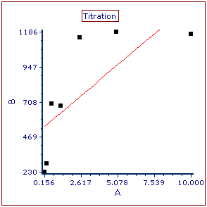
Figure T17.15 Scatter Plot with Regression Unedited
The 2D scatter with regression plot using the titration data in the spreadsheet appears. Notice that the plot contains points in black that represent the points from Columns A (X-axis) and B (Y-axis) of the spreadsheet. The red line overlay is a regression overlay. The default regression fit for all scatter with regression plots is a linear fit. In the following steps we will adjust the plot to display the correct data from the spreadsheet and a more appropriate Michaelis-Menten regression fit. We will also start by adjusting the axis range to more appropriately fit the points within the plotted region.
4.Double-click plot to open Formatting dialog, which will appear docked to right of layout and display General category.
5.Select the Overlays category from the drop-down menu at the top of the formatting dialog.
6.In the 2D Unbinned Overlay Options section of the dialog, change Y Parameter to D. This will change the data used from Column A "Monos Median" to Column D "M/L Ratio"(Figure T17.16).
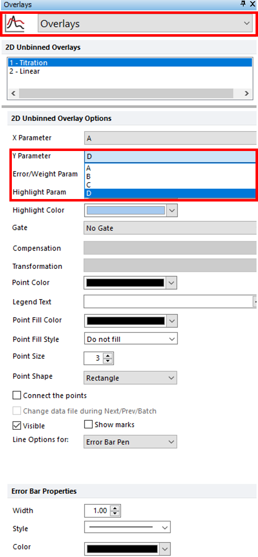
Figure T17.16 Changing Y Parameter
7. Select the Axes category.
8. Select Y Axis (Figure T17.17).
9. Enter "150" in the Minimum Range and "750" in the Maximum Range fields (Figure T17.17).
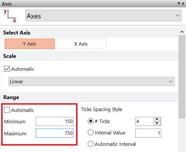
Figure T17.17 Updating Y-Axis Range Values
10. Select X Axis (Figure T17.18).
11. Enter "12" in the Maximum Range window (Figure T17.118).
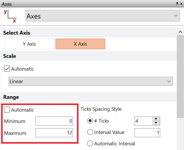
Figure T17.18 Changing X-Axis Range Maximum
12. Select Regression Fit category.
13. Choose MichMenten from Regression Type drop-down list under Regression Model Options.
14. Confirm Number of regression dots is set to 30 (Figure T17.19).
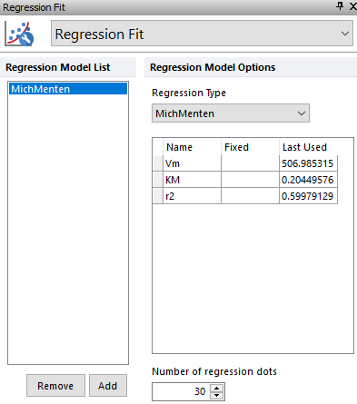
Figure T17.19 Regression Fit Settings
The scatter plot should resemble Figure T17.20
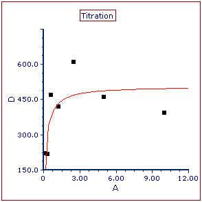
Figure T17.20 Scatter with Regression Plot after Modifications
15.Type into "Monos CV" cell E1.
16. In Data List, Ctrl+A.
17. Drag and drop data files to E2 (Figure T17.21).
18.Choose Statistic Token from the Paste Special dialog.
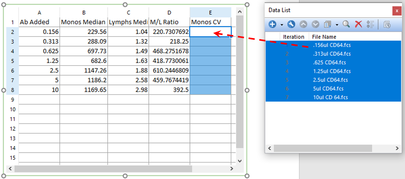
Figure T17.21 Drag and Drop Data Files to E2
The Statistic page of the Create Statistic dialog now appears.
19. Select FL 8 Log from the Parameter list under Data File Information.
20. Select Monos from the Gate area.
21. Select CV from Statistic list box.
22. Click OK (Figure T17.22).
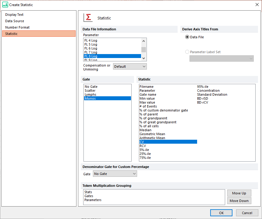
Figure T17.22 Edit Statistic Information for Monos CV
The spreadsheet should now resemble Figure T17.23.
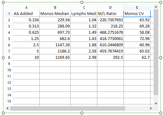
Figure T17.23 Columns A, B, C, D, and E Complete
22. Click to select scatter with regression plot.
23. Select the Overlays category.
24. Select E from the Error Bar Param drop-down list. This will change the data used from Column A "Monos Median" to Column E "Monos CV". (Figure T17.24).
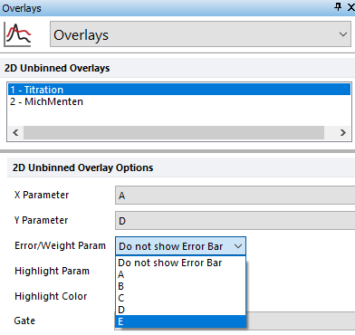
Figure T17.24 Adding Error Bar from Overlays Category
The titration Scatter with Regression plot updates to reflect the addition of black error bars using the Monos CV data, shown in Figure T17.25. Note: that as you adjust any of the gates in the layout the raw data points, regression line, and error bars will all update accordingly and in real-time.
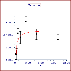
Figure T17.25 Scatter with Regression Plot with Error Bars
We now will add a Regression Parameter Statistics default window to obtain the Vmax (Vm in Figure T17.26) and summarize the fit.
25. Right-click the Scatter with Regression plot.
26. Select Statistics> Regression Fit Statistics from the pop up menu.
A Regression Parameter Statistics window now is inserted on the layout (Figure T17.26).
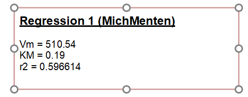
Figure T17.26 Regression Parameter Statistics Window Inserted to Summarize Fit of Scatter with Regression Plot
