Create a Regression Overlay
While defining a formula for a regression is useful it is often desirable to display the line fit with your data points. In this section we will use a line fit created for linear values and overlay it on the scatter plot.
| 1. | Load the FITC MESF Beads Completed.fey layout located in the Regression Analysis folder within the Tutorial Sample Data archive. |
| 2. | Click on Page 2 of the layout. |
| 3. | Choose the Data→Save/Load→Custom Data→New Custom Data command. |
| 4. | Name the new custom data Regression Line Fit (Figure T27.14). |
| 5. | Change the number of Columns to 2 (Figure T27.14). |
| 6. | Change the number of Rows to 10 (Figure T27.14). |
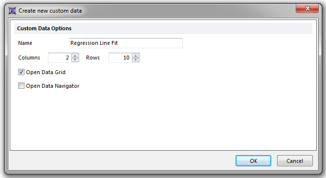
Figure T27.14 Creeating a New Custom Data Grid with 2 Columns and 10 Rows
| 7. | Click OK. |
We will use this custom data grid to calculate values for the line fit based the equation for the line which is defined by the formula above the scatter plot in the layout. We will first calculate a range of X values based on the data which will later be used to calculate Y values from the equation of the line.
The range of X values must be divided into bins based on your data. In this data set, the X values for Median range from about 40 to 5500 (see Median column in the custom data grid). For this example, we will put these values into 10 bins which results in an addition of 546 from one bin to the next [(5500-40)/10 = 546]. We will round 546 to 600 which will give us a final range of values from 40 to 5440. The range you define here will give the upper and lower limits of the line. We will perform this calculation for each of the 10 rows in the data grid using parameter math.
| 8. | Click on the Regression Line Fit custom data grid to select it. |
| 9. | Choose the Data→Calculate→Parameter Math→Single Calculation command. |
| 10. | Select A from the Output Parameter dropdown list (Figure T27.15). |
| 11. | Click on the Formula radio button (Figure T27.15). |
| 12. | Enter the following formula: '=40+(Row-1)*600' (Figure T27.15). |
| 13. | Click Calculate (Figure T27.15). |
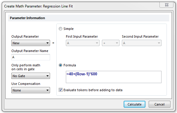
Figure T27.15 Defining Parameter Math for Column A in the Regression Line Fit Custom Data
Column A in the data grid will fill with all of the parameter math calculated values. The formula we used sets 40 as the minimum value and uses the current row number minus one as the multiplier for each bin. The result is the table of values in the custom data grid seen in Figure T27.16.
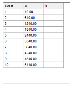
Figure 27.16 Column A Calculated by Parameter Math
We will now calculate the Y values for the line fit based on the equation for the line defined by the custom token Linear Fit for Overlays which was defined through steps similar to the Creating a Linear Regression Token section.
| 14. | Click on the Regression Line Fit custom data grid to select it. |
| 15. | Choose the Data→Calculate→Parameter Math→Single Calculation command. |
| 16. | Select B from the Output Parameter dropdown list (Figure T27.17). |
| 17. | Click the Formula radio button (Figure T27.17). |
| 18. | Enter the following text in the formula box: =LinearXtoY(P1, [ |
| 19. | Right-click after the bracket in the formula. |
| 20. | Choose Insert Token. |
| 21. | Insert the Linear Fit for Overlays token located in the Custom category. |
| 22. | Click Insert. |
| 23. | Enter a close bracket and close parenthesis after the token. |
Uncheck the Evaluate tokens before adding to data box (Figure T27.17).
The final formula should look like Figure T27.17.
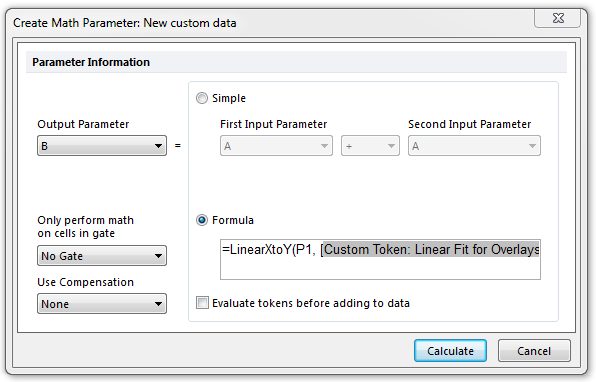
Figure T27.17 Defining the LinearXtoY Function
| 24. | Click Calculate. |
The data grid will update to display the Y values calculated from the equation of the line and the X values in the data grid (X values in the LinearXtoY formula were defined by P1=Parameter 1=Column A) as seen in Figure T27.18.
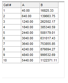
Figure T27.18 Completed Custom Data Grid for Linear Regression
We will now overlay the data grid on the scatter plot to display the line fit.
| 25. | Right-click on the scatter plot. |
| 26. | Choose Add overlay from the pop-up menu. |
| 27. | Choose the Active Files tab (Figure T27.19). |
| 28. | Double-click on Regression Line Fit (Figure T27.19). |

Figure T27.19 Choosing Regression Line Fit as an Overlay
| 29. | Change the Y-Axis Parameter to B. |
| 30. | Click OK. |
The regression line will now appear on the scatter plot as red dots (Figure T27.20). We will format the scatter plot to view the regression as a simple line.
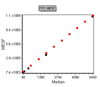
Figure T27.20 Regression Line Fit Data Overlayed on the Scatter Plot
| 31. | Right-click on the scatter plot. |
| 32. | Choose Format from the pop-up menu. |
| 33. | Choose the Overlays category. |
| 34. | Choose the Regression Line Fit overlay. |
| 35. | Change the Point Shape to Do Not Show. |
| 36. | Check the Connect the points box. |
| 37. | Click OK. |
The scatter plot will now look like Figure T27.21, displaying the raw data as dots and the linear regression line fit as a black line.
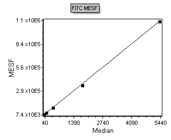
Figure T27.21 Scatter Plot Displaying Raw Data as Dots and the Regression as a Black Line
Next, we will apply a linear regression to an FCS data file to obtain MESF data.
