Insert a Scatter with Regression Plot
We will now use the Custom Data Table created in the previous section to create a regression analysis using a Scatter with Regression Plot. Once complete, you will have created a regression analysis of the data set complete with error bars that will all update in real time in response to gating changes
You may begin this tutorial using the layout created in the Create a Custom Data Table tutorial.
You may also begin this tutorial by opening the layout Titration_Data_Grid_Completed.fey found in the FCS Express Sample Data folder which has all the steps from the Create a Custom Data Table tutorial completed.
| 1. | Select the custom data table, it should now have a green border. |
| 2. | Select the Insert→2D Plots→Scatter with regression command (Figure T17.37). |

Figure T17.37 Insert Scatter Plot Command
| 3. | Click on a blank area of the page in the layout. |
A 2D scatter with regression plot using the titration data in the custom data table appears, shown in Figure T17.38.
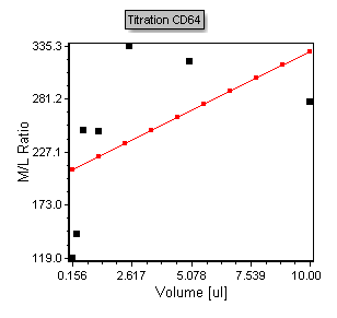
Figure T17.38 Scatter Plot of Titration Data
Notice that the plot contains points in black that represent the points from the Custom Data table. The red line overlay is a regression overlay. The default regression fit for all scatter with regression plots is a linear fit. In the following steps we will adjust the plot to display a more appropriate Michaelis-Menten regression fit. We will also start by adjusting the axis range to more appropriately fit the points within the plotted region.
| 4. | Double click the scatter with regression plot to bring up the formatting dialog. |
| 5. | Select the Axis category. |
The Axis page of the Formatting scatter plot dialog appears. Please refer to Figures T17.39A and T17.39B for the following steps.
| 6. | Select Y axis, shown highlighted in blue in Figure T17.39A. |
| 7. | Enter '500' in the Maximum Range window, shown highlighted in blue. |
| 8. | Select X axis, shown highlighted in blue in Figure T17.39B. |
| 9. | Enter '12' in the Maximum Range window, shown highlighted in blue. |
| 10. | Click Preview. |
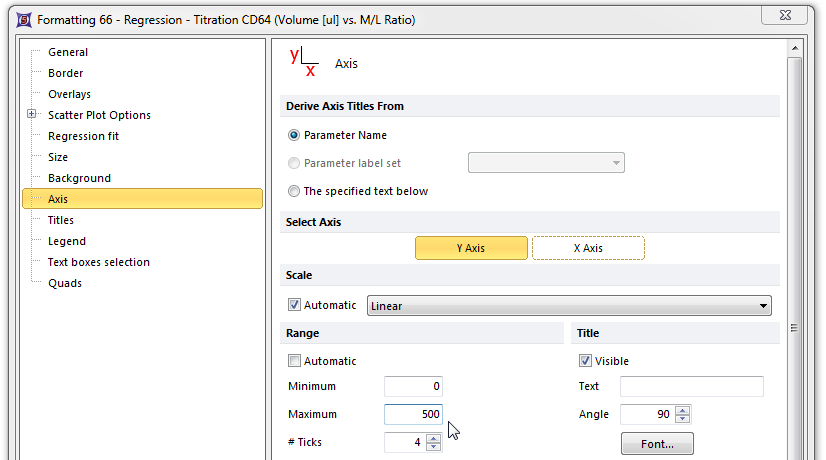
Figure T17.39A Formatting the Y-axis of the Scatter Plot
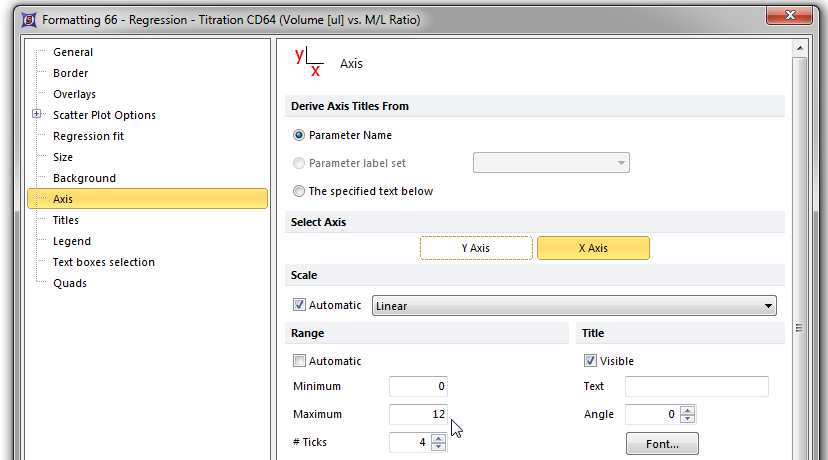
Figure T17.39B Formatting the X-axis of the Scatter Plot
The titration scatter plot now appears with a more appropriate axis scaling shown in Figure T17.40 below.
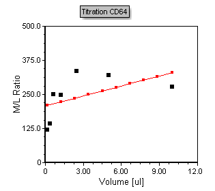
Figure T17.40 Formatted Titration Scatter with regression plot.
We will now change the type of regression fit used on plot and smooth the regression line
| 11. | Click on the Regression fit category. |
| 12. | Choose MichMent from the Regression Model Options→Regression Type drop down list. |
| 13. | Increase the number of regression dots from 10 to 30. |
The plot will now look like figure T17.41 below. Note that the regression line now fits the data accordingly.
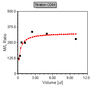
Figure T17.41 - Scatter with regression plot displaying the MichMent regression fit type overlay
We will now add more data to the titration plot to reflect the Coefficient of Variance (CV) of the Monocyte population. We will enter this data as an error bar on the scatter plot. To begin, we will add a new column, for the monocyte CV data, to the titration custom data table.
| 14. | Right-click inside the M/L ratio column of the titration custom data table to bring up the pop-up menu. |
| 15. | Select Insert→Column to the Right from the pop-up menu, highlighted in blue and indicated by the cursor in Figure T17.42. |
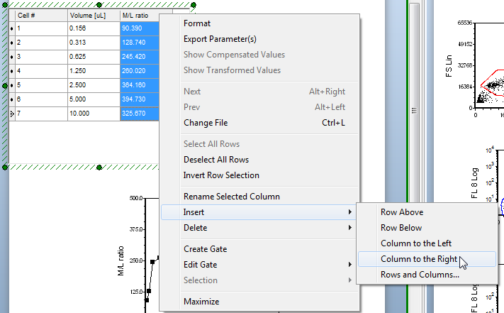
Figure T17.42 Inserting a New Column in the Custom Data Table
The New Column Name dialog appears.
| 16. | Enter 'Monos CV' in the new column name field. |
| 17. | Click OK. |
A new blank column appears to the right of the M/L ratio column labeled Monos CV. We will now insert the token representing the CV of the CD64 fluorescence of the monocyte population into the new column. Please refer to Figure T17.43 for the following steps.
| 18. | Click inside the top cell of the Monos CV column, shown highlighted in blue. |
| 19. | Click on the token icon, indicated by the cursor and highlighted in blue. |
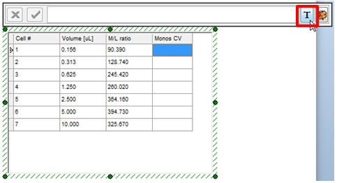
Figure T17.43 Inserting Token Data into a Cell of the New Column
The Insert a Token dialog appears.
| 20. | Select the Statistic token. |
| 21. | Click Insert. |
The Create Statistic dialog appears.
| 22. | Select Color Dot - .156ul CD64.fcs.DNS (SS Lin vs. FL 8 Log). |
| 23. | Select the Statistic category on the left. |
The Statistic page of the Create Statistic dialog now appears; here, we will select the Y CV of the Monos gate as the statistic used for the token. Please refer to Figure T17.44 for the following steps.
| 24. | Select Y CV from the Statistic: list box, shown highlighted in blue. |
| 25. | Select Monos from the Gate: drop-down list, indicated by the cursor and highlighted in blue. |
| 26. | Click OK. |
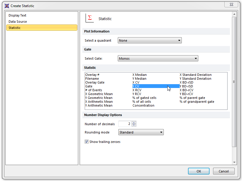
Figure T17.44 Create Statistic Dialog for Monos CV
The titration custom data table updates to reflect the insertion of the Monos CV statistic token for the 0.156μl data, as shown highlighted in blue in Figure T17.45.
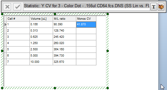
Figure T17.45 Monos CV Token Data
Continue to fill in the Monos CV column for the other CD64 volumes, repeating steps 18 through 26. Alternatively, you can use a combination of copy and paste, as demonstrated in the previous section, being sure to update the token to use the appropriate data plot. When the Monos CV column is filled in it should look similar to Figure T17.46.
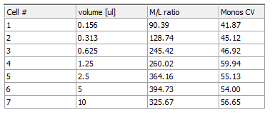
Figure T17.46 Titration Custom Data Table with Monos CV Column Completed
We will now use the Monos CV data as the error bar data for the titration scatter plot.
| 27. | Double click the scatter with regression plot to bring up the formatting dialog. |
The Formatting Overlays dialog appears.
| 28. | Select the Overlays category. |
| 29. | Select Monos CV from the Error Bar Param drop-down list (Figure T17.47). |
| 30. | Click OK. |
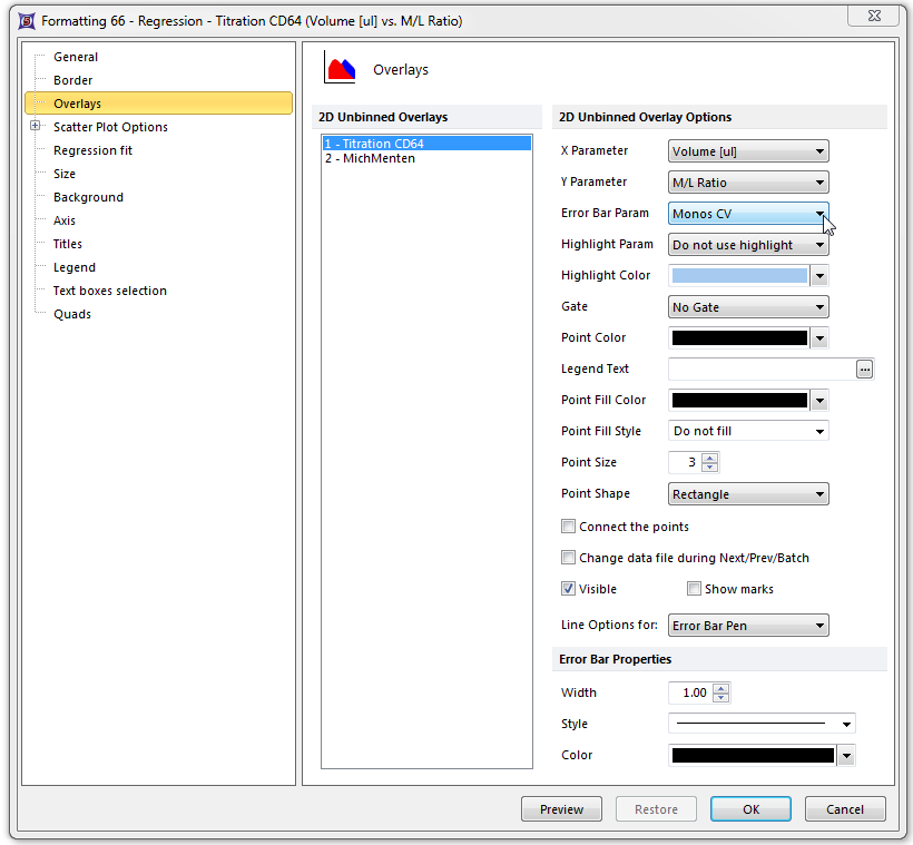
Figure T17.47 Formatting Overlays Dialog for the Titration Scatter Plot
The titration scatter plot updates to reflect the addition of blue error bars using the Monos CV data, as shown in Figure T17.48. Note that as you adjust any of the gates in the layout the points, regression, and error bars will all update accordingly and in real time.
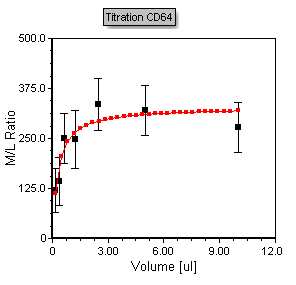
Figure T17.48 Titration Scatter Plot with Error Bars
