Adding Error Bars
Error Bars and Highlighting can be added to Bar Plots and to Scatter Plots. In this example, we will add these features to a Bar Plot.
1.Select File tab→Open.
2.Open the layout titled "Error Bars.fey" within the Tutorial Sample Data archive.
A Spreadsheet and its associated Bar Plot without Error Bars or Highlighting already exist on the layout. The Bar Plot is graphing the means of the "apo" and "necro" %-gated statistic for each of the three Color Dot Plots. This is accomplished through the use of array formulae within the Spreadsheet, which can be seen when clicking on Cell E1 (Fig. 1).

Figure 1. Array formula for calculating the mean of three tokens in a Spreadsheet
We will also employ an array formula to calculate the error bars in this example; however, error bars may also derive from default Statistic Tokens or from freetext.
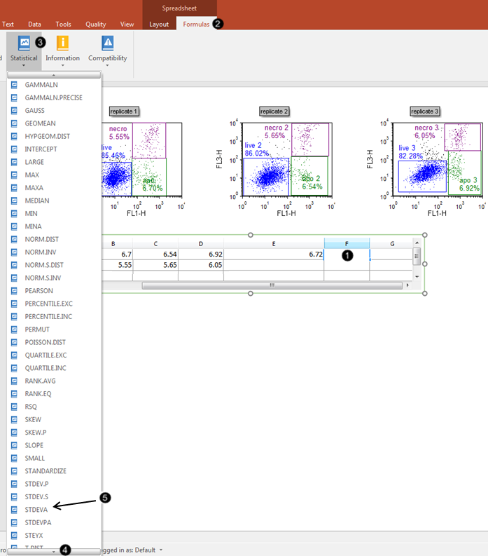
3.Click on Cell F1 of the Spreadsheet (Fig. 2, ![]() ) to select it.
) to select it.
4.Click the Formulas tab, which has now been revealed in the formerly hidden Spreadsheet tab family (Fig. 2, ![]() ).
).

Figure 2. Inserting a function into the Spreadsheet cell
5.Click the Statistical command (Fig. 2, ![]() ).
).
6.Scroll down through the menu of Statistical formulas (Fig. 2, ![]() ) until "STDEVA" is visible.
) until "STDEVA" is visible.
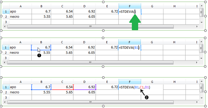
7.Select "STDEVA" from the menu (Fig. 3, ![]() ).
).
We will now enter Cells B1-D1 as components of the StdDev array formula.
8.Click Cell B1 of the Spreadsheet (Fig. 3, ![]() ), while the cursor is within the parentheses of the "STDEVA" formula, as shown by the green arrow.
), while the cursor is within the parentheses of the "STDEVA" formula, as shown by the green arrow.
9.Type a comma (") (Fig. 3, ![]() ).
).
10. Repeat Steps 8-9 for Cells C1-D1 of the Spreadsheet. When complete, the filled-in formula will appear as in Figure 3, bottom.

Figure 3. Entering components of the Standard Deviation formula
The Custom Data Grid "apo" row now contains a complete StdDev array formula for the error bar, which has been evaluated with the result shown in Cell F1 (Fig. 4).

Figure 4. Numerical result of completed array formula within the Spreadsheet
We will now enter the corresponding mean and error bar formulas for the "necro" row of the Custom Data Grid, by dragging the appropriate Cells within the Spreadsheet to fill the series.
11. Click on Cell E1 in the Spreadsheet, which contains the complete AVERAGE formula that was created for you in the layout, prior to beginning the tutorial.
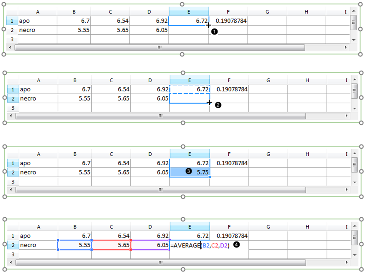
12. Hover the mouse pointer over the lower-right corner of Cell E1 in the Spreadsheet, until the cursor forms a crosshair (Fig. 5, ![]() ).
).

Figure 5. Filling a series in the Spreadsheet.
13. Drag the mouse to the lower-right corner of Cell E2 in the Spreadsheet, while keeping the mouse button pressed (Fig. 5, ![]() ).
).
14. Release the mouse button (Fig. 5, ![]() ). A numerical value appears in Cell E2 as a result of filling the series.
). A numerical value appears in Cell E2 as a result of filling the series.
15. Double-click Cell E2 to view the formula and its components (Fig. 5, ![]() ). Note that the formula was extended faithfully, but refers to the "necro" %-gated values from Row 2 in the Spreadsheet.
). Note that the formula was extended faithfully, but refers to the "necro" %-gated values from Row 2 in the Spreadsheet.
16. Repeat Steps 11-15 for Cell F1, to fill the formula for the Standard Deviation of the "necro" %-gated values. The Spreadsheet will then appear as in Figure 6 below.

Figure 6. The Standard Deviation for the "necro" row values has been calculated by filling the appropriate cell in the Spreadsheet.
We will now format the Bar Plot to derive the error bars from the appropriate column in the Spreadsheet.
17. Double-click the Bar Plot to open the Formatting dialog.
18. Click on the Overlays category (Fig. 7, ![]() ).
).

Figure 7. Adding error bars to a Bar Plot in the Formatting dialog
19. Choose "F", which refers to the column F of the Spreadsheet, from 2D Bar Overlay Options→Error Bar Param dropdown list (Fig. 7, ![]() ).
).
20. Select red from the Color dropdown menu of the Error Bar Properties section (Fig. 7, ![]() ).
).
21. Click OK (Fig. 7, ![]() ).
).
The Bar Plot will now appear as in Fig. 7, right.
22. Optional:
•Click the Data tab→Change Data on All→ Next/Previous buttons to advance through the set of files in the Data List and watch as the Bar Plot and Scatter Plot update with the new data.
•Adjust the gates on the plots and watch the Bar Plot and Scatter Plot update in real-time.
In the next section we will add highlighting and exploding parameters to Bar, Scatter, and Pie Plots.
