Check Box Custom Tokens
The Check box Display type allows you to create a check box directly in the layout that displays the name of the Custom Token. Checking the box returns a "TrueValue" entry for the Custom Token while unchecking the box returns a "FalseValue" entry for the custom token. To create a Check box Custom Token:
1. Create a new Custom Token with or without text.
2. Drag and drop the Custom Token from the Custom Token window onto the layout to insert it.
3. Double-click the Custom Token in the layout to open the Edit custom token dialog.
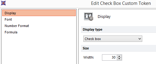
4. Change the Display type to Check box (Figure 19.66).

Figure 19.66 The custom token display type is set to Check box.
5. Click OK.
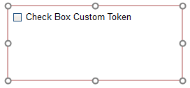
A Check box will appear within the text box in the layout where the token was inserted (Figure 19.67).

Figure 19.67 When the custom token display type is set to Check box, a check box will appear in the layout displaying the name of the custom token.
6. Check or uncheck the box next to the Custom Token name in the layout.
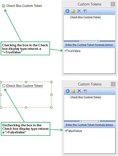
Once the box has been checked, the Custom Token returns a "TrueValue" entry for the Custom Token. Unchecking the box returns a "FalseValue" entry for the Custom Token (Figure 19.68). The token value, "TrueValue" or "FalseValue" may then be used in any location within FCS Express where a True or False evaluation is made via tokens such as displaying pages or IF, THEN, ELSE statements.

Figure 19.68) Once the box has been checked, the Custom Token returns a "TrueValue" entry for the Custom Token. Unchecking the box returns a "FalseValue" entry for the Custom Token.
