Chorus Index Sorting Data Files
Chorus Index Sorting Data Files only allow for analysis on indexed sort events.
To analyze Index Sort Data:
1. Insert a heat map for the index sort data file.
2. Select the parameter of interest on the y-axis (Figure 32.37).
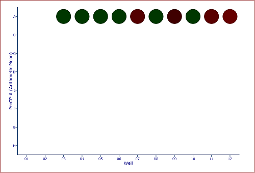
Figure 32.37 Default Heat Map with PerCP Arithmetic Mean Y Parameter
3. Insert a Color Dot Plot.
4. Change the axes on the color dot plot to the parameters of interest.
5. Create a Well Gate on all wells.
Note:
o In addition to creating a gate on all wells a gate may be created on one, or any number of wells, to visualize the individually sorted cells.
o Since Chorus Index Sorting Data Files only contain data for the unsorted events, we can use the Emphasize on Plots feature of gates to emphasize the events that fall within the gate (Figure 32.38).
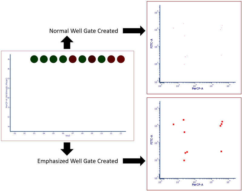
Figure 32.38 Heat map with Well Gate created on all wells. Standard gate is shown above while a gate with the Emphasize on Plots check box checked is shown below. Note that events highlighted in red fall within the well gate and in this case represent all events that were sorted into the plate making them easier to visualize.
6. Select the Insert tab→General→Gate View command to insert a Gate View.
7. Drag and Drop the Well Gate from the Gate View to the Color Dot Plot to apply the Well Gate (Figure 32.39).
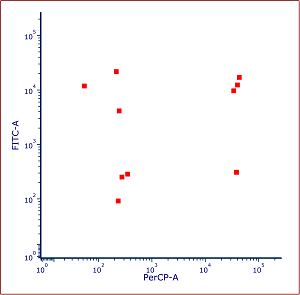
Figure 32.39 Color Dot Plot gated on Well Gate with events emphasized
8.Optional: Create additional Well Gates to isolate any number of individual wells (blue events below) or a group of wells (purple events below) (Figure 32.40).
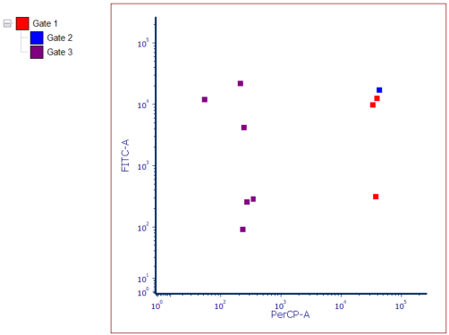
Figure 32.40 Color Dot Plot gated on Well Gate with Children Gates Applied and Emphasized
It is possible to insert a heat map statistics grid in a text box to display statistics for each well in the heat map as done in Figure 32.41.

Figure 32.41 Heat Map Statistics Grid displaying statistics for the Y parameter of the Heat Map
Another useful feature for index sorting data is the Heat Map Overlay function. Heat Map Overlays allow a user to view multiple statistics and parameters on a single heat map by adding each statistic as a new overlay. For instance, in Figure 32.42 left, the upper slice of the well represents FITC arithmetic mean while the lower slice represents PerCP arithmetic mean so single and double positive events can be more easily visualized.
Additionally, users may add a Radius Statistic, which changes the size of the well to reflect the selected parameter. For instance, in Figure 32 below (right), the heat/color for each well is dependent on the PerCP arithmetic mean while the size of the well radius is dependent on the FITC arithmetic mean.
Please see the Heat Map Overlay section of the manual for full instructions on how to create a heat map overlays of different parameters and types as well as setting the radius parameter statistic.
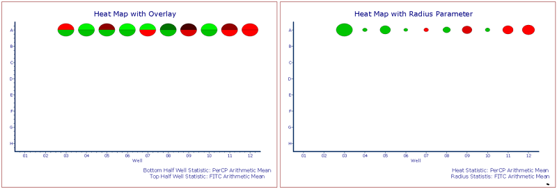
Figure 32.42 Custom Heat Maps with Overlay (left) and Radius Parameter (right). Standard Deviations of Color Levels was changed to 1.
