Complete a Spreadsheet and Insert a Scatter with Regression Plot
For this tutorial we will be using a layout file that has plots of FITC MESF beads and a custom data set, with custom tokens.
1.Open the layout FITC MESF Beads.fey found in the Calculating MESF From Regression folder of the Tutorial Sample Data archive.
The following layout should appear as shown in Figure T27.1.
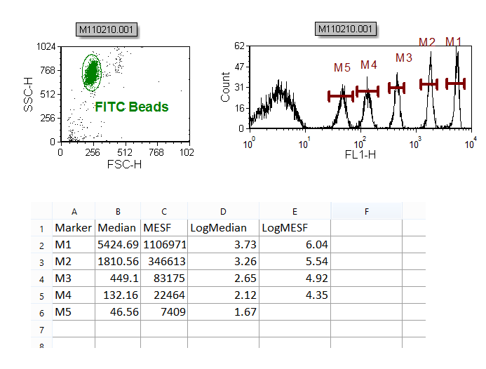
Figure T27.1 The FITC MESF Beads.fey Layout
In the upper left corner of the layout, is a Color Dot plot of the FITC beads with a gate around the single bead events. To the right of this plot, is the FITC histogram plot, gated with the 'FITC Beads' gate, with markers defining each of the five FITC bead populations.
Under both plots, is a spreadsheet, named 'FITC MESF'. For more details on how to create a spreadsheet, please see our creating a spreadsheet for analysis tutorial.
Please take a moment and double click on an entry in each column of the spreadsheet and examine the data entry. The first column is the marker name and is a manually entered data value. The second column is the median value for each of the defined markers on the histogram, and is defined using a statistics token (see the Inserting a Token or Custom Token in a cell chapter of the manual to learn more about this topic).
The third column is the MESF FITC value assigned to each of the bead populations, and is a manually entered data value. The fourth and fifth columns are the Log values of the median and MESF bead populations, and are defined by formula inserted directly in the spreadsheet. In this case, the formula for calculating the Log, using log base 10, is =LOG(num), where num can be both a manually inserted number, a numeric token or, as in this case, a cell reference.
Notice that the bottom right cell of the spreadsheet (Cell E6), under the 'LogMESF' column, is empty. We will now fill this cell with the required value by copy-pasting the content of one of the other cells in that column.
2.Select Cell E3, as shown in Figure T27.2, ![]() . Please note that any cells among E2 and E5 can actually be copied in this step.
. Please note that any cells among E2 and E5 can actually be copied in this step.
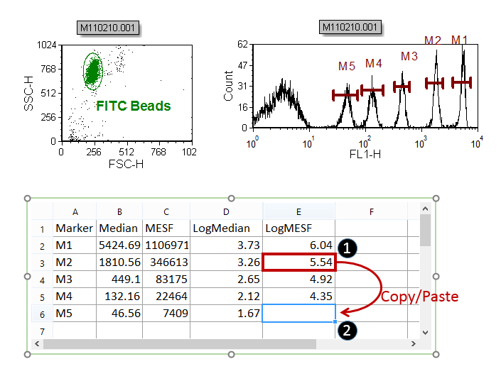
Figure T27.2 Copying and pasting the E3 cell content into the E6 cell to complete the spreadsheet.
3.Press Cmd+C to copy the cell content.
4.Select Cell E6 as show Figure T27.2, ![]() .
.
5.Press Cmd+V to paste the cell content .
We have now completed the spreadsheet as shown in Figure T27.3.
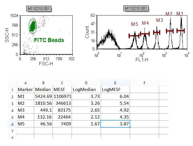
Figure T27.3 The spreadsheet successfully complete.
Now, we will insert a Scatter with Regression plot using the FITC bead data in the spreadsheet.
4.Select the spreadsheet; it should now have a green border.
5.Select the Insert tab→2D Plots→Scatter with Regression command.
6.Click on a blank area of the layout below the spreadsheet to insert the Scatter with Regression plot.
An empty plot using the data from the first two columns, 'A' and 'B', of the custom spreadsheet appears.
We will now format the Scatter with Regression plot to display the Median and MESF data from the spreadsheet (i.e. columns 'B' and 'C' respectively).
7.Place the cursor over the Y-axis 'B' label.
8.Press and hold the left mouse button and the list of columns from the spreadsheet appears, as shown in Figure T27.4.
9.Release the button when the cursor is over 'C', shown highlighted in blue in Figure T27.4.
10. Repeat 7 to 9 for X-axis selecting 'B' as column to display.
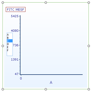
Figure T27.4 Selecting 'LogMESF' Data for the Y-axis
The empty plot is now populated with the data from column B and C of the spreadsheet in black, along with a best-fit regression curve in red, as shown in Figure T27.5.
Note: The regression curve type has defaulted to the first option (Linear), which is appropriate for this dataset. When working with other datasets, the Regression Type can be chosen from the Formatting options of the Scatter with Regression plot. The smoothness of the curve can also be adjusted. See this section of the manual for details.
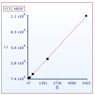
Figure T27.5 Scatter with Regression Plot of Median and MESF Data from the Data Grid
We will now format the Scatter with Regression plot to display the 'Log MESF' (i.e. column 'E') data of the spreadsheet on the Y-axis.
11. Place the cursor over the Y-axis 'C' label.
12. Press and hold the left mouse button and the list of columns from the Spreadsheet appears.
13. Release the button when the cursor is over 'E'.
The Scatter with Regression plot now updates to reflect the selection of the 'Log MESF' (i.e. column 'E') data for the Y-axis.
We will now change the X-axis parameter to the 'LogMedian' (i.e. column 'D')data of the spreadsheet on the X-axis.
10. Place the cursor over the X-axis 'B' label.
11. Press and hold the left mouse button and the list of columns from the Spreadsheet appears.
12. Release the button when the cursor is over 'D'.
The Scatter with Regression plot now updates to reflect the selection of the 'LogMedian' (i.e. column 'D') data for the X-axis and appears as in Figure T27.6.
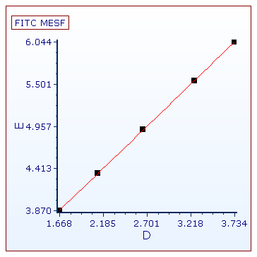
Figure T27.6 Scatter with Regression Plot with Log Median and Log MESF Values from the Spreadsheet.
We will now format the Scatter with Regression plot to better visualize the five data points.
13. Right-click on the Scatter with Regression Plot.
14. Choose Format from the pop-up menu.
15. Choose the Axis category (Figure T27.7a, ![]() ).
).
16. Change the Y Axis Range Minimum to 3 and Maximum to 7 (Figure T27.7a, ![]() ).
).
17. Click on X Axis under Select Axis (Figure T27.7a, ![]() ).
).
18. Change the X Axis Range Minimum to 1 and Maximum to 4.
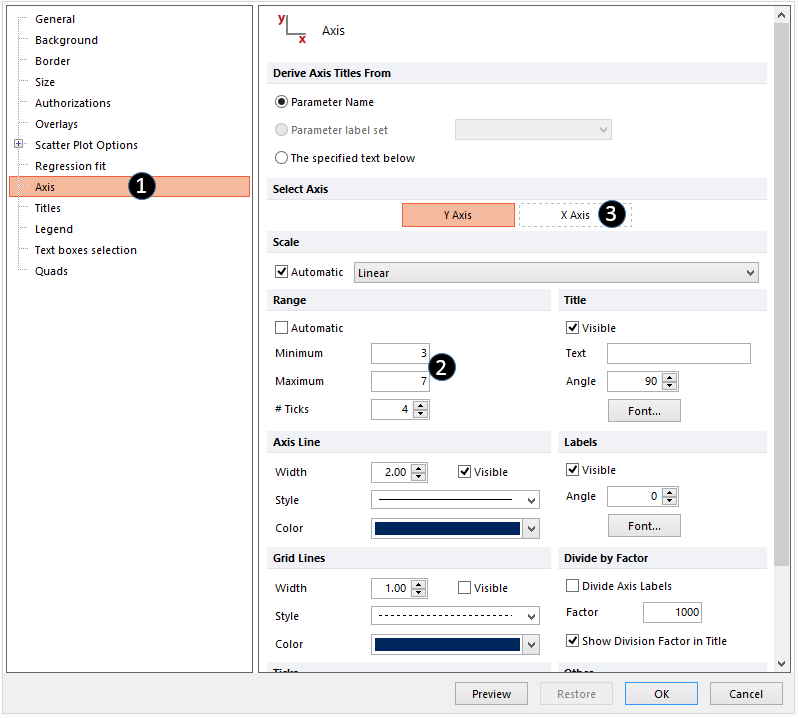
Figure T27.7a Formatting axis for Scatter with Regeression plot.
19. Click on the Overlays category (Figure T27.7b, ![]() ).
).
20. Click on the second overlay ("2-Linear") from the 2D Unbinned Overlays list (Figure T27.7b, ![]() ).
).
21. Choose Connecting Lines from the Line Options for dropdown menu (Figure T27.7b, ![]() ).
).
22. Set the line with to 1.5 (Figure T27.7b, ![]() ).
).
23.Click OK (Figure T27.7b, ![]() ).
).
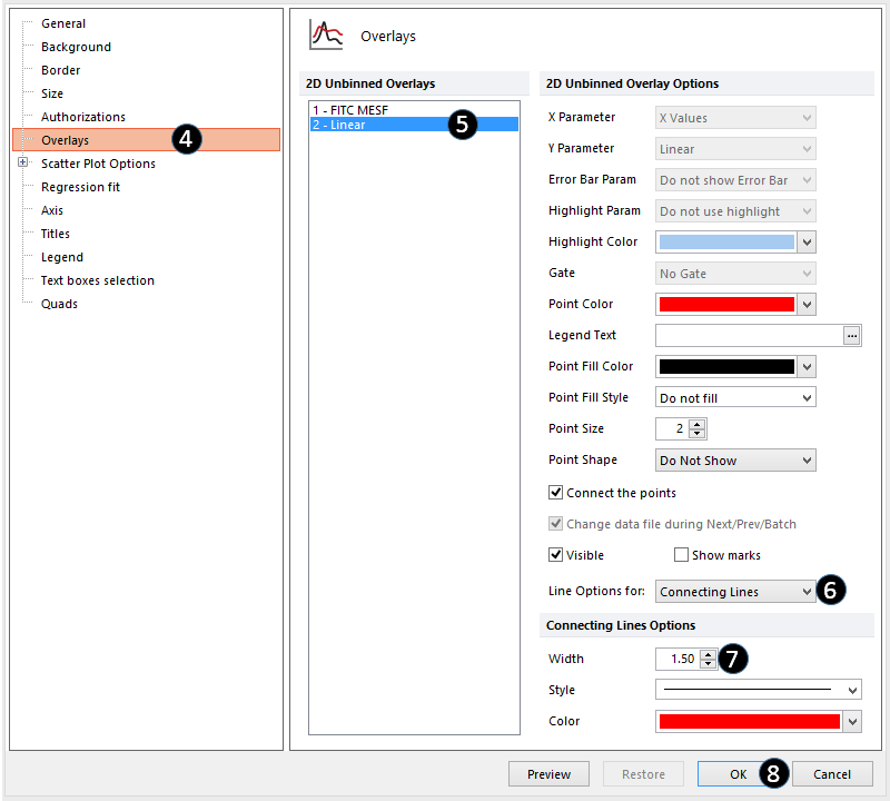
Figure T27.7b Formatting fitting line in Scatter Plot with Regression.
The Scatter with Regression plot will now look like Figure T27.7c. It has been formatted to bring all of the data points into range and to increase the width of the red regression curve.
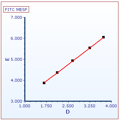
Figure T27.7C Scatter Plot with Regression reformatted.
Next, we will insert and view a linear regression token for the data set.
