Creating a Check Box Custom Token

Contents
Check box Custom Token display types create a check box directly in the layout that displays the name of the Custom Token. Checking the box returns a "TrueValue", also equivalent to -1, entry for the Custom Token while unchecking the box returns a "FalseValue", also equivalent to 0, entry for the Custom Token. The True or False value of the token can then be used to control any number of true or false dependent actions such as displaying pages. In the course of this tutorial we will create a check box Custom Token and use it to display
1. Navigate to the Tutorial Sample Data folder from the File tab→Open.
2. Open the layout CheckBoxCustomToken.fey.
The layout only contains a Custom Tokens window. We will use the predefined Custom Tokens in the window to work with the Check box feature.
3. Drag and drop the Check Box Custom Token from the Custom Token window onto the layout to insert it.
A text box containing the text "This will be our check box custom token" will appear as in Figure T5.50 below:
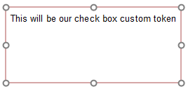
Figure T5.50 - The Check box custom token inserted in the layout.
4. Double click on the token text of "This will be our check box custom token" to open the Edit Token dialog.
5. Choose Check box from the Display type dropdown menu within the Display category (Figure T5.51).
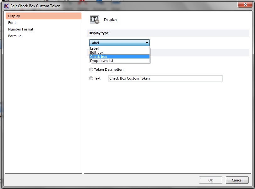
Figure T5.51 - Choosing the Check box display type from the drop down list.
6. Click OK.
A Check box will appear within the text box in the layout where the token was inserted that displays the name of the Custom Token (Figure T5.52).
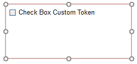
Figure T5.52 - When the Custom Token display type is set to Check Box, a check box will appear in the layout displaying the name of the Custom Token.
7. Check the check box in the text box.
Notice that the value of the token in the Custom Tokens window now changed to "=TrueValue"
8. Uncheck the check box in the text box.
Notice that the value of the token in the Custom Tokens window now changed to "=FalseValue"
The True and False values returned through using the Custom Token display type of check box can be used elsewhere in the layout. Before we continue using the True and False values, we will rename the token which will in turn rename the value in the check box.
9. Click on the Check Box Custom Token name within the Custom Tokens window.
10. Press F2, which is the short-cut for the Rename command . Alternatively, right-click on the token and choose Rename.
11. Enter the text "A New Check Box"
12. Press Enter.

Figure T5.53 - Renaming the Check box token to rename the text in the Check box display.
Once renamed, the token name will appear in the Custom Tokens window with the new name, and the check box text within the text box will also be renamed (Figure T5.53).
We will now utilize the Check box token to display a message when checked / unchecked.
13. Drag and drop the Message to Display Custom Token from the Custom Token window onto the layout to insert it.
14. Check the check box in the first text box containing the Check Box Custom Token, which was inserted onto the Layout in Step 3.
Notice that the message updates as the Check box is changed. The action occurs because the Message to Display Custom Token uses an IF Then Else Custom Token format that evaluates the status of the Check Box Custom Token (Figure T5.54). If the value equals "-1" (the numeric representation of "TrueValue"), then "The Check Box Has Been Checked" is returned in the field. If the value equals "0" (the numeric representation of "FalseValue"), then "The Check Box Has NOT Been Checked" is returned in the field. The messages between quotations can be any custom text or can be replaced with any token or Custom Token values from your layout and analysis.

Figure T5.54 - The message to display custom token uses an IF THEN ELSE Custom Token format to return values based on the status of the Check box Custom Token.
We will now utilize the Check box token to display a page when checked / unchecked.
15. Right click on the Page 2 tab.
16. Choose Format.
17. Choose the Visibility category.
18. Click on the Custom radio button.
19. Enter an '=' sign in the text field.
20. Click on the "T" button to the right to insert a token.
21. Choose the A New Check Box Custom Token from the Insert a Token→Custom list.
22. Enter the text "=truevalue" after the token. The Visibility formatting category should look like Figure T5.55.
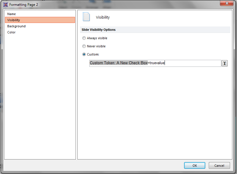
Figure T5.55 Entering a custom page visibility formula to view or hide a page based on the status of a check box being checked or unchecked.
23. Click OK.
24. Check or Uncheck the check box in the text box containing the Check Box Custom Token (on Page 1 of the Layout).
Notice in the page tabs that Page 2 appears and is hidden depending on the status of the Check box. In this example we have used the "truevalue" text to evaluate the token rather than the numeric "-1" and "0" values used in step 14. Checking the box returns true value in turn displaying the page. In contrast, if the text "=falsevalue" was entered the page would display when the Check box is unchecked.
In the next section we will create a drop down list Custom Token display type.