Load, Insert, and Format Heat Maps
In this section, we will learn how to:
•Load data in the FCS plate folder format
•Insert a Heat Map
•Change the orientation of the Heat Map
•Choose the statistic/parameter to display in the wells
•Change the color levels of the Heat Map
•Adjust the style of display
•Show only events gated on a plot in the Heat Map
We will be using the HighContentFormatting.fey layout for this section which is located in the Tutorial Sample Data archive. This layout contains one 2D Plot that will be used towards the end of this section.
In this section you will also learn how to load a folder that contains data from a 96 well plate-based experiment. FCS Express can accommodate any number wells in any order on the plate. The data that we will be using is located in the Tutorial Sample Data archive. For convenience, only one row plus one well of data has been included.
In order to load most types of 96 well plate flow data, you must choose the folder that contains all the data files from the plate, as opposed to one of the data files themselves.
1.Load the HighContentFormatting.fey layout from the Tutorial Sample Data archive.
2.Select the Data→Organize Data Sets→Data List command (Figure T9.2).
3.Click the ![]() symbol to add data files to the data list.
symbol to add data files to the data list.
4.Choose FCS Plate folder from the Files of type: dropdown list (Figure T18.1, outlined in red).
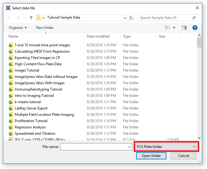
Figure T18.1 Choosing FCS Plate Folder from the Files of Type: Drop-down List
5.Navigate to the High Content Flow Plate Data folder in the Tutorial Sample Data archive (Figure T18.2).
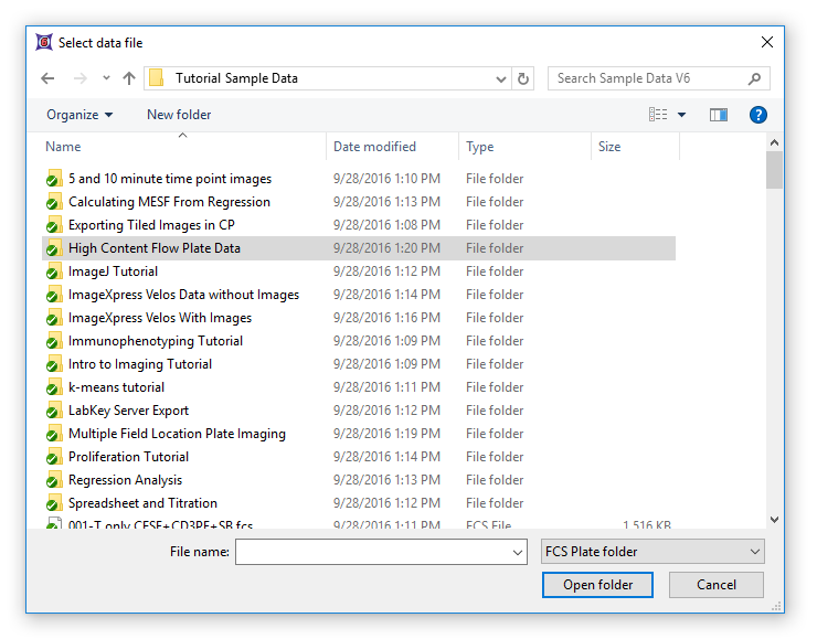
Figure T18.2 - Choosing the High Content Flow Plate Data Folder
6.Select the folder and click Open folder.
7.Select any .fcs data file within the folder and click Open Folder.
The folder will now appear in the Data List as a single file. This single file contains the .fcs files and data from all wells in the plate.
Note: In order for FCS Express to know what size plate is being used for analysis (i.e., 24, 48, 96, 384 wells) the folder must contain a file which defines the plate. For this example, the file has been included in the High Content Flow Plate Data folder and is named "plate.AllExtraKeywords.txt" (Figure T18.2b). This uses a special feature of FCS Express that allows you to add extra keywords to a data file without modifying the file. Please see chapter 17.2 of the FCS Express manual, Extra Keywords, for more details.
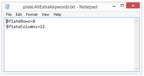
Figure T18.2b - Content of "plate.AllExtraKeywords.txt" file
8. Drag and drop the "High Content Flow Plate.Data" from the Data List to a blank spot on the page within the layout (Figure T18.3, ![]() ).
).
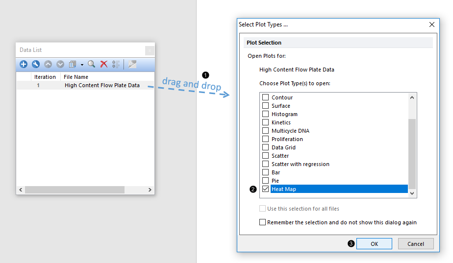
Figure T18.3 Dragging and Dropping a Data File from the Data List Tab and Choosing Heat Map as Plot Type
9. Check the Heat Map box in the Select Plot Types... dialog (Figure T18.3, ![]() ).
).
10. Click OK (Figure T18.3, ![]() ).
).
A heat map will appear in your layout like the one below in Figure T18.4. The heat map is only displaying wells A1-12 and B1 because we have only included these wells in the sample data. The parameter we are concerned with in this data set is FL2-A. We will now change the axis to display this parameter.
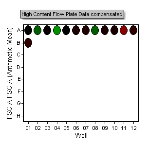
Figure T18.4 Inserted Heat Map
11. Click on the axis parameter along the row labels (Figure T18.5).
12.Choose FL2-A from the pop-up menu.
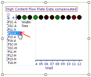
Figure T18.5 Changing the Heat Map Parameter
Note: The colors in the plot above now reflect the Arithmetic mean of the FL2-A channel of each well of heat map. We will show how to change the statistic that is plotted later in the tutorial.
We will now duplicate the Heat Map and change the orientation of the newly created Heat Map.
13. Select the Heat Map.
14. Choose Home→Clipboard→Duplicate (Figure T18.5b). Alternatively, use the Cmd+DD command.
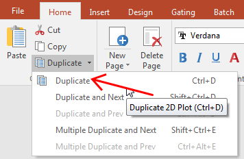
Figure T18.5b - Duplicate command
A copy of the original heat map will appear on the layout. Arrange the plots so they look like Figure T18.6.
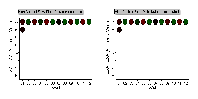
Figure T18.6 Duplicate Heat Maps
15. Right-click on the newly created Heat Map on the right side of the layout.
16. Choose Format from the pop-up menu.
17. Choose the Heat Map→Heat Map Specific Options category.
18. Change the Orientation from Landscape to Portrait (Figure T18.7).
19. Click OK.
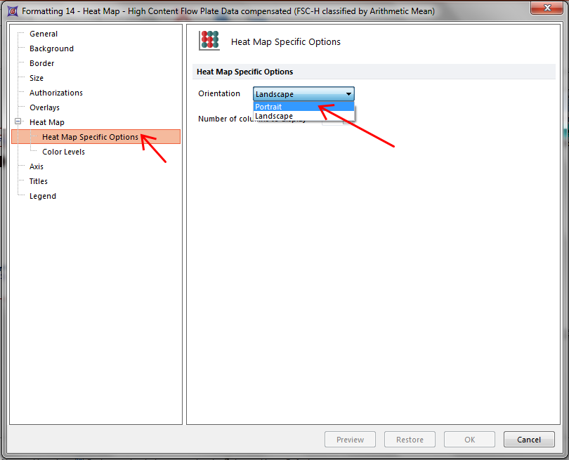
Figure T18.7 Changing Orientation from Landscape to Portrait
The layout will now look like Figure T18.8. Changing the orientation of the Heat Map may be useful depending on the layout of your experiment or your display/publication needs.
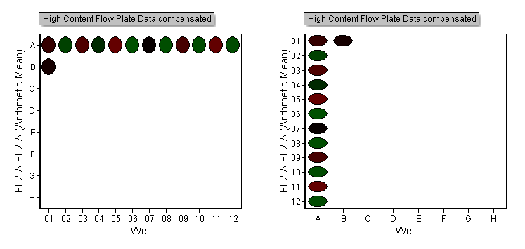
Figure T18.8 Heat Maps Displayed in Landscape and Portrait Modes
We will now change the statistic that is being represented by colors in the heat map.
20. Hit Cmd+Z to undo the orientation change.
21. Right-click on the left plot.
22. Choose Format from the pop-up menu.
23. Choose the Overlays category.
The heat map is currently displaying the "Arithmetic Mean" of all the events in the well as indicated in the "Statistic to show" field.
24. Change the Statistic to show to Median from the drop-down list and click OK (Figure T18.9).
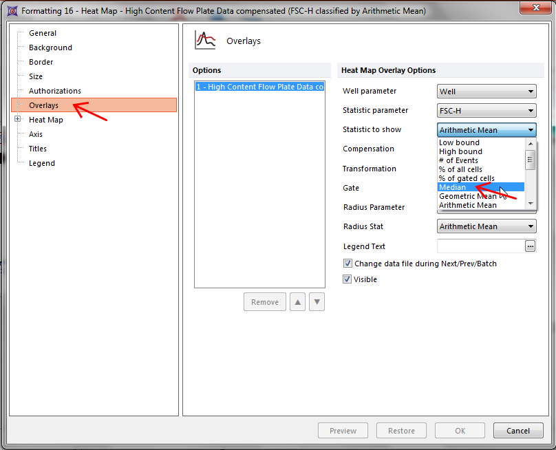
Figure T18.9 Changing the Statistic to Show in the Heat Map
The layout will now look like Figure T18.10. Notice how the plot on the left side now shows a very positive "hot" well in position A4. In this example, Median provides better discrimination between hot (red) and cold (green) wells than does Arithmetic Mean (plot on right side).
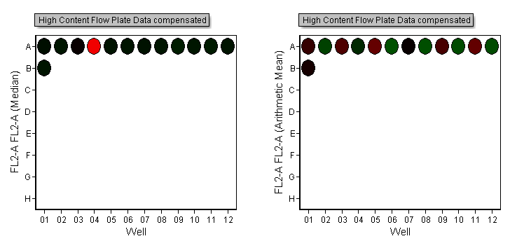
Figure T18.10 Heat Maps Displaying Statistics for Median (Left) and Arithmetic Mean (Right).
We will now adjust the color levels of the Heat Map which is useful for display purposes and for helping to further discriminate positive from negative samples.
25. Right-click on the left plot.
26. Choose Format from the pop-up menu.
27. Choose the Heat Map→Color Levels category.
28. Change the Selected Color Level from the drop-down list to Rainbow and click Preview (Figure T18.11).
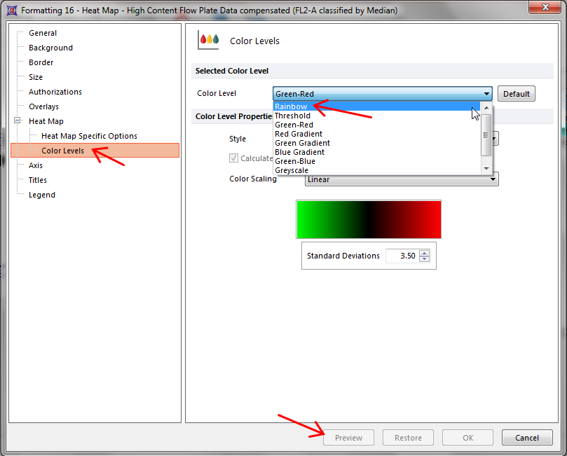
Figure T18.11 Changing the Color Level of a Heat Map
Move the formatting dialog to the side so you can see the changes to the heat map. Try changing and previewing the color levels for Green-Red, Green-Blue, Greyscale, and Inverse Greyscale, to see the differences. The Threshold color level assigns a color to any wells above the defined threshold level. We will now enter threshold to view this feature as in Figure T18.12.
29. Change the Selected Color Level from the drop-down list to Threshold.
30. Enter "1000" in the Threshold Value field.
31. Change the Below Threshold Color to Yellow.
32. Change the Above Threshold Color to Orange.
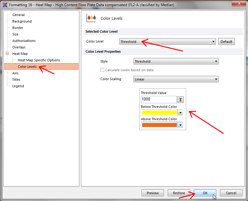
Figure T18.12 Defining a Threshold to Display as a Color Level in a Heat Map
33. Click OK.
The heat map will now look like Figure T18.13. Wells in which the median FL2-A value is above 1000 are displayed as orange and wells which are less than 1000 are displayed in yellow.
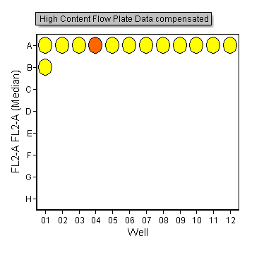
Figure T18.13 Heat Map with Threshold Color Level
Note: See Choosing a Color Scheme for additional information about coloring heat maps.
We will now change the Color Level Style. The Style refers to the method of assigning colors to different values in the heat map. The default style is "mean +/-SD". This assigns wells whose values are the mean of all the values on the plate to be the color black. Wells whose values deviate from the mean are colored one of two colors, depending on whether they are above or below the mean. The degree to which a well is shaded towards a particular color depends on the user defined standard deviation value, which defaults to 3.5 SD. For the Red-Green Color level, wells that are 3.5 SD lower than the mean are green, and wells that are 3.5 SD above the mean are red. There are three other choices in this dialog; fixed range, percentile, and threshold.
34. Select both heat maps on the layout.
35. Choose the Format→Plot Options→Overlays command.
36. Change the Statistic to show to Median and click OK (Figure T18.13b).
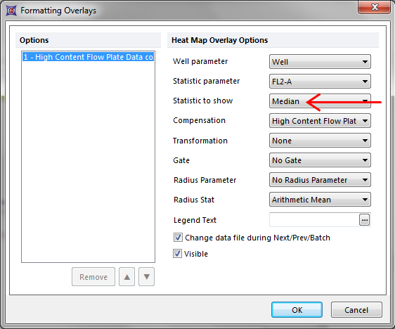
Figure T18.13b - Formatting Overlays window
37. Right-click on the left plot.
38. Choose Format from the pop-up menu.
39. Choose the Heat Map→Color Levels category (Figure T18.11).
40. Change the Selected Color Level to Green-Red.
41. Change the Style to Percentile from the drop-down list and click OK (Figure T18.14).
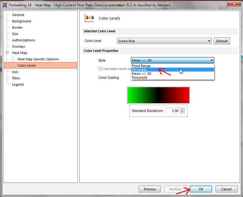
Figure T18.14 Changing the Style of the Heat Map Color Levels
42. Repeat steps 37-40 on the right plot.
43. Change the Style to Fixed Range (on the right plot).
44. Change the Color Scaling to Logarithmic from the drop-down list (on the right plot).
45. Click OK.
The layout and heat maps will now look like Figure T18.15. Notice how the color levels have changed as a result of changing the color level Style from Mean +/- SD to Percentile, and Fixed Range.
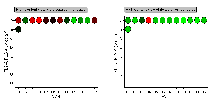
Figure T18.15 Adjusting Color Styles
We will now load the FCS Plate folder data into the 2D plot on the layout, gate the plot, and apply the gates to the heat map to display only the gated events.
46. Select the plot labeled "2D Plot for Gating".
47. Choose the Data→Change Data on Selection→Select command.
48. Choose the Data List tab.
49. Select High Content Flow Plate Data.
50. Click Open.
Note: Alternatively you can drag and drop the "High Content Flow Plate Data" from the Data List directly onto the "2D Plot for Gating" (Figure T18.15b).
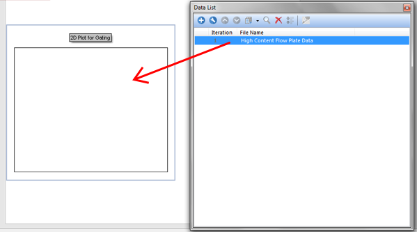
Figure 18.15b - Drag&Drop from Data List
51. Create two gates on the 2D plot as in Figure T18.16 below.
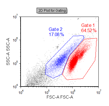
Figure T18.16 A Gated 2D Plot Created from the High Content Flow Plate Data
Note: Since the plot above is ungated, it is showing all the events from all the wells in the data file.
52. Select the Heat Map on the left.
53. Choose Gate 1 from the Gating→Create Gates→Current Gate drop-down list (Alternatively you can drag and drop Gate 1 from the 2D Plot directly onto the Heatmap).
54. Select the Heat Map on the right.
55. Choose Gate 2 from the Gating→Create Gates→Current Gate drop-down list (Alternatively you can drag and drop Gate 2 from the 2D Plot directly onto the Heatmap).
Notice how the heat map updates to only display cells that fall within the gate you applied. Try moving the gates and watch the heat maps update.
Next, we will analyze data in a heat map.
