Formatting a Proliferation Histogram
In the course of this section we will :
•Learn how to adjust the proliferation overlays to better visualize the populations of interest.
•Learn how to produce the curve fitting statistics.
•Learn how to smooth the proliferation histogram.
•Learn how to use a batch process for analyzing multiple proliferation samples.
1.Open the "Proliferation Tutorial Formatting Section.fey" layout in the "Proliferation Tutorial" folder within the Tutorial Sample Data folder.
2.Click on the "Proliferation Data" page.
3.Click once on the proliferation histogram to select it.
4.Select the Format tab→ Plot Options→ Overlays command.
| The Formatting Overlays dialog will appear (Fig. T20.11). |
5.Select the Noise overlay from the left (Fig. T20.11a, ![]() ).
).
6.Uncheck the Visible box (Fig. T20.11a, ![]() ).
).
7.Select the Generation 6 overlay from the left (Fig. T20.11b, ![]() ).
).
8.Change the Color to Blue (Fig. T20.11b, ![]() ).
).
9.In the Fill Style drop down select the 1st option for a completely filled rectangle (Fig. T20.11b, ![]() ).
).
10.Select the Generation 8 overlay from the left (Fig. T20.11c, ![]() ).
).
11. In the Fill Style drop down Select the 1st option for a completely filled rectangle (Fig. T20.11c, ![]() ).
).
12. Click OK (Fig. T20.11c, ![]() ).
).
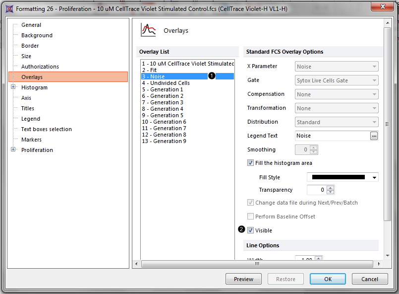 Figure T20.11a Removing the noise overlay from the proliferation plot. |
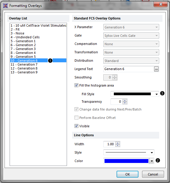 Figure T20.11b Coloring generation 6 in the proliferation plot blue. |
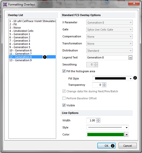 Figure T20.11c Coloring generation 8 in the proliferation plot green. |
The proliferation histogram now appears without displaying the noise, with the peak corresponding to generation 6 filled in blue, and the peak corresponding to generation 8 filled in green (Fig. T20.12). This allows for easier confirmation and visualization of each generation and fitted peak. You can change the formatting of any and all of the different fitted elements and overlays in this way.
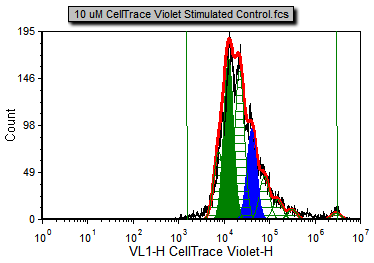
Figure T20.12 The formatted proliferation plot displaying different generations in different colors with the noise overlay removed.
Both the RMS error and R-Chi Square are measures of the goodness of the fit. When setting the proliferation model fit parameters, it is important to check how changing these parameters affect these two statistics. The combination of settings that provides the least RMS error and R-Chi Square is mathematically the best fit. We will now show the associated statistics for this proliferation model.
12. Right-click on the proliferation histogram to bring up the associated pop-up menu.
13. Select Statistics→Proliferation Fit Statistics from the pop-up menu.
The Proliferation Fit Statistics window will now appear.
14. Right-click on the proliferation histogram to bring up the associated pop-up menu.
15. Select Statistics→Proliferation Population Statistics.
The Proliferation Population Statistics window will now appear.
16. Move both statistic tables so that the proliferation histogram and tables are all visible as in Fig. T20.13.
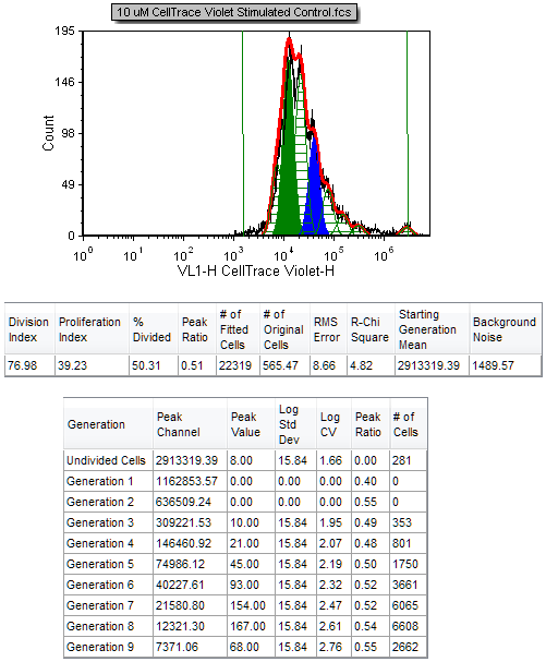
Figure T20.13 Proliferation Histogram with the Proliferation Fit Statistics and Proliferation Population Statistics
We will now smooth the proliferation histogram.
17. Click on the proliferation histogram to select it.
18. Select the Format Tab→Plot Options→Overlays command.
The Formatting Overlays dialog will appear, similar to Figure T20.11.
Note that, by default, the first overlay is selected in the left hand side. This is the overlay we will smooth since the rest of the overlays are calculated from the fitting algorithm.
19. Increase the Smoothing to 6.
20. Click OK.
The Proliferation histogram and the statistics are now updated to reflect the smoothing (Figure T20.14). The black contour of the raw data is much smoother, but the fit changes significantly (note that the proliferation fit and proliferation population statistics have changed). Although this provides for a nicer visual presentation, this option should be used with caution since it affects the statistics obtained when using the raw data, and can thus affect the interpretation of the data. Note that the R-Chi Square value has increased from 4.82 to 17.76 as a result of smoothing the raw data, indicating an inferior fit. Thus it is advisable to cull statistics from an unsmoothed (raw) proliferation plot, while applying smoothing to a duplicate Proliferation plot or regular histogram for visual presentation only, if desired.
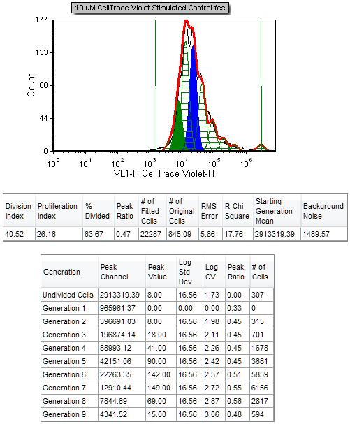
Figure T20.14 Proliferation Histogram and Associated Statistics with Smoothing
Now that we have formatted our plots for the experiment and inserted proliferation statistics we will create a batch process in the next section to summarize the three sample experiment.
