Heat Map Overlays
FCS Express allows users to view multiple statistics and parameters from a high content experiment in a single heat map by adding each statistic as a new overlay. Each well is represented by a circle with each overlay represented as a slice similar to a pie chart. Different overlays may represent different parameters and statistics from the same data set or multiple data sets. One Color Level will be applied globally to all overlays of a Heat Map.
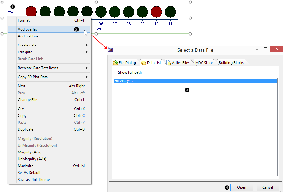
To create a heat map overlay (Figure 32.14):
1.) Right-click on the Heat Map.
2.) Click Add overlay from pop-up menu.
3.) Select data files(s) to use for the overlay from Select a Data File dialog (note that the existing data file may be chosen in the Data List tab or new files accessed in the File Dialog tab).
4.) Click Open.

Figure 32.14 - Adding Overlays to a Heat Map, Steps 1-4.
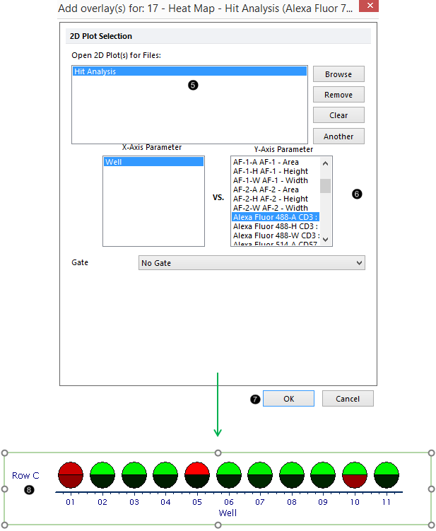
5.) Choose 2D Plot(s) under 2D Plot Selection.
6.) Select the parameter to use for the overlay from the Y-Axis Parameter list.
7.) Click OK.
The new overlay will be added to the heat map as in Figure 32.15.

Figure 32.15 - Adding Overlay to Heat Map, Steps 5-7.
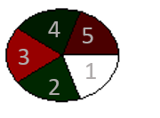
The first overlay occupies the lower-right sector of the well, while new overlays are added in a clockwise fashion (Figure 32.16).

Figure 32.16 - New overlay sectors added in clockwise fashion to Heat Map, starting from lower-right sector.
Please note when visualizing SPADE, only one SPADE tree may be displayed on a Heat Map.
