Inserting Summary Charts
The source data for Summary Charts in FCS Express is always a spreadsheet. The Spreadsheet must contain at least two types of data (in two separated columns) (figure 5 below provides an example of Category and Values columns):
•Values: the numerical freetext or token values to be plotted for each row, where each row corresponds to a data point.
•Category: the column containing the primary classification labels.
Optionally, other two column with additional classification labels may be specified.
•Group: A second level of classification. When a Group parameter is defined, the data within each Category is graphed separately accordingly to the group classification.
•Split: A third classification level in addition to the Category and the Group parameters that is only available for Violin plots.
Finally, two color parameters can be specified in case the shape color should be different between Categories (available for Box and Whisker, primary Violins and Beeswarm plot shapes) and/or Split Violins (only available when split violins are visible):
•Color parameter: the column of the spreadsheet containing the colors that should be used for each Category. When the color parameter is specified, the "Color Parameter" will be an available option in the color drop-down menu for the element of interest (e.g. the Box, the Violin or the Beeswarm) in the Shapes section (see the Formatting Summary Charts chapter for more information). The number of color levels specified in the spreadsheet column for this parameter, must match the number of categories.
•Split Violin Color: the column of the spreadsheet containing the colors that should be used for each second-half of each violin. When the Split Color parameter is specified, the "Color Parameter" will be an available option in the color drop-down menu of the Shapes→Second Violin section (see the Formatting Summary Charts chapter for more information). The maximum number of color levels that can be specified in the spreadsheet column for Split Violin Color parameter, is equal to the number of categories multiplied by the number of groups.
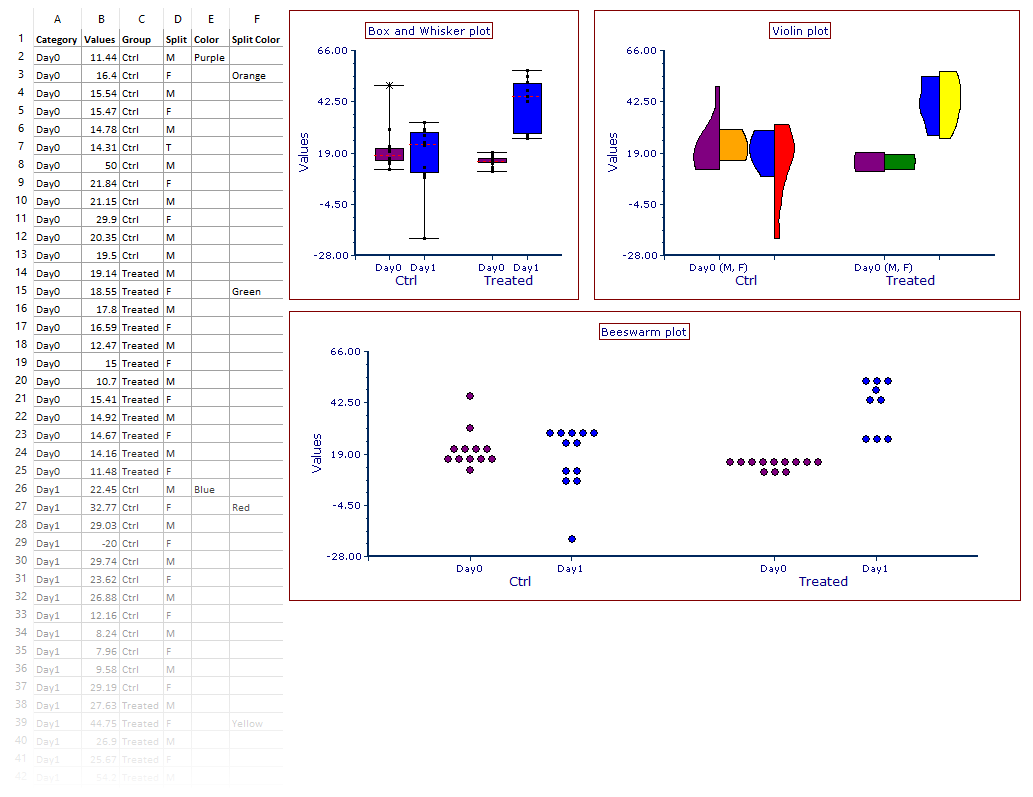
An example of Box and Whisker, Violin and Beeswarm plots are depicted in figure 5.266 below.
Note: the column header in the spreadsheet is defined by the user. In the example below, "Values", "Category", "Group", "Split", "Color" and "Split Color" were used as column headers.

Fig. 5.264. Example of Box and Whisker, Violin plots and Beeswarm charts.
Summary Charts may be inserted into the layout via the ribbon bar Insert tab→Charts→Summary, by selecting the chart of interest, or via the Data Navigator by drag and drop.
To create a Summary Chart via the ribbon bar:
1. Select a Spreadsheet containing the data intended for graphing.
2. Click the Insert tab→Charts→Summary command.
3. Select between Box and Whisker, Violin and Beeswarm style.
4. Click on a blank space of the layout to insert the chart.
To create a Summary Chart via the Data Navigator:
1. Drag a Spreadsheet containing the data that has to be graphed from the Data Navigator to an empty part of the page.
2. Release the mouse button.
3. Select Box and Whisker, Violin or Beeswarm from the Select Plot Types… dialog.
By default, Summary Charts plot the first two columns of the Spreadsheet for the Category and Values parameters, respectively. To populate the Summary Chart with parameters other than the first two columns of the Spreadsheet, either:
•Click on the X and/or the Y axis parameter name within the plot and select the intended parameter to use as Category and/or Values parameter respectively; or,
•Change the Category and/or the Values parameters from the Overlay Formatting dialog.
