Populating Bar Plots by Drag-and-Drop
Bar Plots are easy to populate through the drag-and-drop functionality in FCS Express 6. You can drag gates, statistical tokens, or freetext to create bars on a Bar Plot that has been inserted on your layout.
When populating a Bar Plot by drag-and-drop, the following attributes can be controlled:
•The specific statistic relating to the gate to be plotted.
•The position of the new bar relative to existing bars.
•The addition of new overlays to the Bar Plot.
•The X-axis label for each bar.
See the figures and steps below to learn how to populate Bar Plots by drag-and-drop.
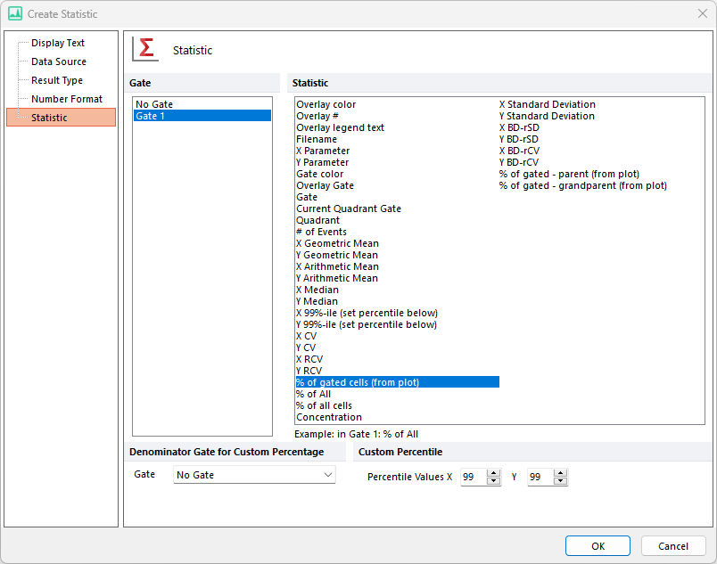
After inserting a Bar Plot, dragging and dropping gates onto it will cause the Edit Statistic dialog to appear. The specific statistic relating to the gate can be chosen for plotting (e.g., "% of gated cells (from plot)" in Fig. 5.224).

Figure 5.222 Edit Statistic dialog appearing after dragging a gate to a Bar Plot
The result of dragging and dropping a gate to a bar plot and choosing the desired statistic in the Edit Statistic dialog is shown in Fig. 5.225.

Figure 5.223 Dragging and dropping a gate onto a Bar Plot
A second gate can be dragged to the Bar Plot to open the Edit Statistic dialog, from which a statistic for the second bar is chosen (Fig. 5.226).

Figure 5.224 Dragging and dropping a second gate onto a Bar Plot
Statistical tokens or freetext from default statistics windows or text boxes on your layout can also be dragged directly to Bar Plots. In this case, the Edit Statistic dialog will not appear. In the example below, the selected "CD8, % of gated cells" statistic is dragged to the second position, to form a new bar between the existing two (Fig. 5.227).

Figure 5.225 Dragging and dropping a statistic token to the middle position in a Bar Plot
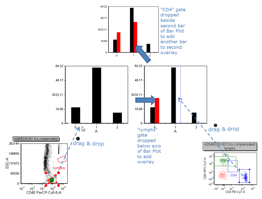
To add an overlay, drag the data source toward the Bar Plot and drop it below the axis (Fig. 5.228, ![]() ); the overlay will be overlaid onto the first bar.
); the overlay will be overlaid onto the first bar.
To add subsequent bars, drag the data source toward the Bar Plot and drop it to the right of the intended bar of the first overlay (Fig. (below) ![]() ).
).

Figure 5.226 Dragging and dropping an overlay to a Bar Plot
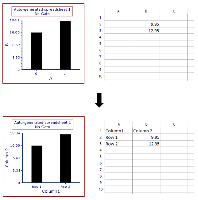
To add a descriptive axis label for each bar:
1.Open the Data Navigator
2.Drag the Auto-generated spreadsheet item corresponding to the Bar plot of interest and drop it on any empty part of the blank page.
3.Choose to create a Data Grid. A spreadsheet containing the value graphed in the Bar plot will open (Figure 5.229, upper pane).
4.Populate column headers and row headers with either freetext or tokens (via right-click → Insert Token) (Figure below, lower pane).
Tip: See the Formatting Bar Plots section for details on how to customize colors, bar style, error bars, and more.

Figure 5.227 Clicking on a Bar Plot axis label to edit it
