Plotting Values
The default parameter for plotting kinetics data is Median, but often times it is useful to look at other values such as Mean, Geometric Mean, Count, and percentage of events above a threshold. In this section, you will learn how to change these plotting values and define a threshold based on gates/tokens.
The sample data files for this section are located in the Tutorial Sample Data archive. The KineticsTutorialParameterSection.fey layout will be used here. The layout is embedded with the kinetics10.010, and kinetics25.025 sample data, and has a Ca++ Ratio parameter math formula applied.
1.Double-Click the kinetics10.010 plot. The Formatting dialog appears, so reposition it to see both plots.
2.Select the Overlays category.
3.Change the Plotting Value from Median to Mean (Figure T23.15, red arrow).
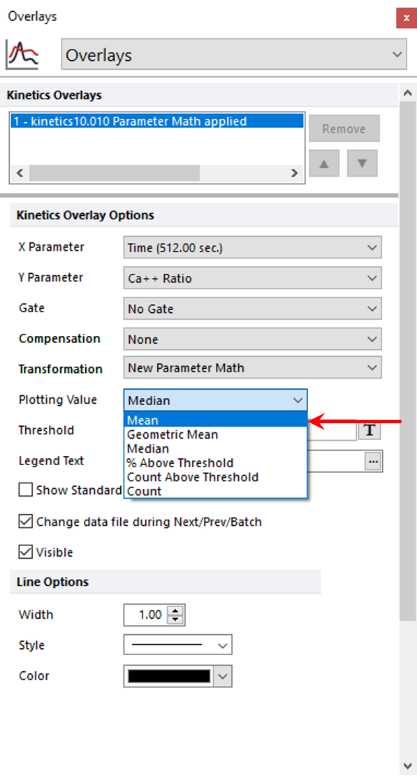
Figure T23.15 Changing the Plotting Value
The plot will change to display the Mean Ca++ Ratio on the Y-Axis.
4.Change the Plotting value to Count.
Steps 3 and 4 may be repeated to view any of the plotting values.
Selecting Count will plot the number of events acquired per unit time. This is very useful to ensure that the event rate over time is consistent for quality control. Notice how there are many peaks and valleys due to low cell numbers. We will change the resolution to view the #Events/Time at the appropriate resolution.
5. Choose the Specific Options category in the Formatting dialog.
6. Change the Plot Resolution to 32x32 from the Resolution drop-down list.
7.Select the Overlays category.
The plot should resemble Figure T23.16. Count vs. Time is a useful way to view the flow rate of your sample (it can reveal when a sample was removed or placed on the instrument, or if the flow rate decreased or increased for any reason). Note the large valley during the beginning of acquisition in this example when the sample was removed to add a drug.
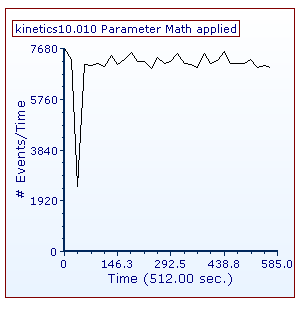
Figure T23.16 Kinetics Plot Displaying Count vs. Time
We now will assign a threshold to view % Above Threshold as a plotting value on a new page and plot.
8. Choose % Above Threshold from the page tabs.
You will see a Kinetics Plot and a Density Plot for kinetics10.010 with gates applied to the Density Plot (Figure T23.17). The gates are applied such that the Baseline Gate encompasses events before addition of a drug. Statistics derived from the gate will serve as baseline values for plotting % Above Threshold. The Post Treatment Gate includes events after the addition of a drug. We will plot the percentage of cells within this gate that responded with a fluorescence signal above the baseline.
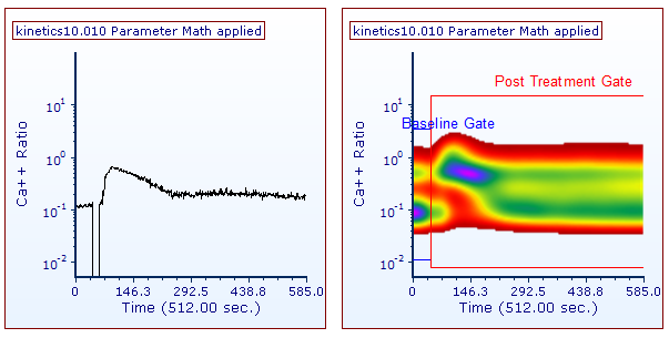
Figure T23.17 Kinetics and Density Plots with Thresholding Gates Applied
9. Click the Kinetics Plot on the left to select it.
10. Choose the Overlays category.
11. Select "Post Treatment Gate" from the Gate drop-down list.
12. Choose % Above Threshold from the Plotting Values drop-down list.
13. Click on the Token Symbol ![]() after the Threshold field.
after the Threshold field.
14. Choose "Y Median + 2 * SD" from Custom in the Insert a Token dialog (Figure T23.18). (The Y Median + 2* SD custom token represents the Y median of the baseline gate plus two standard deviations of the Y median in the baseline gate.)
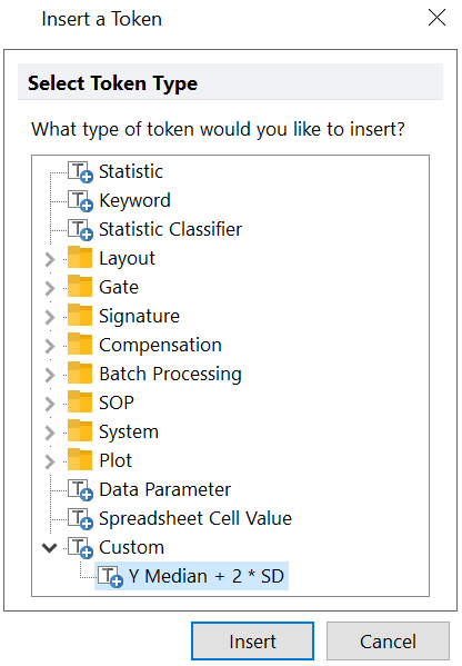
Figure T23.18 Choosing a Custom Token as a Threshold Value
The plots in the layout should now look like Figure T23.19. The kinetics plot on the left is displaying the percentage of events in the Post Treatment Gate that are above the Y-Median plus two standard deviations of the baseline gate for the Ca++ Ratio parameter.
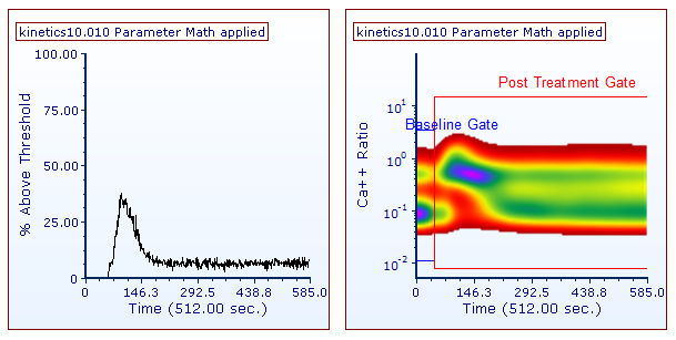
Figure T23.19 Kinetics Plot Displayed as % Above Threshold
In the next exercise, we will overlay and format kinetics plots.
