Formatting Multicycle DNA Plot
There are many formatting features in FCS Express to aid in the visual assessment of a MultiCycle analysis of a DNA histogram. The different cell cycle populations can be shaded in different ways and markers can be displayed indicating the location of the mean of a specific population. In addition, the user can zoom in on a specific area on the histogram for a more detailed view of the analysis.
We will continue using the layout from the previous section to format the Multicycle plot.
1.Click inside the MultiCycle plot to select it.
2.Choose the Overlays category in the Formatting dialog.
3.Select 4 - Diploid G1 from the Overlays List (Figure T21.21, blue highlighted text).
4.Select the angled line pattern(fifth option) from the Fill Style drop-down list (Figure T21.21, red outline).
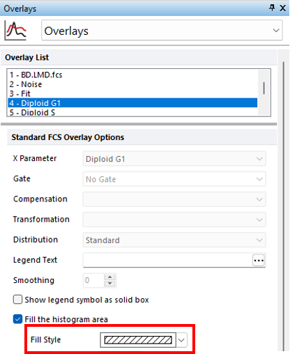
Figure T21.21 Formatting Overlays Multicycle DNA Plot
The Multicycle plot will update to reflect the changes (Figure T21.22).
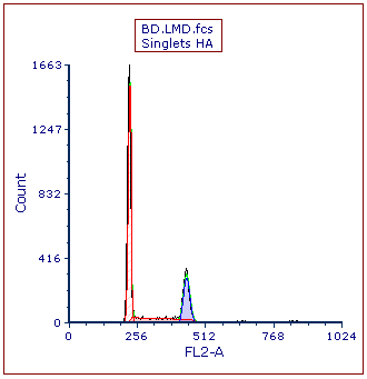
Figure T21.22 MultiCycle DNA Histogram Updated with Solid Fill on the Diploid Peak
We now will add a marker on the histogram to indicate the location of the aneuploid G2 peak.
5.Click the Multicycle plot to select it if necessary.
6.Select Position Markers category in the Formatting dialog.
7.Multiple select A1 Mean and A2 Mean from the Position Markers list (Figure T21.23, blue highlighted text).
8.Check the box next to Show position marker on the plot under Position Marker Options (Figure T21.23, red outline). The plot will update automatically to show the two markers.
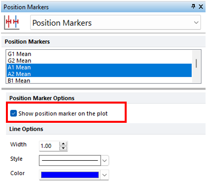
Figure T21.23 Adding Position Markers to Multicycle Plot
Alternatively, the DNA Position Markers can be accessed from right-click pop up menu to select or deselect them individually.
•Right-click inside the histogram to bring up the pop-up menu.
•Select DNA Position Markers→A1 Mean to deselect it.
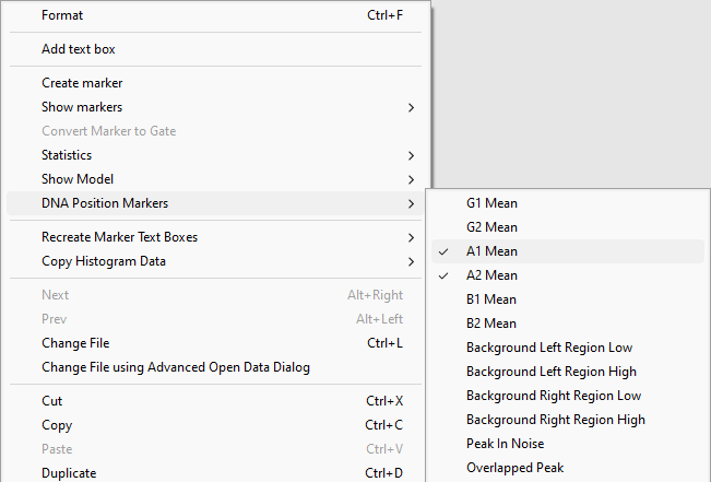
Figure T21.24 Deselecting DNA Position Marker from the Popup Menu
A vertical line marking the location of the mean of the aneuploid G2 peak remains on the Multicycle plot (Figure T21.25).
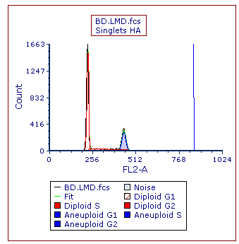
Figure T21.25 MultiCycle Histogram Updated with a DNA Position Marker on the Aneuploid G2 Mean
We will zoom into the Multicycle plot to more closely examine the aneuploid population.
9.Right-click inside the DNA histogram to bring up the pop-up menu.
10.Select Magnify (Axis) (Figure T21.26).
11. Place the cursor to the left of the aneuploid G1 peak on the DNA histogram, shown by left arrow.
12. Press and hold the left mouse button and move the mouse to the right while holding.
13. Release the left button when the right arrow is to the right of DNA Position Marker (Figure T21.26, indicated by the crosshair cursor).
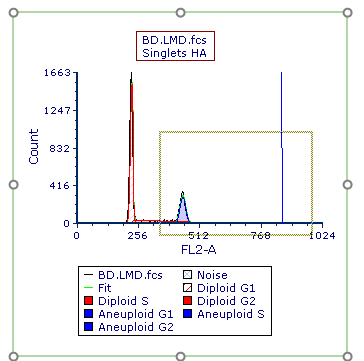
Figure T21.26 Selecting an Area on the X-axis to Zoom
The Multicycle plot updates to zoom in on the area of the x-axis drawn in the previous steps (Figure T21.27).
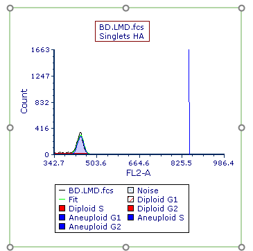
Figure T21.27 Multicycle Plot Zoomed along X-Axis
We now will change the y-axis scale on the histogram.
14. Click Multicycle plot to select it.
15. Choose the Axes category in the Formatting dialog.
15. Select Y-Axis (Figure T21.28, ![]() ).
).
16. Uncheck the box next to Automatic under the Range subcategory (Figure T21.28, ![]() ).
).
17. Enter "300" in the Maximum field under the Range subcategory (Figure T21.28, ![]() ).
).
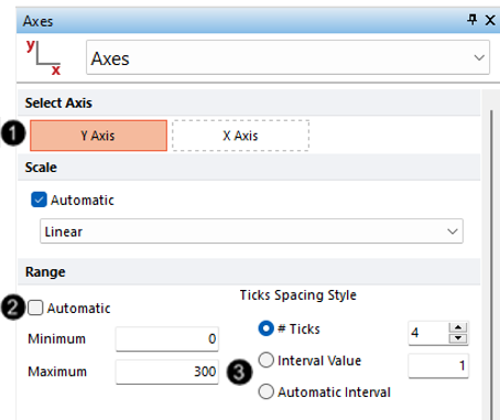
Figure T21.28 Formatting Axes Dialog
The MultiCycle plot updates with the new y-axis scaling (Figure T21.29).
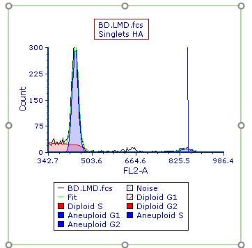
Figure T21.29 MultiCycle Plot with Rescaled Y-Axis
Next, we will perform MultiCycle analysis of 3 cycle data.
