Import and Analyze 96 Well Images
After adjusting the export settings in CellProfiler and running your pipeline, you may proceed to import the data into FCS Express. FCS Express only needs one additional piece of information regarding the setup of your experiment. CellProfiler currently does not export the plate format that was used for your experiment. A series of standard plate format definitions can be downloaded from the FCS Express website. For this example, we will be using a 96 well template which can found in the Tutorial Sample Data archive and is labeled Experiment.ini. The plate format definition file must be called Experiment.ini and placed into the Default Output Folder you defined in CellProfiler.
Importing the 96 Well Plate Imaging Experiment to FCS Express
Note on FCS Express Preferences before starting these steps of the tutorial:
The File selection dialog must be enabled:
A. Open the FCS Express User Options by choosing File→Options.
B. Selct the Files/Directories category.
C. Check the box next to When inserting a new plot or displaying information from a data file, always display the selection dialog.
(Enabling this feature is not a requirement of FCS Express, it has been selected for convenience in this tutorial.)
1. Load the Section1pipelineCOMPLETED.cpproj pipeline into CellProfiler 3.0.
2. Drag and drop the folder called Example Vitra Images into Images module and click Apply filters to file list button.
3. Confirm the default input and output folders in CellProfiler to load and store the data are set as shown in Figure T26.1.
4. Click the Analyze Images button in the lower left of the in CellProfiler window.
5. Open FCS Express.
6. Click New Layout from Startup Screen.
7. Open the FCS Express User Options by choosing File→Options.
8. Select Cell Profiler Options from the Data Loading category (Figure T26.8).
9. Select csv from the delimiter drop-down list.
10. Check the Load Images check box.
11. Uncheck the box next to Load path names from Cell Profiler table of contents file.
12. Click OK to close the FCS Express User Options dialog.
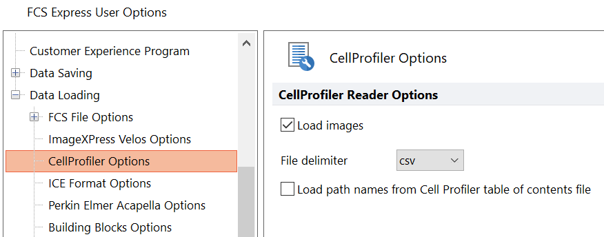
Figure T26.8 CellProfiler Data Loading Options for a 96 Well Plate Experiment with Images
13. Select File tab→New→New if needed to open a new, blank layout.
14. Select the Insert tab→Other Plots group→Plate Heat Map command (Figure T26.9).
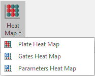
Figure T26.9 Inserting Plate Heat Map from Ribbon
15. Click anywhere on the layout and the Select data file dialog will appear.
16. Browse to the Default Output Folder where you stored your output data from CellProfiler.
17. Change the Files of type: drop-down list to Cell Profiler (*.cpout) (Figure T26.10). Icons for the documents output by CellProfiler will appear. For this example, they will be labeled cells.cpout and nuclei.cpout.
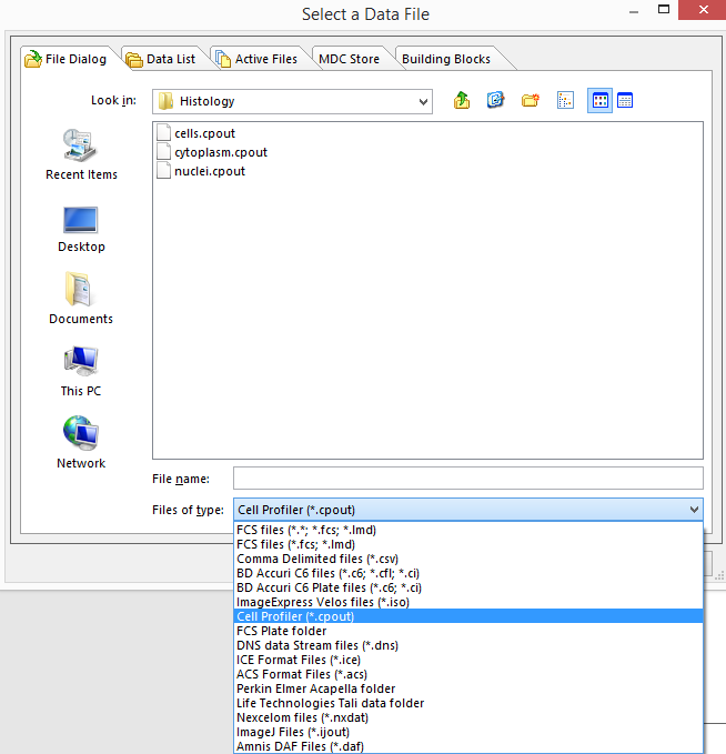
Figure T26.10 Choosing CellProfiler Files
18. Select cells.cpout.
19. Click Open.
Note: For this example, we will use cells.cpout file, which will display data from objects classified in the IdentifySecondaryObjects module of CellProfiler, corresponding to the entire cell area. The file, nuclei.cpout, will display data from objects classified in the IdentifyPrimaryObjects module of CellProfiler, which corresponds only to the nuclear area of the cells.
18. Highlight the Y-Axis Parameter you wish to view in the heat map from the Open 2D Plots dialog. For this example, choose Intensity_MeanIntensity_Cytoplasm (Figure T26.11).
19. Click OK.
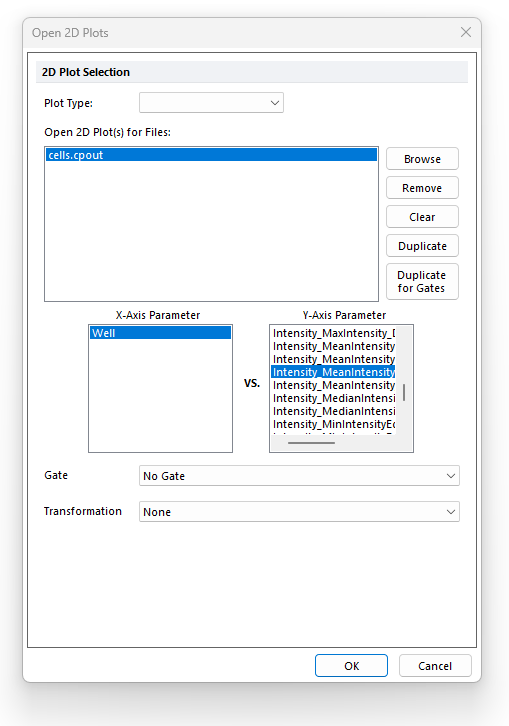
Figure T26.11 Opening a Heat Map and Choosing the Y-Axis Parameter from the Open 2D Plots Dialog
A plate heat map will appear on your layout, indicating that the data were imported successfully (Figure T26.12).
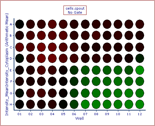
Figure T26.12 Example of a Heat Map Generated from CellProfiler Data
Gates can be created on the Plate Heat Map can be gated using the Gating→Create Gates→Well command.
Tips: to display the Well Gate border around the gated wells (e.g. red circle around Well A01 in the picture below), select the Show Gate option after right-clicking on the Plate Heat Map, then check the gate of interest.
Inserting a new 2D plot based on the well gate will allow you to view the data within that gate (e.g. a single, or multiple wells) in familiar dot plots (see picture below).
Image can be accessed using a picture plots (Figure T26.13).
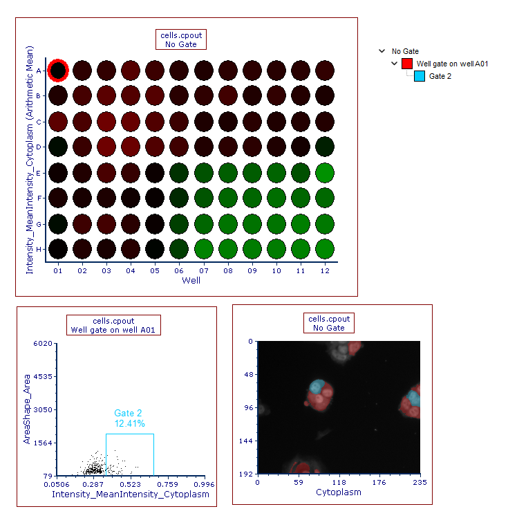
Figure T26.13 Plate Heat Map from CellProfiler Data with Corresponding Dot and Picture Plots
Note about panning and zooming (please refer the working with picture plots chapter for more details)
By default, Picture plots display images at their original zoom starting from their top-right corner.
When the original size of the picture exceed the size of the plot, to see a larger part of the picture the user can:
•enlarge the plot itself and/or (Figure T26.13a below)
•change the zoom of the Picture plot by selecting Specific Options from the Format tab of the ribbon bar (Figure T26.13b below). Should the zooming not being enough, the plot can be resized in addition.
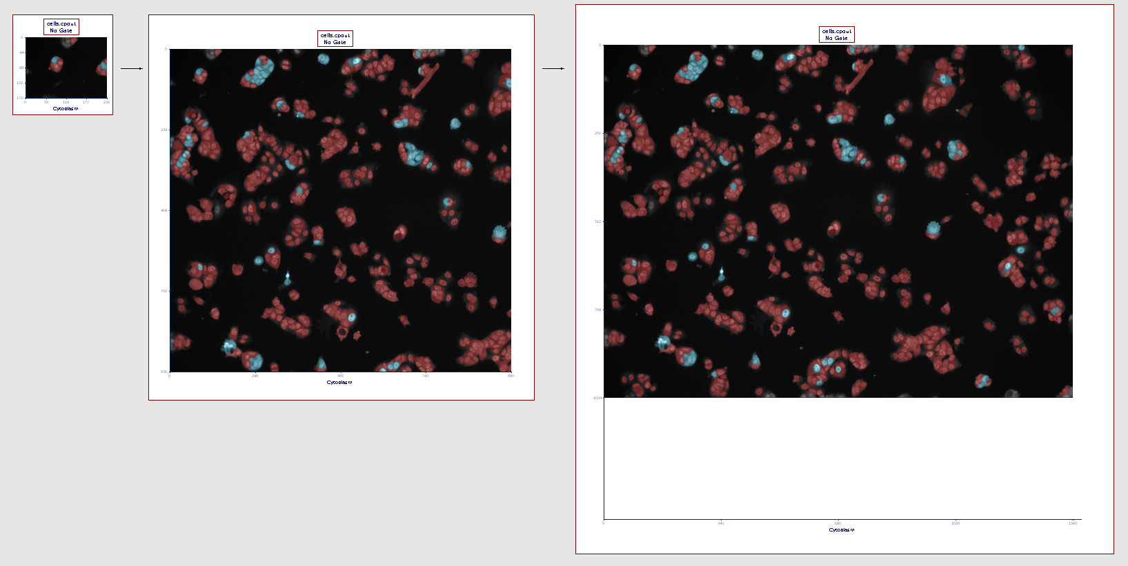
Figure T26.13a
The picture plot (left) has been resized in order to display teh full picture (right)
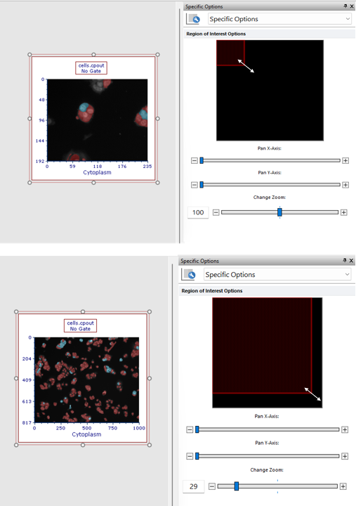
Figure T26.13b
The picture plot (top) has been zoomed through the Specific Options dialog in order to display a larger part of the picture (bottom).
If a different region of the image should be displayed within the picture plot, please change the panning (please refer the working with picture plots chapter for more details).
Next, we will export single images from CellProfiler.
