Summary Charts
The Summary Chart is a chart type that can be used to present and summarize data from spreadsheets in the layout.
A Summary chart can graph summary statistics such as the Mean or the Median, the distribution of the data, the Outliers and Single Data Points.
Based on the summary chart style and which statistics it graphs, a summary chart may be referred to a Box and Whisker, Violin, or Beeswarm Plot:
•Box and Whisker, when the distribution of the data is visualized according to quartiles, where the middle two quartiles are represented by a mean- or median-bisected box, and the outer two by whiskers. Individual data points within each set may also be denoted by points, and the appearance of outliers can also be visually emphasized.
•Violin plots, when the probability density of the data at different values is displayed, usually smoothed by a kernel density estimator. Individual data points within each set may also be denoted by points, and the appearance of outliers can also be visually emphasized.
•Beeswarm plots, when individual data points are displayed in a 1D scatter plot, with a logic ensuring that plotted points do not overlap.
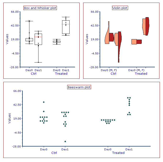
An example of the above mentioned Summary Charts (all displaying the same dataset) is depicted in Figure 5.274 below:

Fig. 5.272 Examples of Summary plots with Box and Whiskers style (upper left), Violin style (upper right) and Beeswarm style (bottom).
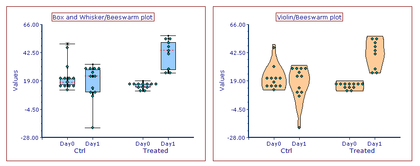
FCS Express allows users to mix and match the different properties of Box and Whisker, Violin and Beeswarm plots. For example, individual data points (which are a typical characteristic of Beeswarm plots) can be visualized on both Box and Whisker and Violin plot types. Similarly, a Violin distribution can be displayed on a Box and Whisker plot. Two examples of customization are depicted in Figure 5.275 below.

Fig. 5.273 Examples of Summary plots with mixed style. Box and Whisker plot with individual data points (left) and Violin plot with individual data points (right).
Next topics:
