Creating an analysis Spreadsheet
For this tutorial, we will be using a layout file that has 2D density plots with defined gates from seven data files, each having a different amount of CD64 antibody. Please note you may skip ahead to the next section to insert a scatter with regression plot using a completed spreadsheet.
1.Select the File tab→Open→Load Layout dialog.
2.Open the layout Titration.fey found within the Tutorial Sample Data archive in a subfolder called Spreadsheet and Titration.
The following layout should appear as shown in Figure T17.1.

Figure T17.1 Titration Layout
In the upper left corner of the layout, a dot plot displays SS Lin (side scatter) versus FS LIN (forward scatter) with a scatter gate, drawn in red. The Scatter gate has been defined to exclude very low and very high scatter signals. All the other plots on the layout are gated using this Scatter gate. Seven different volumes of CD64 were added to peripheral blood mononuclear cells and are shown in the seven color dot plots. To define the negative population for this titration experiment, a gate has been drawn on the lymphocyte population, shown in blue as the Lymphs gate, in the 2D plot of Side Scatter (SS Lin) versus CD64 (FL 8 Log). The positive population is the monocyte population which is defined in purple as the Monos gate. In the lower left corner of the layout is the Gate View window showing that the Lymphs and Mono gates are children of the Scatter gate, meaning the data is first gated using the Scatter gate and then the Lymphs and Mono gates are applied.
We will use a spreadsheet to calculate the values of CD64 signal to noise ratio for each of the seven volumes of CD64 used. The values will be defined as the ratio of the median CD64 fluorescent intensity of the monocyte population (the positive population) divided by the median CD64 fluorescent intensity of the lymphocyte population (the negative population).
3.Select the Insert tab→Spreadsheet and Charts group→Spreadsheet command  . Click on the page where you want the spreadsheet to be inserted and a blank spreadsheet will appear.
4.To change the name of the spreadsheet, right-click on the "New spreadsheet 1" in the Data navigator select "Rename". Enter "Titration".
5.Click OK to close window.
The new spreadsheet appears on the layout.
6.Click and drag spreadsheet border to reposition.
7.Release the button when spreadsheet is positioned where desired.
For this exercise, we will populate the spreadsheet with the following information:
Column A - amount of antibody added,
Column B - median CD64 fluorescent intensity of the monocyte population, and
Column C - median CD64 fluorescent intensity of the lymphocyte population.
8. Click cell A1 of spreadsheet.
9. Type "Ab Added".
10. Press Enter. Cell A2 will be outlined in blue (Figure T17.3).
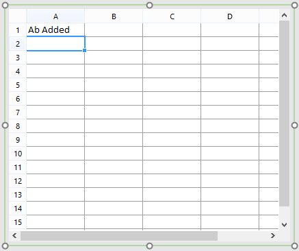
Figure T17.3 Populating Spreadsheet Cell A1
11. Type "0.156".
12. Press Enter. Cell A3 will be outlined in blue.
13. Type "0.313".
14. Press Enter. Cell A4 will be outlined in blue.
15. Type "0.625".
16. Press Enter. Cell A5 will be outlined in blue.
17. Type "1.25".
18. Press Enter. Cell A6 will be outlined in blue.
19. Type "2.5".
20. Press Enter. Cell A7 will be outlined in blue.
21. Type "5".
22. Press Enter. Cell A8 will be outlined in blue.
23. Type "10".
24. Press Enter. Cell A9 will be outlined in blue.
Cells A2-8 should be populated with antibody amounts (Figure T17.4).
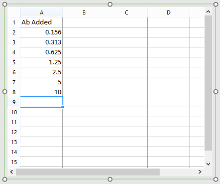
Figure T17.4 Column A Complete
To populate cells from columns B, we will drag and drop the SS Lin vs FL8 Log Color Dot plots for each respective antibody amount.
25. Type "Monos Median".
26. Press Enter. Cell B2 will be outlined in blue.
27. Click plot for 0.156 ul CD64.
28. Click border of plot to cell B2 of spreadsheet (Figure T17.5).
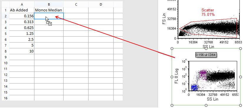
Figure T17.5 Drag and Drop Plot to Spreadsheet Cell B2
29. Release mouse button.
30. Select Statistic token from Paste Special window (Figure T17.6).
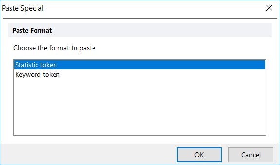
Figure T17.6 Paste Special Window
The Statistic page of the Create Statistic dialog now appears (Figure T17.7).
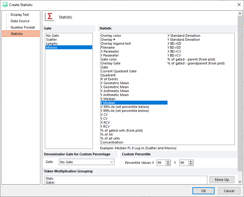
Figure T17.7 Edit Statistic Infromation for Monos
--
Note: the order the gates are displayed in the create statistic dialog was changed in version 7.20 onwards. Now, all shown gates (i.e. those whose outline is displayed on the plot of interest) are set to be on top of the list.
--
31. Click OK.
32. Select Monos from the Gate area.
33. Select Y Median from the Statistics list box.
34. Select OK.
35. Repeat Steps 27 - 34 for the following color dot plots and spreadsheet cells:
0.313 ul CD64 to B3, 0.625 ul CD64 to B4, 1.25 ul CD64 to B5, 2.5 ul CD64 to B6, 5 ul CD64 to B7, and
10 ul CD64 to B8.
The spreadsheet should now appear as in Figure T17.8.
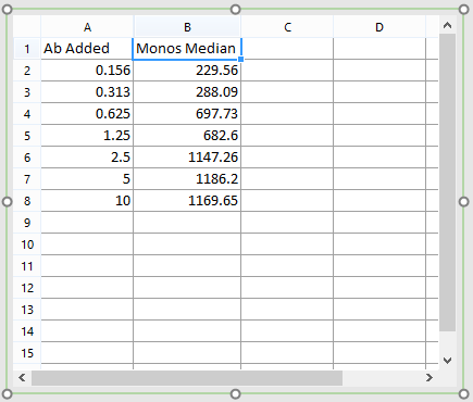
Figure T17.8 Columns A and B Complete
Column C will be populated by dragging and dropping data files from the data list onto the spreadsheet.
36. Click Data tab→Organize Data Sets group→Data List command.
37. Press Ctrl+A to select all data files.
38. Click and hold mouse button on any data file in data list.
39. Drag data files to cell C1 in spreadsheet (Figure T17.9).
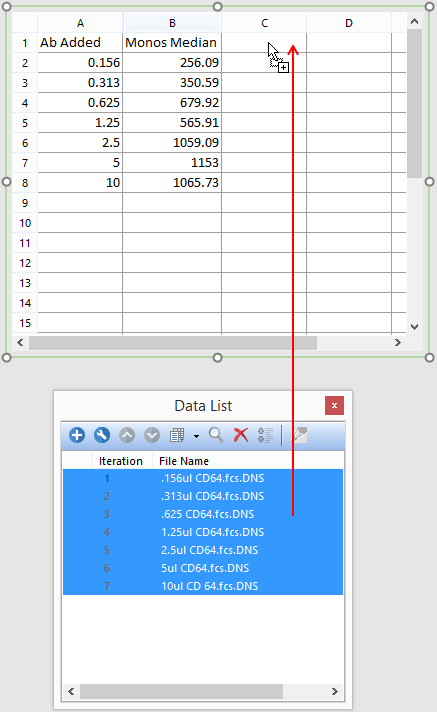
Figure T17.9 Drag and Drop Files from Data List to Spreadsheet
40. Release mouse button.
41. Choose Statistic token.
The Statistic category of the Create Statistic dialog now appears.
42. Select FL Log 8 from Parameter list under Data File Information.
43. Select Lymphs from Gate area.
44. Select Median from Statistic list box.
45. Click OK (Figure T17.10).
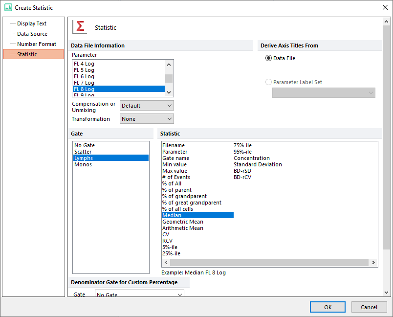
Figure T17.10 Edit Statistic Dialog for Lymphs
--
Note: the order the gates are displayed in the create statistic dialog was changed in version 7.20 onwards. Now, all shown gates (i.e. those whose outline is displayed on the plot of interest) are set to be on top of the list.
--
46. Click cell C1.
47. Type "Lymphs Median".
48. Press Enter.
The spreadsheet should appear similar to Figure T17.11 below.
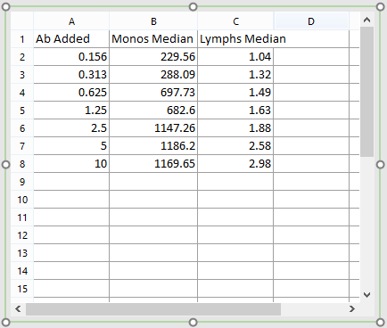
Figure T17.11 Columns A, B, and C Complete
Alternatively, gates may be dragged and dropped from each dot plot to the spreadsheet.
•Click gate of interest from plot and drop onto appropriate cell.
oFor example, click and drag purple Monos gate from color dot plot - 0.156 ul CD64 SS Lin vs FL 8 Log to cell B2 of spreadsheet.
•Release mouse.
•Select Y Median from Statistic list box.
•Click OK.
Values in the spreadsheet will update in real-time as gating is changed.
•Click and hold red Scatter gate in upper left plot on layout - 10 ul CD64 SS Lin vs FS Lin.
•Move mouse and observe values changing in spreadsheet as Scatter gate is moved.
•Release mouse.
•Press Ctrl+Z to undo gate move.
To resize column width(s), follow one of the two commands below:
• Hover mouse cursor over right border of column header until resizing cursor appears (![]() )→double click (left in Figure T17.13 below).
)→double click (left in Figure T17.13 below).
• Spreadsheet tab group→Layout tab→Format drop-down list→AutoFit Column Width (right in Figure T17.12 below).

Figure T17.12 Resizing single column width (left) or autofitting widths for entire spreadsheet (right)
We will now calculate the ratios of the CD64 staining for the Monocyte and Lymphocyte populations within the spreadsheet.
49. Add page to layout by using Home tab→Pages group→New Page command.
50. Use View tab→Navigators group→Layout Navigator command to open Layout Navigator.
51. Drag and drop spreadsheet "Titration" from Page 1 to Page 2 within Layout Navigator (Figure T17.13).
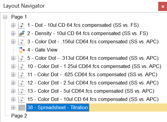
Figure T17.13 Moving Spreadsheet to Page 2
52. Select the View tab→Multiple Pages group→Two Pages (Vertical) command.
53. Go to Page 2 of layout.
54. Select the spreadsheet.
55. Click cell D1.
56. Type "M/L Ratio".
57. Press Enter. Type "=" into cell D2.
58. Click cell B2.
59. Type "/".
60. Click cell C2.
61. Press Enter.
62. Click cell D2.
63. Hold Shift and click cell D8.
64. Release mouse button.
65. Ctrl+C.
66. Ctrl+D.
The spreadsheet should now appear similar to Figure T17.14.

Figure T17.14 Columns A, B, C, and D Complete
In the next section, we will create a regression curve from a spreadsheet.
