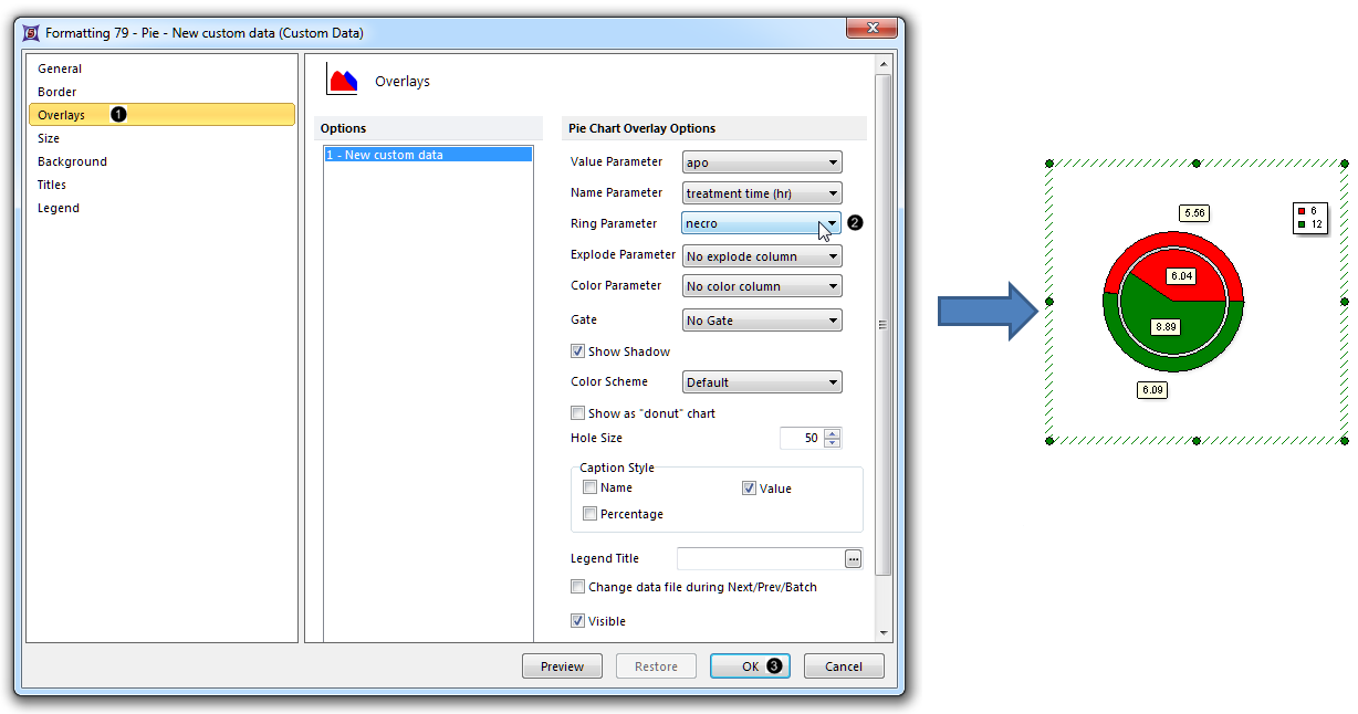
In this section of the tutorial, we will display an additional dataset as a Ring on a Pie Chart. Please complete the Displaying Additional Datasets section of the tutorial before proceeding.
| 1. | Double-click the Pie Chart to open the Formatting dialog. |
| 2. | Click the Overlays category (Fig. 50,  ). ). |

Figure 50. Displaying an additional dataset as a Ring on a Pie Chart
| 3. | Choose "necro" from the Ring Parameter dropdown list of the Formatting Pie dialog (Fig. 50,  ). ). |
| 4. | Click OK (Fig. 50,  ). The Pie Chart now appears with the "necro" dataset as a ring at the periphery of the pie (Fig. 50, right). ). The Pie Chart now appears with the "necro" dataset as a ring at the periphery of the pie (Fig. 50, right). |
| • | Click the Data tab→Change Data on All→ Next/Previous buttons to advance through the set of files in the Data List and watch as the Bar Plot, Scatter Plot, and Pie Chart update with the new data. |
| • | Adjust the gates on the plots and watch the Bar Plot, Scatter Plot, and Pie Chart update in real-time. |

