Setting the Parameter to Display
To select the parameter and statistic to display on the Heat Map, use one of the following methods:
| • | Select the Heat Map and use the Format tab→Plot Options→Overlays command, and choose from the dropdown menus under Classification Overlay Options. |
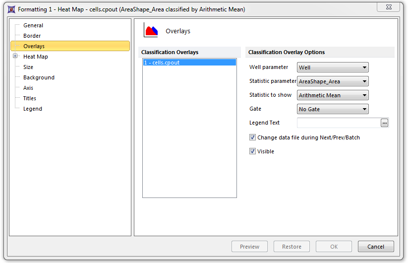
| • | Right-click on the Heat Map, select Format from the pop-up menu, choose the Overlays category, and choose from the dropdown menus under Classification Overlay Options (Figure 28.4). |
| • | Click and hold down the mouse button over the y-axis label and choose an available parameter. Set the statistic to show using one of the above two methods. |

Figure 28.4 Heat Map - Setting the Statistic Parameter and Statistic to Show
The data that is displayed is a combination of the Statistic parameter and the Statistic to show (e.g., Mean, Standard Deviation, CV, Median, # of events, 75%-ile) properties. FCS Express calculates the average of the statistic chosen across all of the wells in the microtiter plate. Then, a color is displayed for each well according to the color scheme property. The usual procedure is to assign the color by comparing the value of the statistic in each well to either:
| • | The mean ± SD of the entire plate. |
| • | A predetermined threshold. |
Choose the parameter from the Statistic parameter drop-down list. The list will normally be populated by a wide range of parameters that were measured or calculated by your instrument. Select the Statistic to show from the predefined statistics in the corresponding drop-down list.
A Heat Map can have a Gate set similar to any other plot in FCS Express. For example, you can draw a gate on a dot plot displaying the data and then drag the gate onto the heat map. You can also set the gate using the drop-down list in the Formatting window pictured above.
