Working with Heat Maps
To display a Heat Map:
| 1. | Select the Insert→Other Plots→Heat Map command. |
| 2. | Click (or click-drag) on your layout where you want the heat map to appear. |
If you are loading a list of data files collected together in a microtiter plate, or a BD Accuri C6 file as a plate, choose FCS Plate folder from the Files of type drop-down list in the Select a Data File dialog. Then choose a folder that contains the files. The folder should contain an extra keywords file to indicate the size of the plate.
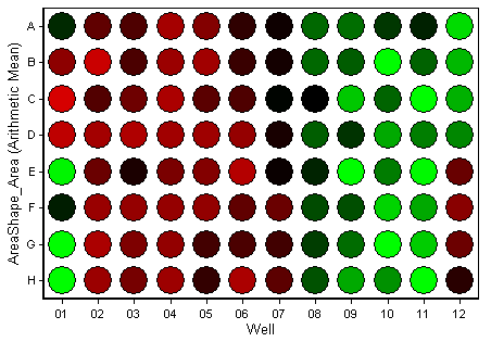
The data in a Heat Map is displayed as a two-dimensional grid of the wells on a microtiter plate. For example, for a 96-well plate, the heat map contains eight rows (labeled A through H) and 12 columns (labeled 01 through 12). The parameter being displayed is shown as the title of the y-axis. Each well displays a color according to the chosen color scheme (Figure 28.1).
You can now create Well Gates to pool your data from multiple wells, and display the parameters of each event on a per-well basis in a Data Grid.

Figure 28.1 Heat Map
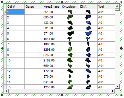
When a Data Grid is displayed for the Heat Map, a Well column will be present showing the well where each cell or event is located. The example below is from an image cytometry experiment, where the Data Grid has been formatted as an image gallery (Figure 28.2).

Figure 28.2 Data Grid with Well Column
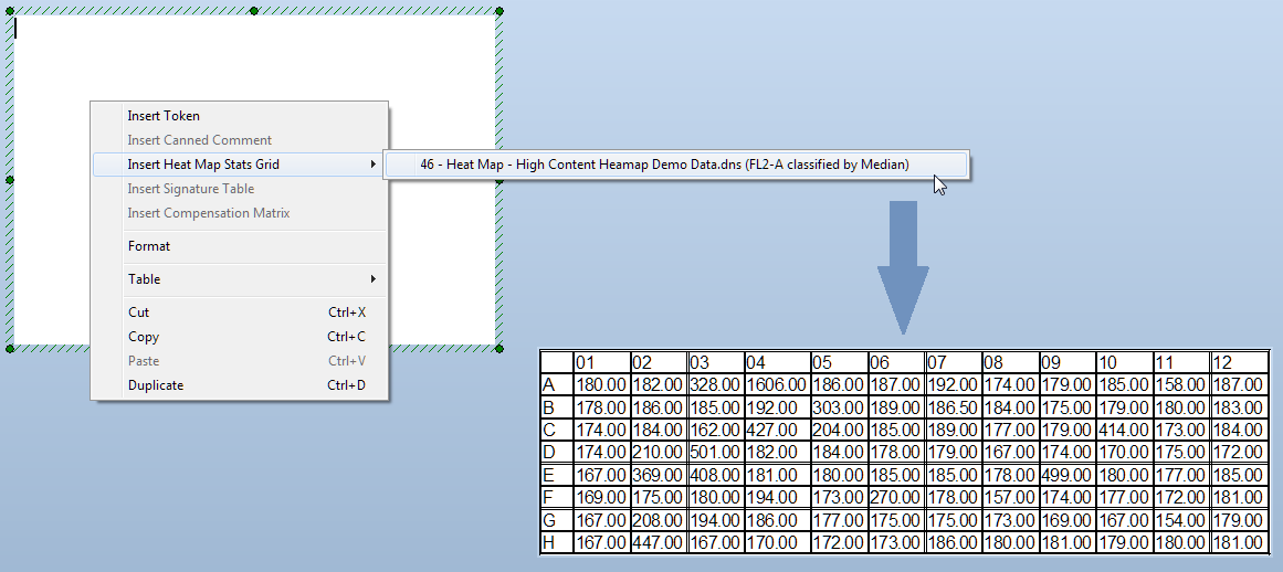
You can insert a table displaying the actual values from each well of your Heat Map into a Text Box. For a 96-well microtiter plate, this will insert an 8 x 12 data grid. To do so, right-click on the Text Box, choose Insert Heat Map Stats Grid, and select the Heat Map to use as a data source from the menu (Figure 28.3).

Figure 28.3 Insert Heat Map Stats Grid into a Text Box
