Formatting a Spectrum Plot

Contents
Formatting options specific to Spectrum Plots are pictured below and include:
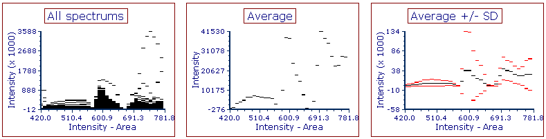
•Plotting All spectrums or Average (![]() ), or Average Showing Standard Deviation (
), or Average Showing Standard Deviation (![]() )
)
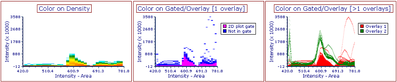
•Setting Display Mode to Color on Gated/Overlays or Density (![]() )
)
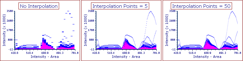
•Interpolating values with desired number of Interpolation points (![]() )
)
To access these formatting options, either
•Select the Spectrum plot(s) and use the Format tab→Plot Options→Overlays or Specific Options command, or
•Right-click on the Spectrum plot, select Format from the pop-up menu, and choose the Overlays or Spectrum Plot Specific Options category (Figure 28.3).

Figure 28.3 - Formatting options specific to Spectrum Plots.
These formatting options specific to Spectrum Plots are detailed in the table below. Standard formatting options for Spectrum Plot overlays are listed here.
Option |
Explanation |
|---|---|
Overlay to show |
All spectrums shows each event as an individual line or dot (left); Average shows the average of all events as one line or dot (center); Average with Show Std Dev
|
The colors in Color on Density mode (left) reflect population density of events; the colors in Color on Gated/Overlays mode (center and right) reflect the following, depending on the number of overlays: •for plots with 1 overlay (center), the gate to which each event belongs (only for gates selected in the Display Gates Option) (e.g., pink for events in the "2D plot gate" below and the base color of the overlay (e.g., blue, below) for cells not in one of the selected gates). •for plots with >1 overlay (right), the overlay (e.g., red for Overlay 1, and green for Overlay 2).
|
|
Interpolate values |
FCS Express can interpolate values to impart a smoother look to your data, so that each event is depicted as a continuous line rather than an array of discrete values. Below are examples of plots with no interpolation (left), and 5 (center) and 50 (right) Interpolation Points between each value.
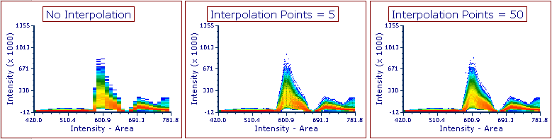
Interpolate values is also applicable to Spectrum Plots with the Color on Density Display Mode:
Please note that interpolation does impact the speed of displaying the plots. Thus, it is recommended to use the lowest interpolation value that provides the desired plot appearance.
|
Resolution |
Increase or decrease the display resolution, or number of bins, of the Y-dimension of the plot. |
Shade Based on Density |
Superimposes a grayscale shading pattern based on the density of plotted data. When gates are displayed on a Spectrum Plot in the Color on Gated/Overlay Display Mode, the shading pattern will be pseudocolored to match the color of the gate displayed. A lighter shade represents a higher density. Note that this option will not apply if multiple overlays are displayed on the Spectrum Plot. |
NOTE: In addition, the formatting options shared by all objects and plots exist for Spectrum Plots.
Below are some example of Spectrum plot customizations.
Figure 28.4 displays two Spectrum Plots with the Display Mode option set to Color on Density (Option ![]() in the table above) and a Spectrum plot showing two Overlays as Average (Option
in the table above) and a Spectrum plot showing two Overlays as Average (Option ![]() in the table above). Please note that a legend is also displayed in the latter.
in the table above). Please note that a legend is also displayed in the latter.

28.4 Example of Spectrum plot customizations.
Figure 28.5 shows a Spectrum plot with three Overlays as an Average (Option ![]() in the table above). Please note that a legend is also displayed.
in the table above). Please note that a legend is also displayed.

28.5 Example of Spectrum plot customizations.