Creating the Layout
In the course of this example, we will:
•Create a layout to use for our panel.
We will now proceed to create a layout for the analysis of our experiment using the panel we created. We will be using plots and gates. Please refer to previous tutorials for more information on inserting plots, formatting plots, and using gates.
Using the layout we started in the previous section, Setting Up the Panel, we will create four plots for our first set of samples.
1.Open the Data List window, if it is not already open.
2.Select the first two files from the list (click on the first file, hold down the Shift key and click on the second file).
3.Drag the selected files outside of the Data List dialog.
4.Release the mouse button to drop the files onto a blank place on the layout.
The Select Plot Types… dialog will now appear, as shown in Figure T10.14.
5.Check the Color Dot option and uncheck all other plot types.
6.Check the Use this selection for all files option.
7.Click OK (Figure T10.14).
8.Note that now in Version 5, FCS Express can remember your selection and use this selection as the default plot type for this layout when creating new plots by dragging and dropping from the Data List.
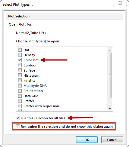
Figure T10.14 Select Plot Types... Dialog
Two color dot plots, using the first two data files selected in the Data List, are now created on the layout. We now need to arrange them in a column on the left side of the layout.
8.Select the plots by holding down the Ctrl button on the keyboard and clicking on each one. It maybe necessary to move the density plot to be able to individually select each plot. Alternatively, click and hold the mouse button down and drag a box that encompasses all four plots, or select the Home→Editing→Select All command.
9.From Home → Editing → Align, select the Align command (Figure T10.15). This tool will help align and distribute your object by arranging them according to the first object that was selected while holding the Ctrl key.
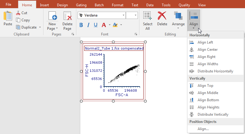
Figure T10.15 Aligning Plots
The Alignment window similar to Figure T10.16 will appear.
10. Under the Horizontal column, select Left Sides. Under the Vertical Column, select No Change.
11. Click OK.
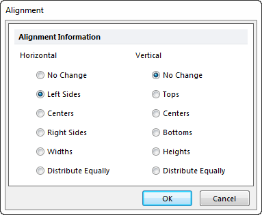
Figure T10.16 Aligning Plots on the Left Side
12. Select the plots. Right click on them and select Duplicate. (Figure T10.17).
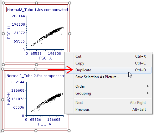
Figure T10.17 Duplicating Plots
The duplicated plots will appear. (Figure T10.18).
13. Rearrange the duplicated plots by placing them to the right of the original plots.
14. Use the Align tool, if needed.
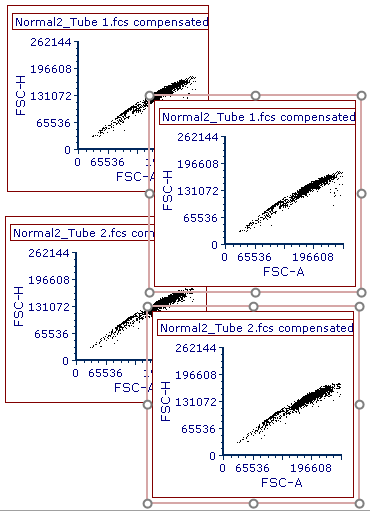
Figure T10.18 Duplicated Plots
The page of the layout should now appear similar to Figure T10.19. For more information on manipulating objects in FCS Express please refer to the tutorial on Using Objects.
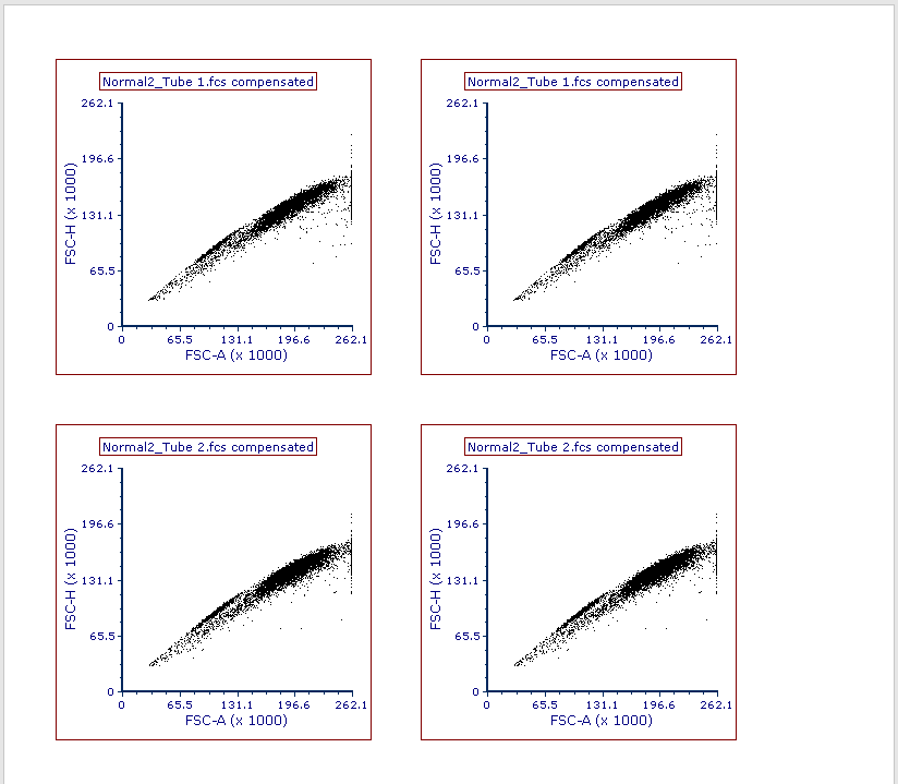
Figure T10.19 Plots Arranged on Page
We will now adjust the X and Y axis parameters, create gates, create statistics and create a 1D histogram to which we will add an overlay.
16. On the 1st plot in the upper left corner, click on the X axis and choose V-500-A. Click on the Y axis and choose SSC-A.
17. On the 2nd plot in the upper right corner, click on the X axis and choose V450-A. Click on the Y axis and choose PerCP-Cy5-5-A.
18. For the 3rd plot, in the lower left, set the X axis to APC-H7-A and the Y axis to V450-A.
19. For the 4th plot in the lower right, set the X axis to APC-A and the Y axis to PE-A.
20. The layout should similar to Figure T10.20.
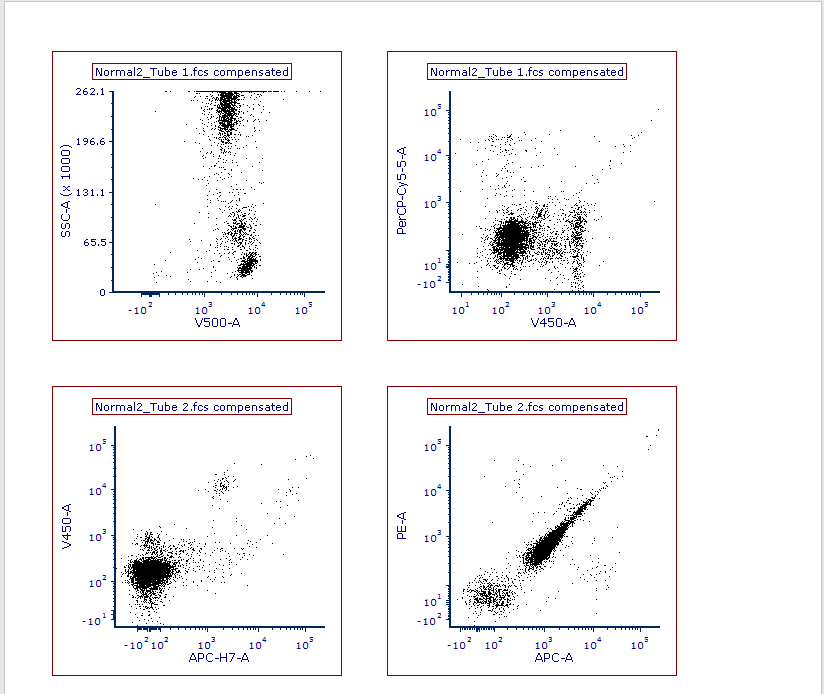
Figure T10.20 Plots with X and Y axis set to Parameters
21. We will also format the titles of the plot to include the Current Gate for that plot.
22. Select all plots by selecting Select All from the Home tab or by clicking Ctrl+A.
23. From the Format tab, select Titles. If you are using Default preferences, most likely the keyword <$FCSE_FILENAMENOPATH> will already be entered as a Title. Position your cursor after <$FCSE_FILENAMENOPATH> and click on Insert Keyword. Select Current Gate from the dropdown menu, as seen in Figure T10.21. Click OK.
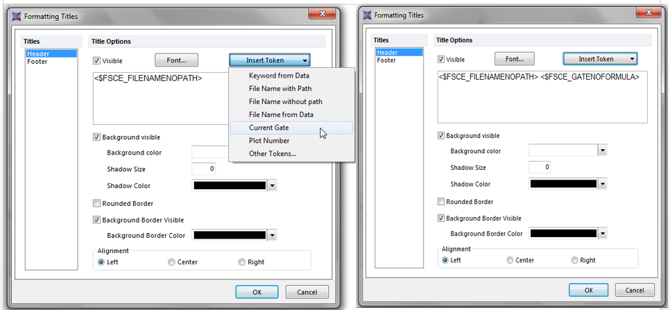
Figure T10.21 - Before and After Adding Current Gate to the Plot Title
24.We will now create gates. On the SSC/V500-A plot, we will create a polygon gate around the lymphs. From the Gating tab, select Polygon and create a gate around the lymphs. Name the gate Lymphs, as seen in Figure T10.21.
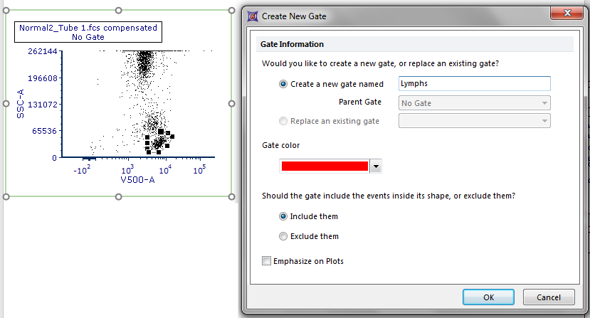
Figure T10.21 - Creating a Lymphs gate
25. We will apply the Lymphs gate to the 2nd plot in the upper right by dragging and dropping the Lymphs gate on top of the 2nd plot. The Before and After can be see in Figure T10.22.
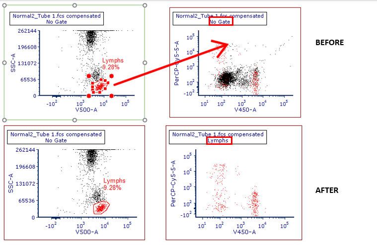
Figure T10.22 - Before and After Dragging and Dropping the Lymphs Gate
26. Select the 2 plots at the bottom of the page. From the Gating tab, select Lymphs from the Current Gate drop down menu, as seen in Figure T10.23.
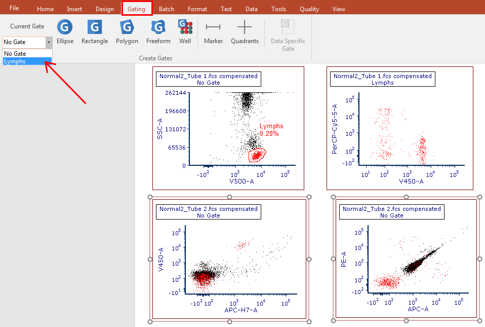
Figure T10.23 - Selecting Lymphs from the Current Gate Drop Down Menu
27. In the 3rd plot in the lower left, create a Rectangle gate around the cluster of cells that are APC-H7/V450 dual positive. Name the gate Cells of Interest.
28. Apply the Cells of Interest gate to the 4th plot in the lower right by dragging and dropping the gate on top of it.
29. Edit the Gates to Display in the top 2 plots by selecting them, then selecting from the Format tab, Gates to Display.
30. Under Gate Options, choose Only the gates checked below. Choose Lymphs.
31. For the question When a new gate is created on the layout, should the gate color be displayed?, select the option Only if the gate was create on a plot showing the same data file as this plot, as seen in Figure T10.24. Click OK.
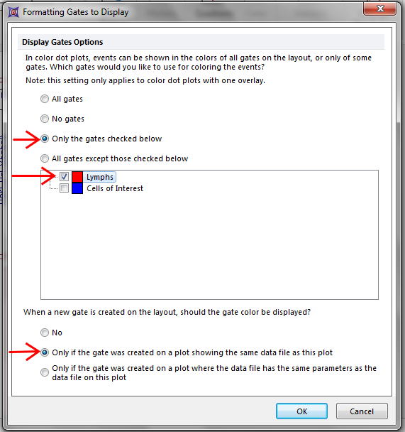
Figure T10.24 - Editing the Gates to Display
32. Your layout should look similar to Figure T10.25.
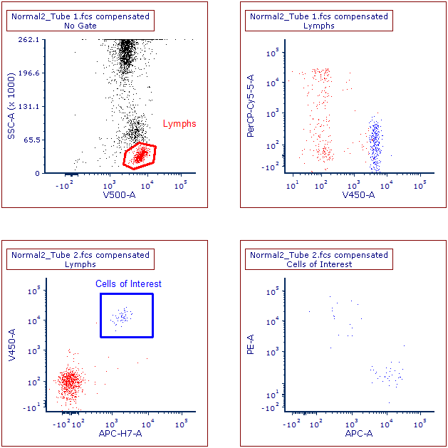
Figure T10.25
33. We will now add Quadrants to the upper right and lower right plots. From the Gating tab, click on Quadrants, then click on the V450 vs PerCPCy5.5 plot. Quadrants can be moved by clicking on the center point of the quadrant and then moving the quadrant to the desired position.
34. Repeat step 33 for the APC vs PE plot.
35. Your layout should appear as in Figure T10.26.
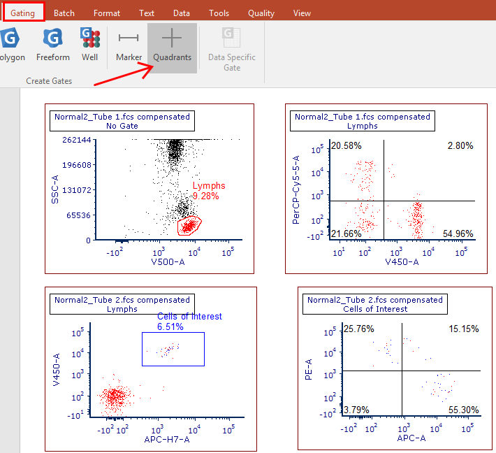
Figure T10.26
36. Now we will add quadrant statistics for the 2 plots that contain quadrants.
37. On the V450 vs PerCPCy5.5 plot, right click and select Statistics>Quadrant Statistics. Right click on the statistics grid and de-select everything but the columns Gate, # of Events, % of Gated Cells and % of All Cells, as seen in Figure T10.27.
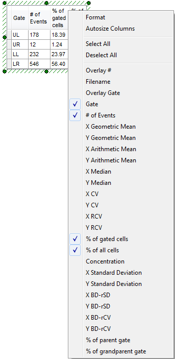
Figure T10.27 - Formatting Statistics
38. From the right click menu, you can also choose Format>Stats to edit the columns to be viewed.
39. Repeat steps 36&37 for the APC vs PE plot.
40. You can also edit the FCS Express User Options to reflect these changes, so each element does not need to edited manually.
41. We will now add another page and add a 1D histogram to this page.
42. From the Insert tab, select New Page. We can also add a new page by selecting the "+" sign next to the Page 1 tab at the bottom of the layout.
43. On Page 2, drag and drop the 2nd tube from the Data List.
44. Select Histogram. Click OK.
45. Change the X axis to PE-A and change the Current Gate to Lymphs.
46. Right click on the histogram and select Add Overlay using Advanced Open Data Dialog, as seen in Figure T10.28.
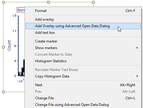
Figure T10.28 - Adding an Overlay
47. In the Advanced Open Data File window, select the Data List tab and choose the 2nd tube. Click Open, as seen in Figure T10.29.
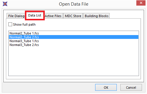
Figure T10.29 - Selecting a Data File for Overlay
48. In the Add Overlay window, in the Parameter section, select APC-A. If not already chosen, select the Lymphs gate, as seen in Figure T10.30. Click OK.
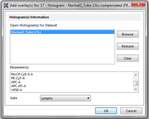
Figure T10.30 - Adding the Overlay
49. Your histogram should look similar to Figure T10.31.
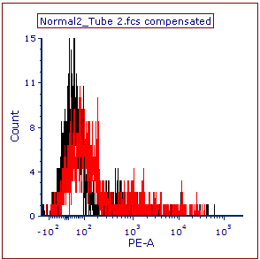
Figure T10.31 - Histogram with Overlay
50. At this point, we will save the layout. From the File tab, select Save As. Once you have chosen a location where you can save your layout, choose Unlinked from the Data Link Style section, as seen in Figure T10.32. This will save your layout as empty template. Click Save.
51. Close the layout.
In the next section, we will use the panel.
