Diva Index Sorting Data Files
Diva Index Sorting Data Files contain fluorescence information only on the indexed sort events. A larger "master" .fcs file contains information on all of the events collected during a sort while a single, or number of, smaller .fcs files contain only the sorted events. See Figure 32.28 below where the master file is 354 kB in size while the file containing only sorted events is 7 kB in size. These two files may be used individually or in conjunction via plot overlays to help visualize index sorting data acquired with Diva.

Figure 32.28 Diva Index Sorting Data Files. Note the larger sized "master" file that contains all events collected and the smaller size file that only contains sorted events.
To analyze Index Sort Data:
1. Insert a heat map for the index sort data file.
2. Select the parameter of interest on the y-axis (Figure 32.29).
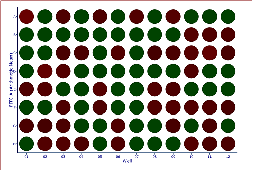
Figure 32.29 Default Heat Map with FITC Arithmetic Mean Y Parameter
3. Insert a Color Dot Plot.
4. Change the axes on the color dot plot to the parameters of interest.
5. Create a Well Gate on all wells.
Notes:
o In addition to creating a gate on all wells a gate may be created on one, or any number of wells, to visualize the individually sorted cells.
o Since Diva Index Sorting Data Files only contain data for the unsorted events, we can use the Emphasize on Plots feature of gates to emphasize the events that fall within the gate (Figure 32.30).
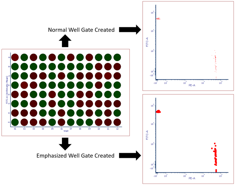
Figure 32.30 Heat map with Well Gate created on all wells. Standard gate is shown above while a gate with the Emphasize on Plots check box checked is shown below. Note that events highlighted in red fall within the well gate and in this case represent all events that were sorted into the plate making them easier to visualize.
6. Optional: Create additional Well Gates to isolate an individual well (blue event) or a group of wells (purple events) (Figure 32.31).
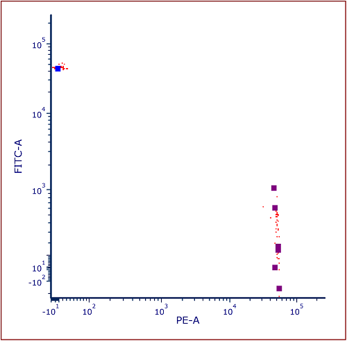
Figure 32.31 Color Dot Plot gated on Well Gate with Children Gates Applied and Emphasized
In the event that you would like to compare the master file to the Index Sort File, you can create a Color Dot Plot Overlay with increased dot size for the Index Sort Data. To do so:
1. Insert a Color Dot Plot for the larger "master" file.
2. Change axes to reflect parameters of interest (Figure 32.32).
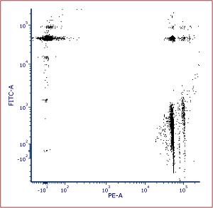
Figure 32.32Color dot plot of the "master" file (largest file in the data directory).
3. Drag and drop index sort data file (smaller data file in the data directory) from the data list onto the Color Dot Plot.
4. Select add the files to the plot as new overlays radio button (Figure 32.33).
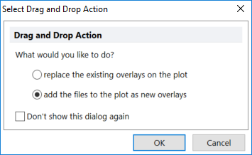
Figure 32.33 Select Drag and Drop Action Window to add Overlays to Color Dot Plot
5. Click OK.
6. Right click on the color dot plot.
7. Select Format.
8. Chose the Overlays category.
9. Select the second overlay.
10. Increase the Dot Size to 5.
11. Click OK (Figure 32.34).

Figure 32.34 Adding an Overlay to Color Dot Plot with increased dot size for the index sorted data file.
It is possible to insert a heat map statistics grid in a text box to display statistics for each well in the heat map as done in Figure 32.35.

Figure 32.35 Heat Map Statistics Grid displaying statistics for the Y parameter of the Heat Map
Another useful feature for index sorting data is the Heat Map Overlay function. Heat Map Overlays allow a user to view multiple statistics and parameters on a single heat map by adding each statistic as a new overlay. For instance, in Figure 32.36 left, the upper slice of the well represents PE arithmetic mean while the lower slice represents FITC arithmetic mean so single and double positive events can be more easily visualized.
Additionally, users may add a Radius Statistic, which changes the size of the well to reflect the selected parameter. For instance, in Figure 32 below (right), the heat/color for each well is dependent on the FITC arithmetic mean while the size of the well radius is dependent on the PE arithmetic mean.
Please see the Heat Map Overlay section of the manual for full instructions on how to create a heat map overlays of different parameters and types as well as setting the radius parameter statistic.
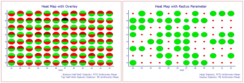
Figure 32.36 Custom Heat Maps with Overlay (left) and Radius Parameter (right). Standard Deviations of Color Levels was changed to 1.
