Creating Plate Heat Map Overlays
FCS Express allows users to view multiple statistics and parameters from a high content experiment in a single plate heat map by adding each statistic as a new overlay. Each well is represented by a circle with each overlay represented as a slice similar to a pie chart. Different overlays may represent different parameters and statistics from the same data set or multiple data sets.
Multiple properties can be formatted for each overlay via the Formatting Plate Heat Map Overlays dialog. However, one Color Level will be applied globally to all overlays of a Plate Heat Map.
There are four ways of adding overlay on a Plate Heat Map:
1.Drag-and-drop file(s) from the Data List onto the Heat Map you wish to overlay. A Select Drag and Drop Action dialog will open, asking whether to replace the existing overlay or to add the files as new overlays;
2.Drag-and-drop a plot from the layout onto the plot you wish to overlay. A Select Drag and Drop Action dialog will open, asking whether to replace the existing overlay or to add the files as new overlays;
3.Right-click on the plot and select Add overlay from the pop-up menu. This launches either the Select Data File or the Open Data File dialog depending on the Open Data Dialog user Options.
4.Right-click on the plot and select Add Overlay using Advanced Open Data Dialog (launches the Open Data File dialog);
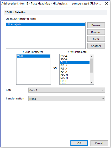
If either Add Overlay option is used, after selecting the data file(s) to add as new overlays, the Add overlay(s) dialog will open (Figure 5.85).

Figure 5.85 - Adding Overlay to Plate Heat Map, Steps 5-7.
The Add overlay(s) dialog allows users to choose, individually for each of the data file(s) listed in the Open 2D Plot(s) for Data Files list, the X-Axis and the Y-Axis Parameters, the Gate and the Transformation to use for the selected overlay
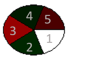
The new overlay will be added to the plate heat map. The first overlay occupies the lower-right sector of the well, while new overlays are added in a clockwise fashion (Figure 5.86).

Figure 5.86 - New overlay sectors added in clockwise fashion to Plate Heat Map, starting from lower-right sector.
Please note: when visualizing SPADE, only one SPADE tree may be displayed on a Plate Heat Map, but multiple overlays displaying the same SPADE tree may be added. By utilizing multiple overlays, each overlay can display a different Y-Axis parameter.
