Adding Highlighting or Exploding
In this section, we will add a Highlight parameter to a Bar Chart and an Explode parameter to a Pie Chart. The Highlight/Explode parameter must be a formula in the Spreadsheet evaluating to "TRUE" or "FALSE." When "TRUE," the bar will be highlighted in a selected color or the pie sector (slice) will explode away from the Pie for emphasis. The layout used in this section contains a spreadsheet and an associated Bar and Pie Charts to which we will add a Highlight or Explode rule, respectively.
Note: Highlighting may be added to Scatter Charts in the same method outlined below for the Bart Chart although it is not demonstrated in these tutorials.
1.Select File tab→Open.
2.Open the layout titled "Highlighting and Exploding.fey" within the Tutorial Sample Data archive. The Bar Plot and Pie Chart are graphing the mean of the three subsets ("live", "apo", and "necro") for the three replicates in the Dot Plots.
3.Click cell D3 of the Spreadsheet (Figure T19.37, ![]() ).
).
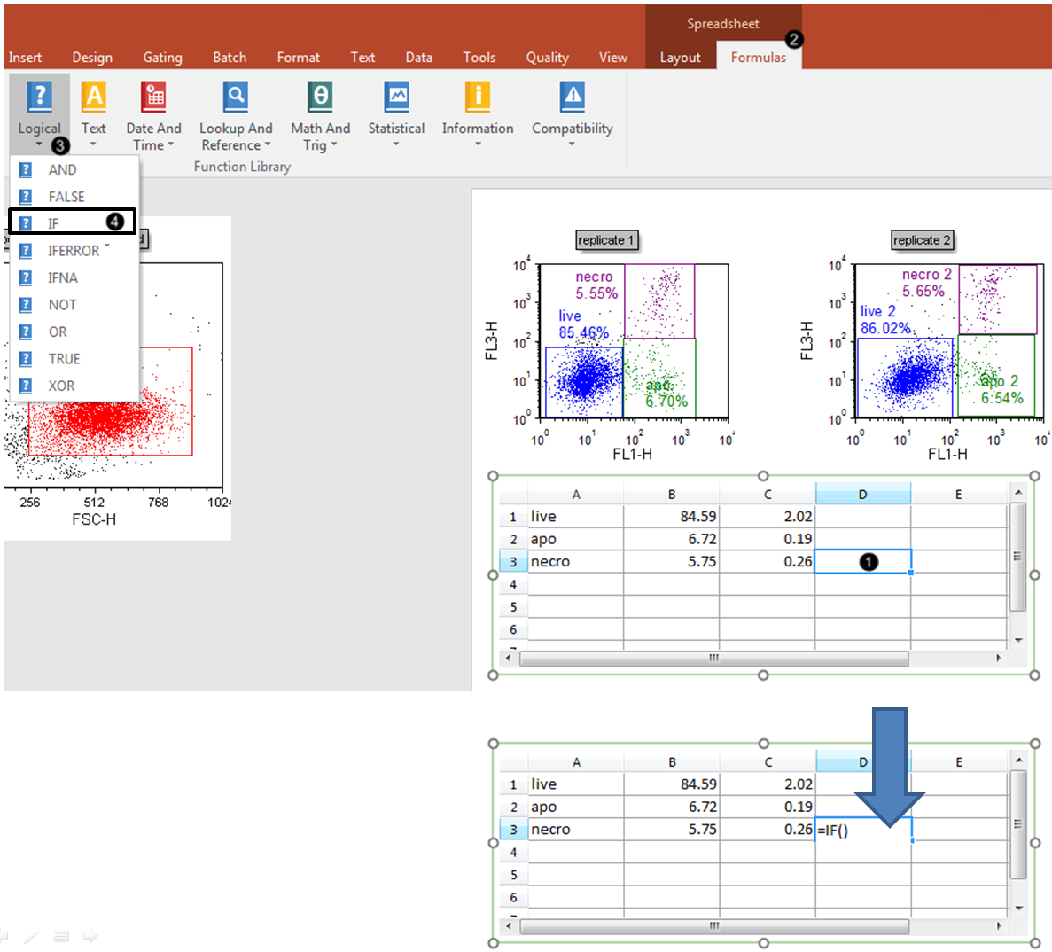
Figure T19.37 Inserting "IF" Logical Formula into Cell D3 of Spreadsheet.
4.Click the Formulas tab, which is now revealed in the ribbon bar.
5.Click the Logical command ![]() .
.
6.Select "IF" from the dropdown menu. The Spreadsheet will now appear as below (Figure T19.38, top panel).
We now will enter cell B3 as a component of the highlighting formula.
7.Click cell B3 (Figure T19.38, ![]() ) while the cursor is within the parentheses of the "IF" formula, as shown by the green arrow in top spreadsheet.
) while the cursor is within the parentheses of the "IF" formula, as shown by the green arrow in top spreadsheet.
8.Type ">5.5" (Figure T19.38, ![]() ) as indicated in bottom spreadsheet.
) as indicated in bottom spreadsheet.
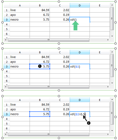
Figure T19.38 Completing "IF" Logical Formula for Cell D3
9. Key Enter, or click on the layout outside of the spreadsheet. The result of the Logical formula will appear as "TRUE" (Figure T19.39).
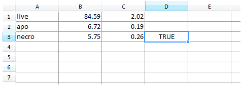
Figure T19.39 Result for "IF" Logical Formula in Cell D3
If desired, an analogous procedure to steps 3 through 9 could be followed to create a Highlight or Explode rule for the "live" and "apo" rows of the spreadsheet.
We now will format the Bar and Pie Charts to derive the Highlight or Explode rule from the appropriate column of the Spreadsheet.
10. Double-click the Bar or Pie Chart. The Formatting dialog will appear, docked to the right.
11. Choose the Overlays category in the Formatting dialog (Figure T19.40).
12. Choose "D" from the Highlight Param (Figure T19.40, left, red outline) or Explode Parameter (Figure T19.40, right, red outline) drop-down list in the Formatting dialog for the Bar or Pie Chart, respectively.
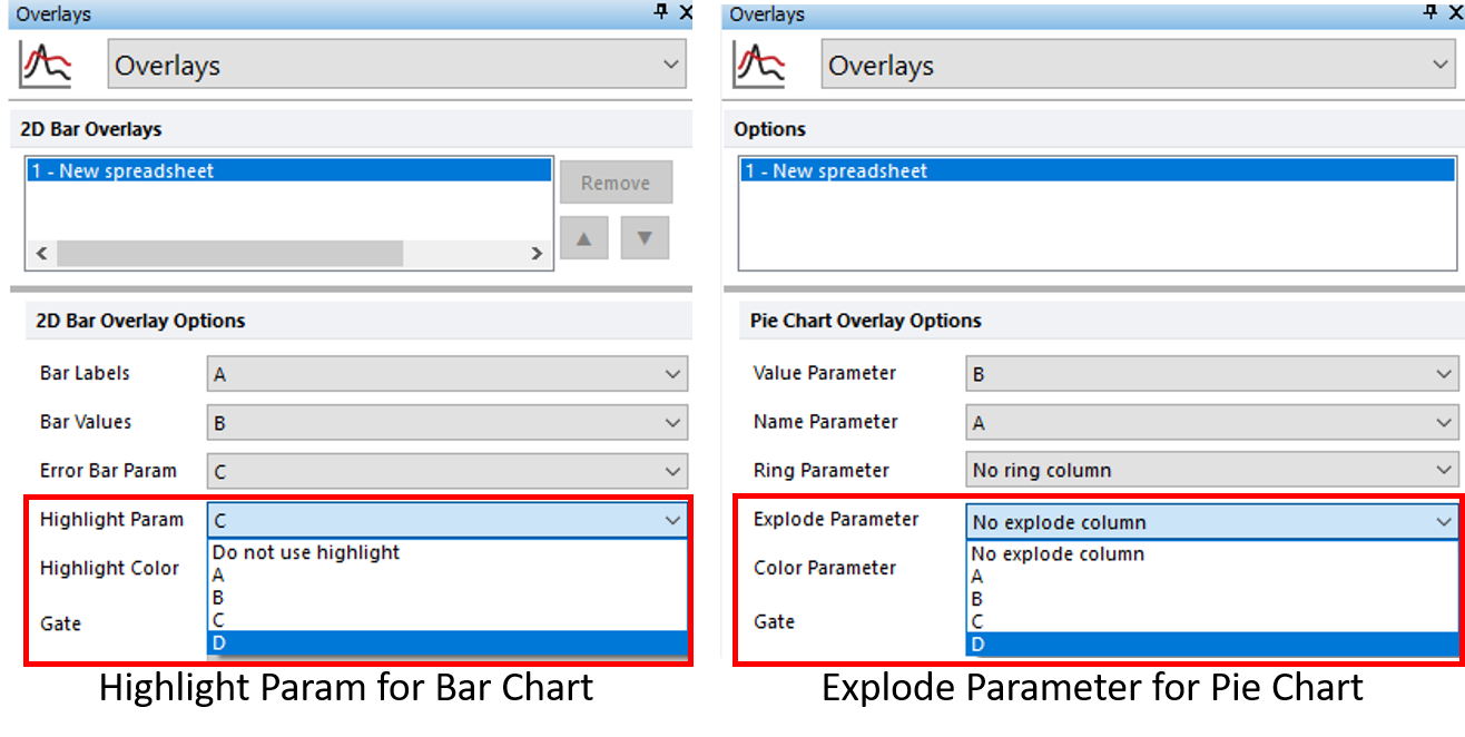
Figure T19.40 Adding Highlight Parameter for Bar Chart (left) and Explode Parameter for Pie Chart (right)
The Bar or Pie Chart should resemble Figure T19.41, left and right, respectively.
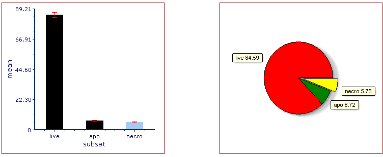
Figure T19.41 Bar Chart after Adding Highlight Parameter (left) and Pie Chart after Adding Explode Parameter (Right) for "Necro" Population
Note the following changes:
•in the Bar Chart, the "necro" bar is highlighted. The Highlight Color and other visual formatting elements of the Bar Chart may be customized from the Overlays category of the Formatting dialog. See this section of the manual for details.
•the Pie Chart, the yellow "necro" sector (slice) has exploded away from the rest of the Pie for emphasis. Sector (slice) Color and other visual formatting elements of the Pie Chart may be customized from the Overlays category of the Formatting dialog. See this section of the manual for details.
13. Optional:
•Click the Data tab→Change Data on All group→ Next/Previous commands to advance through the set of files in the Data List and watch as the Bar and Pie Charts update with new data.
•Adjust the gates on the plots and watch the Bar and Pie Charts update in real-time.
Go on to the next section to learn how to display additional data sets as Overlays on Bar and Scatter Plots or as a Ring on a Pie Chart.
