Displaying Additional Datasets
Additional datasets and parameters can be displayed on Bar, Pie, and Scatter Charts. Bar and Scatter Charts can display multiple additional datasets as Overlays while Pie Charts can display a single additional dataset as a Ring.
In this section of the tutorial, we will enter an additional dataset into a spreadsheet, which can be displayed on the Bar, Pie, and Scatter Charts.
1. Select File tab→Open.
2. Open the "displaying additional datasets.fey" layout within the Tutorial Sample Data archive.
The layout a contains a Spreadsheet and its associated Bar, Pie, and Scatter Charts. The %-gated statistic for the green "apo" gate is being plotted.
We now will add a %-gated statistic for the purple "necro" gate to the Spreadsheet.
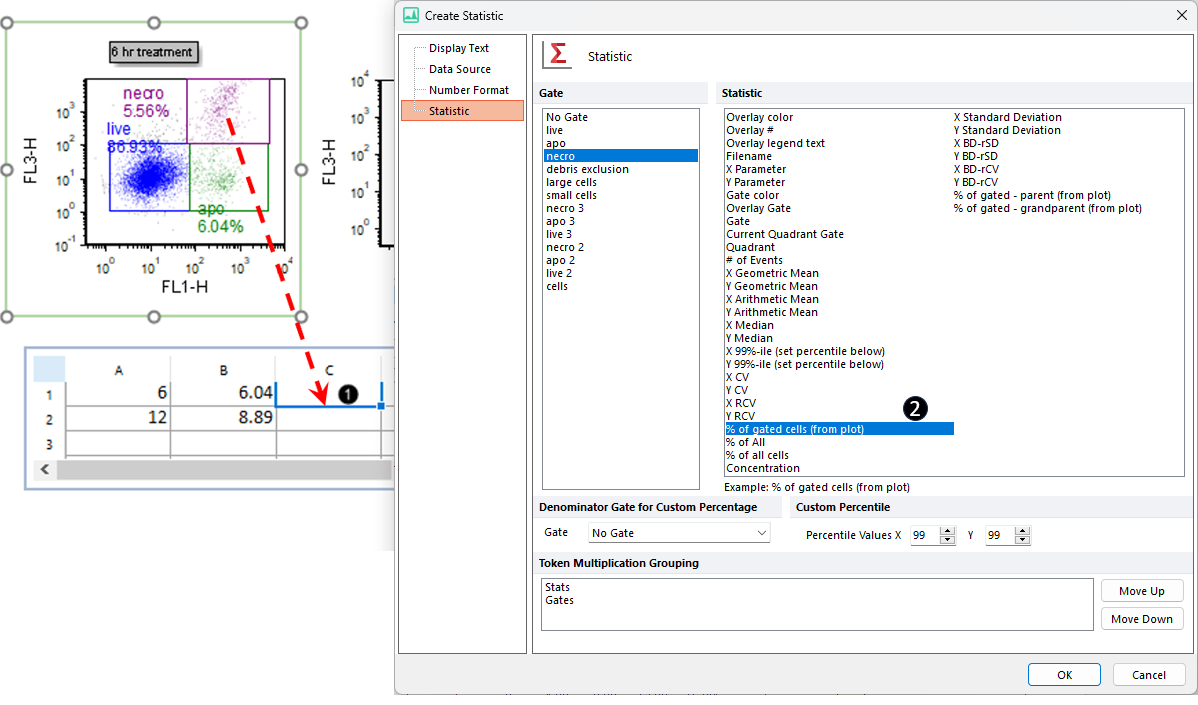
3. Drag and drop the purple "necro" gate from the 6 hr treatment Color Dot Plot to cell C1 of the spreadsheet. While holding down mouse button and dragging the gate, its outline will move (Figure T19.42, ![]() ).
).
4. Select % of gated cells from the Statistic list box in the Edit Statistic dialog (Figure T19.42, ![]() ).
).

Figure T19.42 Entering the %-gated Statistic for the Additional Dataset
--
Note: the order the gates are displayed in the create statistic dialog was changed in version 7.20 onwards. Now, all shown gates (i.e. those whose outline is displayed on the plot of interest) are set to be on top of the list.
--
5. Click OK. Cell C1 will contain the %-gated statistic for the "necro" gate.
6. Repeat steps 3 through 5 for the purple "necro" gate of the 12 hr treatment plot.
The spreadsheet should resemble (Figure T19.43, spreadsheet right of blue arrow).

Figure T19.43 Populating the Spreadsheet with Statistics from the 12-hr Treatment Plot
We will now format the Bar Plot, Scatter Plot, and/or Pie Chart to display this additional dataset from the appropriate column of the spreadsheet.
