Overlays on Bar and Scatter Plots
In this section of the tutorial, we will display an additional dataset as an Overlay to a Bar and/or Scatter Chart. Please complete the preceding section of the tutorial (Displaying Additional Datasets) if necessary.
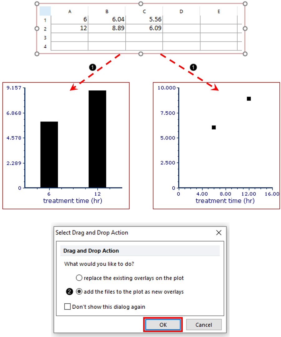
1. Click on the border of the Spreadsheet so it is highlighted in red.
2. Drag and drop the Spreadsheet onto the Bar or Scatter Chart (Figure T19.44, ![]() ).
).
3. Click the add the files to the new plot as new overlays radio button (Figure T19.44, ![]() ).
).
4. Click OK in Select Drag and Drop Action dialog (Figure T19.44, red outline).

Figure T19.44 Adding Overlay to Bar or Scatter Chart by Dragging and Dropping Spreadsheet
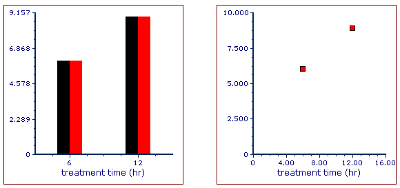
The Bar Plot or Scatter Plot should resemble Figure T19.45.

Figure T19.45 Bar and Scatter Charts with New Overlays
The new Overlay has defaulted to display the second ("apo") column of the Spreadsheet for its values. We will reformat the plot to derive the values from Column C instead of B in order to plot the "necro" gate-derived values.
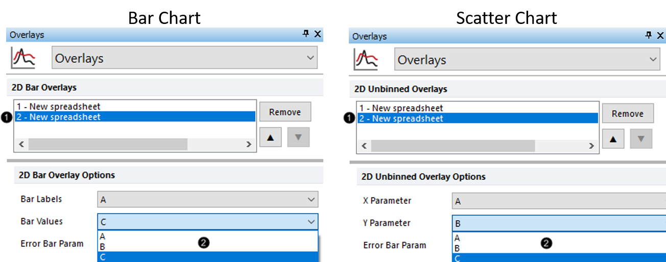
5. Double-click Bar or Scatter Chart. The Formatting dialog will appear, docked to the right.
6. Choose the Overlays category (Figure T19.46, left for Bar Chart, right for Scatter Chart).
7. Click 2- New spreadsheet from the 2D Bar Overlays or 2D Unbinned Overlays list (Figure T19.46, ![]() , left or right for Bar or Scatter Chart, respectively).
, left or right for Bar or Scatter Chart, respectively).
8.Choose "C" from the Bar Values for 2D Bar Overlay Options or from the Y Parameter drop-down list for 2D Unbinned Overlay Options (Figure T19.46 2, ![]() , left or right for Bar or Scatter Chart, respectively).
, left or right for Bar or Scatter Chart, respectively).

Figure T19.46 Updating Source Column for Data Display in New Overlay
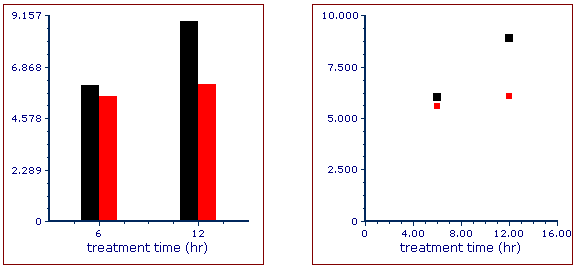
The Bar Plot or Scatter Plot should resemble Figure T19.47.

Figure T19.47 Bar and Scatter Charts after Updating Source for New Overlays
Note: Color, style, size, and other attributes of bars on a Bar Chart and points on a Scatter Chart can be customized independently for each overlay. See the following sections of the manual for details:
9. Optional:
•Click the Data tab→Change Data on All group→ Next/Previous commands to advance through the set of files in the Data List and watch as the Bar, Pie, and Scatter Charts update with the new data.
•Adjust the gates on the plots and watch the Bar, Pie, and Scatter Charts update in real-time.
