Ring on Pie Chart
In this section of the tutorial, we will display an additional dataset as a Ring on a Pie Chart. Please complete the Displaying Additional Datasets section of the tutorial before proceeding.
1.Double-click the Pie Chart. The Formatting dialog will appear, docked to the right.
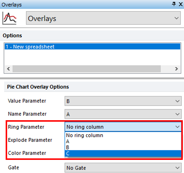
2.Choose the Overlays category (Figure T19.48).

Figure T19.48 Displaying Additional Dataset as a Ring on a Pie Chart
3.Choose "C" from the Ring Parameter drop down list of the Formatting Pie dialog (Figure T19.48, red outline).
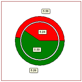
The Pie Chart now appears with the "necro" dataset as a ring at the periphery of the pie (Figure T19.49).

Figure T19.49 Pie Chart Updated to Display "Necro" Population as Ring
4.Optional:
•Click the Data tab→Change Data on All group→ Next/Previous commands to advance through the set of files in the Data List and watch as the Bar, Pie, and Scatter Charts update with the new data.
•Adjust the gates on the plots and watch the Bar, Pie, and Scatter Charts update in real-time.
