Using The High Content Module with Image Data
In this section, we will learn how to:
•Load a layout form a nuclear translocation assay run on a 96-well plate
•Review layouts and examine control well results with picture plots and dot plots
•Use Plate Heat Maps to review key variables measured on cells in a plate view
•Use multiple plate heat maps and data grids to display results in a report
•Optimize gate settings for the nuclear translocation assay
•See how tokens can be used to enhance reporting
•Create and manipulate a Data Grid to display a "Cell Gallery"
Important note before starting: With the release of FCS Express 7.18, Picture plots display images at their original zoom originating from the top-right corner of the image. Both the zoom and region of the image displayed in the Picture plot can be customized (please refer to the Zooming/Panning Specific Options for Picture Plots section of the Working with Picture Plots chapter for more details). Depending on the release of FCS Express you are using, screenshots in the section below may differ from what you see in FCS Express but the results will be the same. Zooming/panning settings may be adjusted as needed by the end user at anytime in the tutorial
Section 1: Image Gating Strategies for Data Analysis with the High Content Module (If you have completed Section 1, please skip to Section 2. If you have completed Sections 1 and 2, please skip to Section 3.)
Image cytometry often is analyzing many images acquired from slides or multiwell plates to interrogate various conditions, compounds, or multiple sample sources. Cellular imaging studies performed under multiple conditions are called "High Content Analysis" typically. The High Content Add-on for FCS Express enables working with and viewing data from multiple samples in plate heat maps. These data are typically from multiwell plates (6- to 1536-well plates). Plate heat maps can display multiple parameters or samples per well position with a variety of color mapping.
We have not provided data for all wells in the plate in the examples used here due to the large size of the original data set. If you would like to work with the full data set, or create your own data set, please visit the Exporting 96 Well Format Images section of the CellProfiler Export tutorial. The instructions there will provide you with a link to the original data set, a completed CellProfiler pipeline for analysis, and instructions for importing and viewing the data in FCS Express Image Cytometry or Plus.
1. Load the IntroToImage3.fey layout from the Intro to Imaging Tutorial subfolder in the Tutorial Sample Data archive.
Confirm you are viewing the Experiment Design page (Figure T30.32). This page contains the results for a nuclear translocation assay from a 96-well plate. A Plate Heat Map displays a representation of wells in the plate along with a measured parameter as the Y-Axis (Intensity_IntegratedIntensity_Cytoplasm in this case) on a green (low) to red (high) color scale.
Below the plate heat map is a plate map of the compounds added to each well, which was inserted as an image. Column 1 contains replicates of four negative and four positive control wells. The Picture Plot in the upper right displays an image of the cytoplasmic stain from well A-01, and the Dot Plot below it displays the integrated cytoplasmic intensity plotted against area for the cells in that image. To the far left, the Gate View shows a summary of all of the existing gate hierarchy used in this layout. We will not address all of the gates in this tutorial, but you may investigate them further on your own.
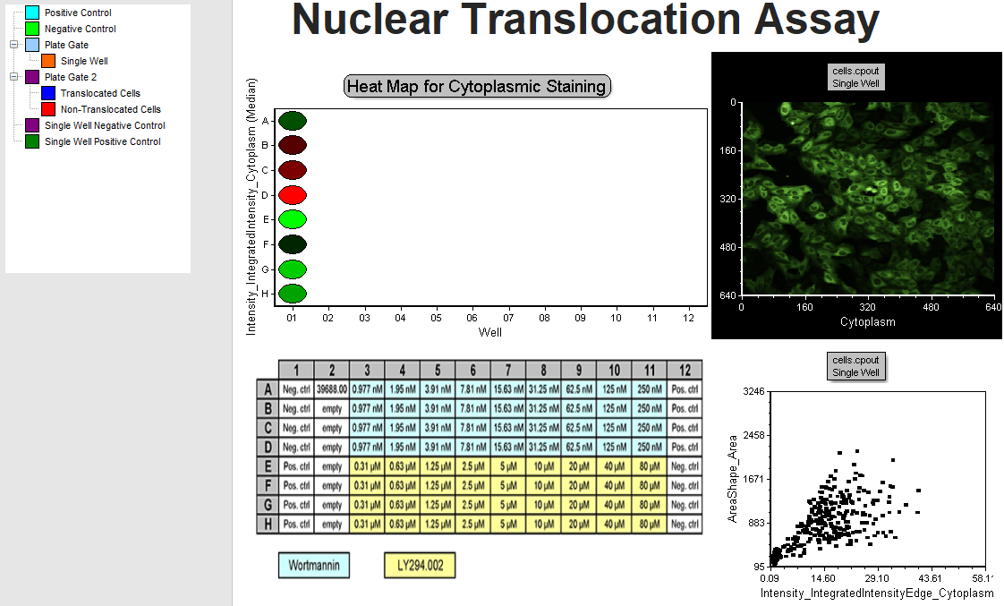
Figure T30.32 Experiment Design Page
2. Double-click the plate heat map. The Formatting dialog will appear, docked to the right side of the layout.
3. Choose the Overlays category (Figure T30.33).
Notice you can plot any parameter that was measured for cells in each well by changing the Statistic parameter drop-down and update the selected statistic of the parameter with the Statistic to show drop-down list. In this example, we are plotting the Median value for all of the cells. Review the available options, but do not change Statistic parameter and Statistic to show (Figure T30.33, red outline).
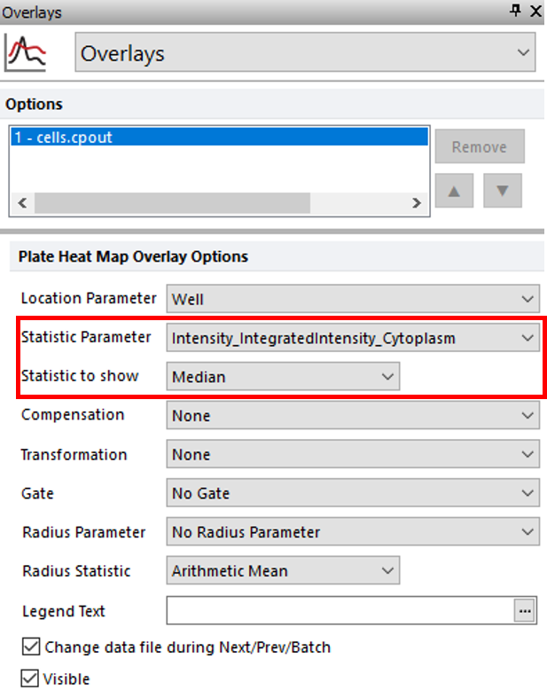
Figure T30.33 Plate Heat Map Overlay Options
4. Select the Color Levels category (Figure T30.34).
5. Change the Selected Color Level drop-down list to Green-Blue (Figure T30.34, blue highlighted text).
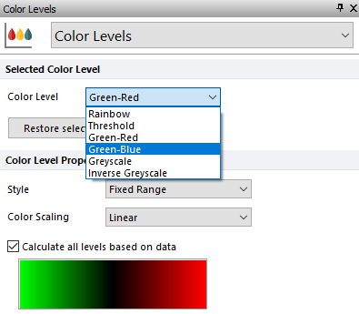
Figure T30.34 Formatting Color Level of Heat Map
The plate heat map should resemble Figure T30.35.
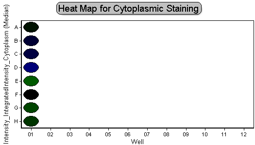
Figure T30.35 Green-Blue Color Level
6. Right-click the plate heat map.
7. Select Edit Gate→Single Well.
This will allow us to edit the "Single Well" gate created previously. Notice an orange circle appears to highlight well A-01 on the plate heat map (Figure T30.36a), indicating this well is the only member of the "Single Well" gate. Review the plate map of compounds; you will notice this is one of four negative control wells (Figure T30.36b).
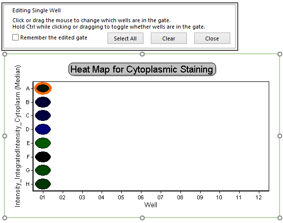
Figure T30.36a Activating Single Well Gate on Plate Heat Map
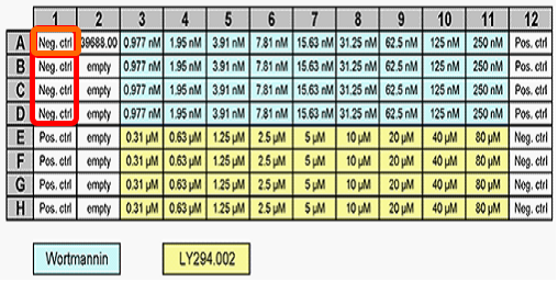
Figure T30.36b Compound Map For 96-Well Plate
8. Click on well B-01, which is another negative control well.
By clicking on well B-01, you have changed the events within the "Single Well" gate to contain only well B-01 data and not the well A-01 data.
Notice the picture plot and dot plot on the page updates to display image and measured data from well B-01 (Figure T30.37, left column of plots).
9. Click on well E-01, which is a positive control well.
Notice the picture plot and dot plot on the page update to display image and measured data from well E-01 (Figure T30.37, right column of plots). Note the image of well E-01 displays a more concentrated morphology of the nucleus and the events in the dot plot distribution are concentrated toward the lower left, indicating smaller areas and dimmer cytoplasmic staining. This is consistent with the fluorescence moving from the cytoplasm to the nucleus. These changes in distribution can be used to help establish gates.
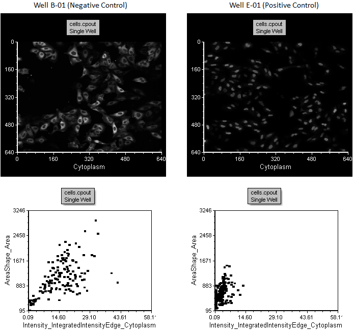
Figure T30.37 Comparison of Negative and Positive Control Wells, B-01 and E-01, in the Left and Right Plots, Respectively
10. Click the Choosing Parameters page tab in the lower left of window.
Notice there are three 2D plots on this page. The "All Cells No Gate" top plot displays the distribution of all cells by plotting Intensity_IntegratedIntensity_Cytoplasm against Intensity_IntegratedIntensity_DNA. On this plot, cells tend to be a loosely clustered distribution (Figure T30.38).
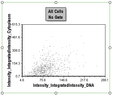
Figure T30.38 All Cells No Gate Dot Plot
11. Click the "All Cells No Gate" plot to select it.
12. Select the Overlays category in the Formatting dialog.
13. Choose Intensity_IntegratedIntensityEdge_Cytoplasm from the X Parameter drop-down list.
The plot should resemble Figure T30.39.
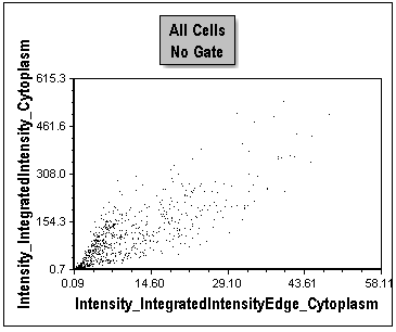
Figure T30.39 Changing X-Axis Parameter
Notice this plot is a distribution of all cells in the first column of the plate. This is optimal for creating gates because of the significant separation of cells throughout positive and negative control conditions. The positive control cells are clustered toward the origin of the plot. We have now identified two parameters that provide good separation of the positive and negative controls. At the onset of protein translocation from the cytoplasm to the nucleus, the outer edge of the cytoplasm changes most rapidly. Thus, comparing the fluorescence of the outer edge of cytoplasm to the whole cytoplasm is a sensitive indicator of the redistribution of the protein toward the nucleus. We will proceed using this combination of parameters for the rest of the tutorial.
Note since the lower two dot plots (Figure T30.40) are displaying cells from the positive control wells only or the negative control wells only, we see very different population distributions. These have been used previously to help define gates for the tutorial.
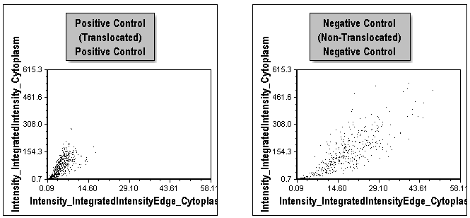
Figure T30.40 Comparison of Distributions for Positive and Negative Control Cells in Left and Right Plots, Respectively
14. Click the Applying Gates page tab.
Notice the picture plots are displayed for both a positive and negative control well with corresponding dot plots below them (Figure T30.41). Gates have been applied to all plots. Events in the red Non-Translocated Cells gate are shown in red, and those in the blue Translocated Cells gate are shown in blue.
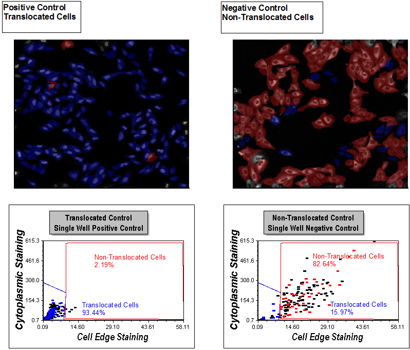
Figure T30.41 Display of Gates on Apply Gates Page
Examine the picture plots. You can see the distinct morphological differences between cells highlighted in blue and red. Review the dot plots. You can see single positive and single negative control well dot plots with gates applied for Translocated Cells and Non-Translocated Cells, respectively. The gating was completed with guidance from viewing distributions in the Choosing Parameters page and reviewing the picture plots to be sure the gates selected for the right morphology on this page. The picture plots are set to highlight cells within the Translocated Cells and Non-Translocated gates as blue and red, respectively. Notice the percentage of cells in each gate is displayed in a text box on each plot. 93.44% of cells are Translocated Cells (blue) in the Positive Control picture plot on the left and only 2.19% cells are Non-Translocated Cells (red). The cells in the Non-Translocated Cells gate still have significant cytoplasmic edge staining and have not translocated, even though they are in the positive control well.
In the Non-Translocated picture plot, 82.64% of the cells reside in the Non-Translocated gate. In the image, they primarily exhibit cytoplasmic staining with an absence of nuclear staining. 15.97% of the cells reside in the Translocated Cells gate. This is the expected behavior for the controls, because the compound driving the translocation can be nearly 100% effective. Since there is always some automatic activation in the negative control condition, the resulting noticeable presence of translocated cells is expected. Using this gating strategy, we can account for the auto-activation in negative controls in subsequent analysis on a cell-by-cell basis. Accounting for these cellular subpopulations can improve the assay quality.
Note: In this example, the Translocated Cells and Non-Translocated gate names are displayed on the dot plots as well as the specific percentage of cells within a gate. This is accomplished easily by using tokens in FCS Express. Tokens are very powerful and allow you to insert a statistic (and many other pieces of information) in a text box either on a page or on plots. Tokens can be used in many locations in a layout to display information from other locations in the layout. The values or text of Tokens update automatically as gates are repositioned or new data sets are loaded. We will not discuss Tokens in detail here. For more information on creating and using tokens, see the tutorial Text Boxes and Tokens or review Using Tokens.
15. Click inside the blue Translocated Cells gate on either 2D plot to select it.
16. Click inside gate and hold mouse button down; while holding the mouse button down, drag the cursor to move the gate a small amount to the right (Figure T30.42).
17. Release the mouse when the gate is in the desired position.
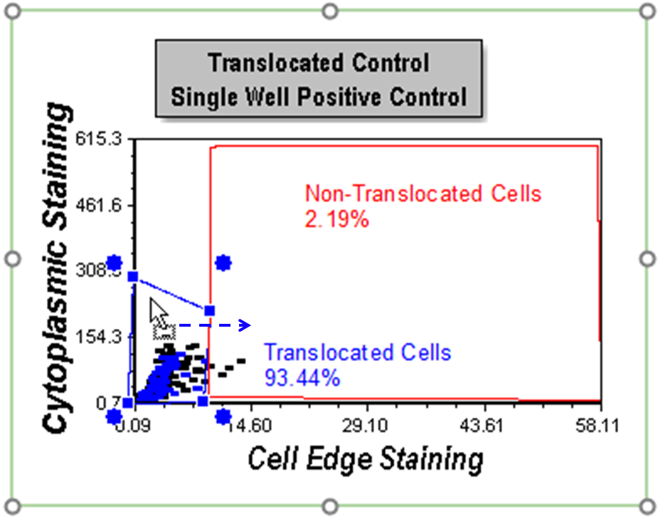
Figure T30.42 Moving the Translocated Cells Gate
Notice the gating display to show the cells in colors updates based on the new position of the gate (Figure T30.43). Any cells not residing in either gate have no color. Note all plots and statistics displayed for gates update. Your layout may not appear exactly at in Figure T30.43 because your gate position change may be slightly different.
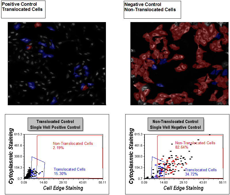
Figure T30.43 All Plots Updated after Moving Translocated Cells Gate
18. Undo the gate repositioning by keying Cmd+Z.
Section 2: Using Data Grids To Create a Cell Gallery View
19. Click the Insert tab→General group→Data Grid command ![]() .
.
20. Click anywhere on the layout where you have space to insert the data grid.
21. Click the Data Grid to select data grid if necessary.
22. Select the General category in the Formatting dialog.
23. Select the Translocated Cells gate from the Gate drop-down list under Data Options (Figure T30.45, blue highlighted text). Observe data grid as a cell gallery updates to show only the translocated cells.
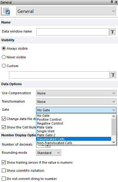
Figure T30.45 Applying Translocated Cells Gate to Cell Gallery
24. Select the Non-translocated Cells gate from the Gate drop-down list under Data Options. Observe the cell gallery updates to show only the non-translocated cells.
25. Select the Parameters to Display category in the Formatting dialog.
26. Select the radio button next to "Only the items checked below" option.
27. Scroll down to the bottom of the parameter list and check the boxes next to Cytoplasm, DNA, and Well options (Figure T30.46).
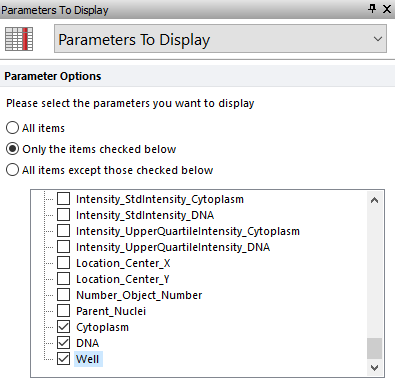
Figure T30.46 Selecting Parameters Displayed to Create a Cell Gallery
The data grid should resemble Figure T30.47. It will be referred to as a cell gallery throughout the rest of this tutorial.
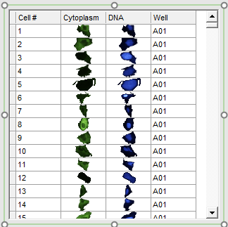
Figure T30.47 Data Grid Configured to Display Cell Images as a Cell Gallery
28. Close the layout and do not save changes.
Section 3: Reviewing an Assay with the High Content Module
29. Open the IntroToImage3.fey layout.
30. Click the Overall Review page tab.
Notice this page is a summary of the entire assay. The Plate Heat Map on the left shows the plate format and the 8 wells of data we have loaded for it (Figure T30.49). There is a dot plot depicting results from well A-01 and the Translocated Cells and Non-Translocated Cells gates. There are picture plots from the same well and a Data Grid with a cell gallery displaying all cells in the well with parametric data. Last, there is a Gate View, which is showing all of the saved gates used in the template. Note some of the gates displayed in the Gate View may not have been used in the examples we have walked through in this tutorial. We will use this page to review the assay as a whole and get a sense of what is happening in each well.
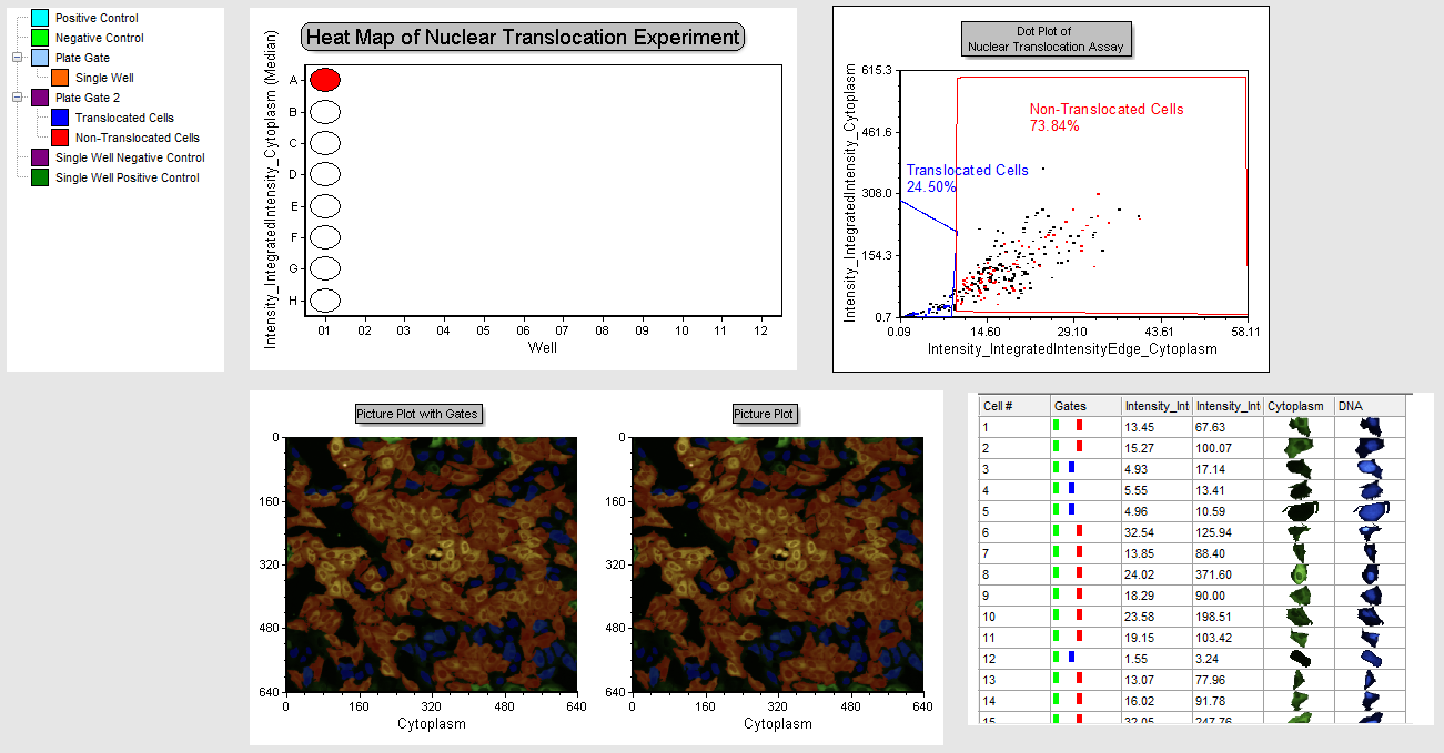
Figure T30.49 Review Page
31. Right-click the plate heat map.
32. Select Edit Gate→Single Well.
Well A01 will be outlined in orange since it is the only well in the "Single Well" gate. You now can click on any well and all plots will update for the selected well. Note if you click on any other plot you will have to repeat the edit gate process to change well displays.
33. Starting with well A01 click on the various wells moving down toward well H01. Observe the changes in the plots.
Give the layout time to update when selecting a well. You will find wells A01-D01 are negative controls and have higher percentage of non-translocated cells. Notice, in the picture plots, most of the cells are red, indicating they are not translocating. In the dot plot, see the large distribution in the plot, and that cells reside in both gates. In the data grid, displaying a cell gallery, you can see in which gates individual cells reside, and the corresponding morphology in their respective images matching their translocated or non-translocated designation.
34. Multiple-select wells E01-H01 and observe the dot plots and picture plots for each well. These are the positive control wells.
Notice the change in the images to predominantly nuclear staining in blue, the dot plot depicts cells clustered predominantly within the positive control gate. The Data Grid with a cell gallery indicates translocated morphology with staining predominantly in the nucleus. The gate display in the data grid indicates all cells in the positive control gate. It is easy to review your data for the whole plate in this layout page and view analytical results combined with images and other relevant information from the original data all in one place!
35. Close the layout without saving changes.
