Gates Heat Maps
The Gates Heat Map plot type allows you to quickly compare gated populations across data files in a convenient visual format, without the requirement of having plots for each data file inserted on your layout. Unlike regular Plate Heat Maps, which only graph data files from multi-well plates, Gates Heat Maps can graph data from all data files, regardless of whether they were acquired in plate format.
To insert a Gates Heat Map plot, choose the Insert tab→ Other Plots→ Gates Heat Map command, and click once on the layout where you want the plot to be inserted. Any default 2D-plot statistic for the gates may be shown in a Gate Heat Map. Below is an example where statistics for four different gates ("CD4", "CD8", "blasts", and "lymphs"), for CD16+56 PE-A median and % of parent, are being compared across data files, in the Gates Heat Map plots at left and right, respectively (Figure 5.73).

Figure 5.73 Examples of Gate Heat Maps (top) showing different statistics for multiple datafiles, and the original plots on which the gates were drawn (bottom).
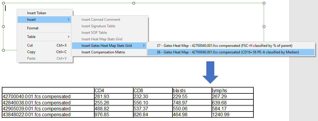
A Gates Heat Map Stats Grid may be inserted for any Gates Heat Map on the layout by right-clicking inside a Text Box, and selecting
Insert from the pop-up menu→ Insert Gates Heat Map Stats Grid→ and selecting the Gates Heat of interest (Figure 5.74). The Stats Grid contains the parametric or %-gated value for each cell that was chosen by the user in Gates Heat Map Overlays.

Figure 5.74 Inserting a Gates Heat Map Stats Grid inside a Text Box.
Many of the formatting features in regular Heat Maps are available for Gates Heat Maps, and these are detailed in the following sections:
