Formatting Scatter Plots with Regression
Scatter with Regression plots in FCS Express are fully formattable. In addition to the formatting options shared by all plots (e.g., border, size, background, axis, titles, and legend), special formatting options are accessible from the Overlays category.
Overlay formatting options for Scatter with regression plots, either:
•Select the Scatter Plot or Scatter Plot with Regression and use the Format tab→Plot Options→Overlays command, or
•Right-click on the Scatter Plot or Scatter Plot with Regression, select Format from the pop-up menu, and choose the Overlays category.
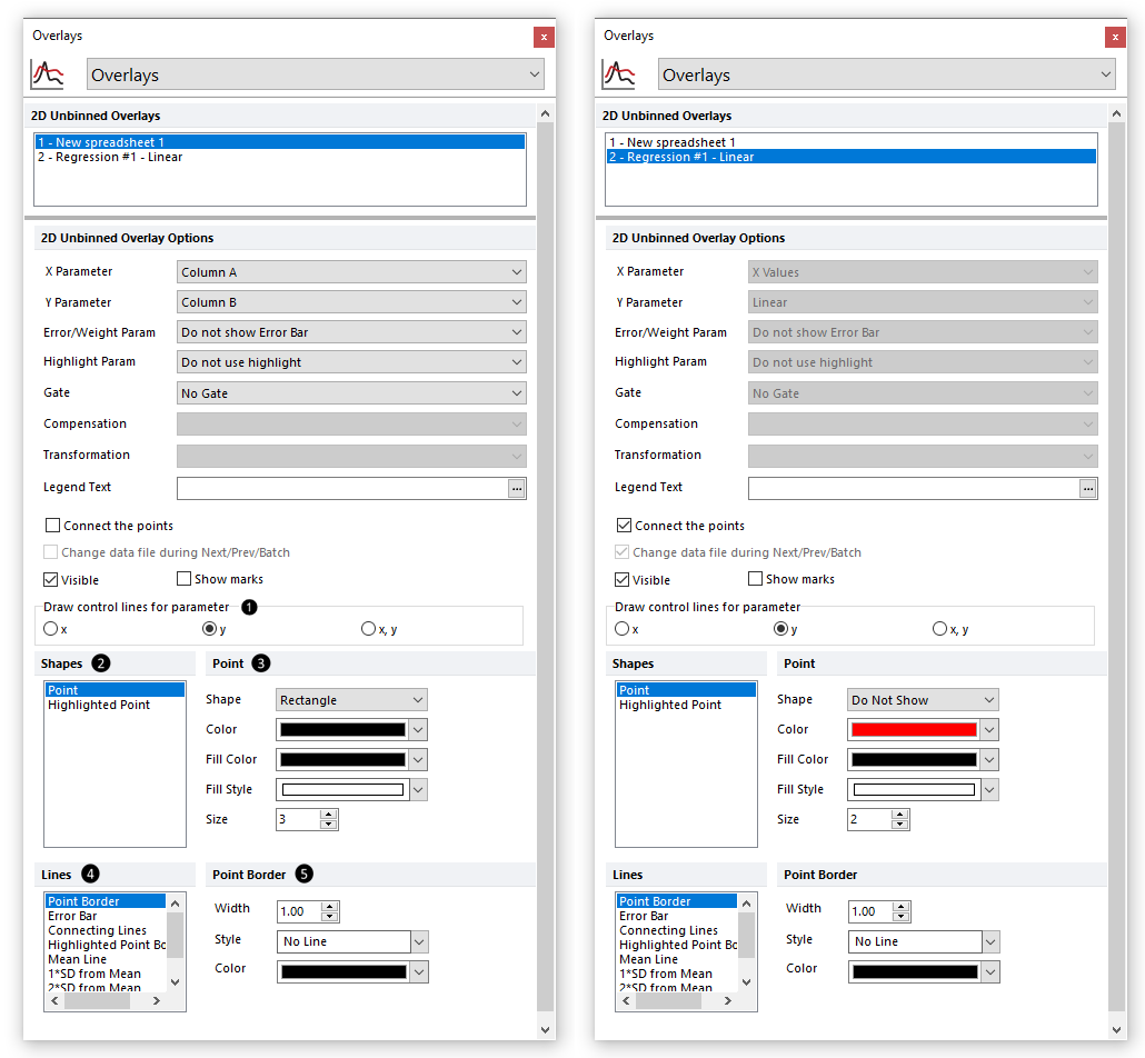
Overlay formatting options for Scatter with Regression plots allow to customize the appearance of both the data (i.e., Overlay 1, ![]() in Figure 5.265) and the regression (i.e., Overlay 2,
in Figure 5.265) and the regression (i.e., Overlay 2, ![]() in the figure below).
in the figure below).

Figure 5.263 Special formatting options for Scatter with Regression Plots
The formatting options are described in the table below.
Option |
Explanation |
|---|---|
X Parameter |
The parameter (column) from the Spreadsheet displayed on the X axis. |
Y Parameter |
The parameter (column) from the Spreadsheet displayed on the Y axis. |
Error/Weight Param. |
The parameter (column) from the Spreadsheet that has to be used to draw the error bars and to calculate the weights for the regression. Note, if an Error/Weights parameter is selected, a weighted regression will be performed. The values reported in this column of the spreadsheet (let's call it error for the sake of simplicity) will be directly used to draw the error bars. Said values will then be transformed with the following formula to calculate the weights for the regression:
Weights used for the regression = 1 / error2
For the sake of simplicity, if the Error/Weights Bar Parameter contains the following values "a, b, c, d,..." the weights that will be used to perform the weighted regression will be "1/a2, 1/b2, 1/c2, 1/d2,...". See below for more information on how to define the error bars. |
Highlight Param. |
The parameter (column) from the Spreadsheet from which the highlighting rule derives. Points will be highlighted (e.g., the orange point in the plot below) in the color defined in the Highlight Color drop down menu if their value meets the criterion defined by the Highlighting rule. See below for more information on how to define a highlighting rule. |
Gate |
The gate that is applied to the Scatter with Regression Plot. |
Legend Text |
The text that will appear in the plot legend beside the symbol for the overlay. |
Connect the points |
Whether the points are connected by a line. |
Change data file during Next/Prev/Batch |
Whether the Scatter with Regression Plot changes during batch processing or in response to a Next/Previous command. It is generally recommended to leave this unchecked (default), as the Scatter with Regression Plot will update automatically as the data to which it refers is changed. |
Visible |
Hides overlays without removing them. Select the overlay file from the 2D Unbinned Overlays list and uncheck Visible. Check Visible to show the overlay again. |
Show marks |
Displays the value of the points as text directly above the points. |
Draw control lines for parameter |
Select which parameter(s) to draw the control lines. Control lines can be drawn for the X parameter, Y parameter, or both X & Y parameters simultaneously. Available control lines, and their formatting options, are listed in |
Shapes |
Allows to select which shape to format with the formatting options available in Available shapes are: •Point •Highlighted point (see the Highlight Param. option above) |
Formatting options for selected shape |
The title and the content of this section update accordingly to the selection made in. In the picture above, "Point" is selected in •Shape. Choose between rectangle (default), triangle, circle, cross, star, hexagon, and diamond options. •Color. •Fill Color. •Fill Style. •Size.
|
Lines |
Allows to select which line to format with the formatting options available in Available lines are: •Point border •Error bar •Connecting lines •Highlighted Point Border •Mean Line •1*SD from mean •2*SD from mean •3*SD from mean
Note: the latter four lines are the control lines to which applies the Draw control lines for parameter option above ( |
Formatting options for selected line |
The title and the content of this section update accordingly to the selection made in. In the picture above, "Point Border" is selected in •Width. •Style. •Color.
Note: Connecting Lines option includes an option to Use color from Point Options. When this option is selected, the color selected in the Color drop-down menu ( |
To add Error/Weight bars or Highlighting to a Scatter Plot, these values must be entered into columns in the Spreadsheet.
To define values for the Error/Weight bars,
1.Go to an empty column of the Spreadsheet
2.Enter the value of the error for each row (each row corresponds to an individual bar). This value may be freetext or a custom token.
3.Choose the appropriate Spreadsheet column for the Error/Weight Param. drop-down menu (see above).
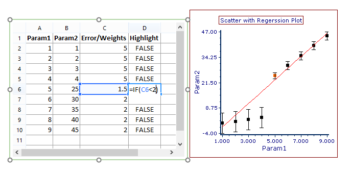
An example of a Scatter Plot with Error/Weight bars and its associated Spreadsheet is shown in the figure below.
To define a Highlighting rule,
1.Go to an empty column of the Spreadsheet
2.Enter the value of the rule for each row (each row corresponds to an individual point). The rule must be a formula evaluating to "TRUE" or "FALSE"; if "TRUE," the point will be highlighted with the color defined in ![]() ,
, ![]() ,
, ![]() and
and ![]() above. An example of a Highlighting rule referring to a cell within the Spreadsheet is shown below in Figure 5.266.
above. An example of a Highlighting rule referring to a cell within the Spreadsheet is shown below in Figure 5.266.
3.Choose the appropriate Spreadsheet column for the Highlight Param. drop-down menu (see above).
An example of a Scatter with Regression Plot with Highlighting and its associated Spreadsheet is shown in the Figure below.

Figure 5.264 Scatter with Regression Plot and associated Spreadsheet with Error Bars and Highlighting
Note: Scatter with Regression Plot Axis titles may be defined:
•directly in the Spreadsheet by using the column header (this require to check the Use values in a first row as labels option in the Spreadsheet Formatting dialog).
•in the Axes category of Formatting options.
