Creating the Layout
In the course of this example, we will:
•Create a layout to use for our panel.
We now will proceed to create a layout for the analysis of our experiment using the panel we created. We will be using plots and gates. Please refer to previous tutorials for more information on inserting plots, formatting plots, and using gates.
Using the layout we started in the previous section, Setting Up the Panel, we will create four plots for our first set of samples.
1.Open the Data List window if it is not already open.
2.Select the first two files from the list (click on the first file, press the Ctrl or Shift key and click on the second file).
3.Drag the selected files by the file name from the Data List and release the mouse button onto the white space of the layout.
The Select Plot Types… dialog will now resemble Figure T11.13.
4.Check the Color Dot option and confirm all other plot types are unchecked (Figure T11.13, blue highlighted text).
5.Check the Use this selection for all files option (Figure T11.13, red outline).
6.Click OK (Figure T11.13).
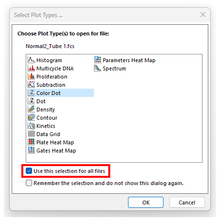
Figure T11.13 Select Plot Types... Dialog
7.Click and drag plots by red outline to position in a column with plot displaying Normal2_Tube1.fcs compensated at top on left side of white space.
8.Click to select the plots by holding down the Ctrl button on the keyboard and click each plot. Alternatively, click and hold the mouse button down and drag a box that encompasses all four edges of both plots, or select the Home tab→Editing group→Select All command. You also may use Ctrl +A to choose both plots.
9.Click Home tab→Editing group→Align command→Position Objects category→Align (Figure T11.14, red outline). This tool will help align and distribute your objects by arranging them according to the first object that was selected in step 8.
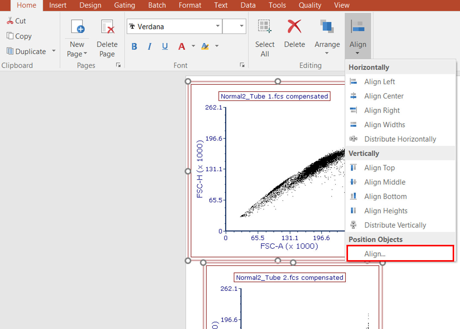
Figure T11.14 Aligning Plots
The Alignment window will appear (Figure T11.15).
10. Under the Horizontal column, select Left Sides. Under the Vertical Column, select No Change.
11. Click OK.
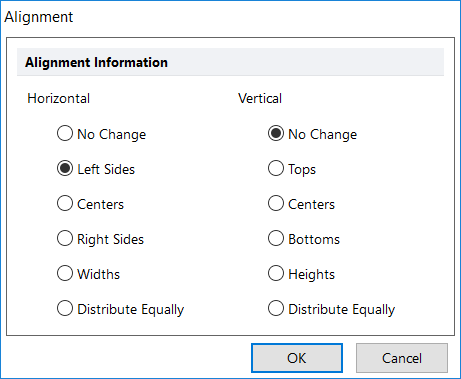
Figure T11.15 Aligning Plots on the Left Side
12. Select the plots. Right click them and select Duplicate. (Figure T11.16, blue highlighted text).
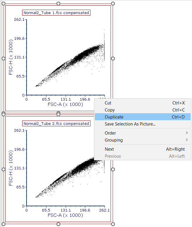
Figure T11.16 Duplicating Plots
The duplicated plots will appear.
13. Rearrange the duplicated plots by placing them to the right of the original plots.
14. Use the Align tool if needed.
The page of the layout should now resemble Figure T11.17. For more information on manipulating objects in FCS Express, please refer to the Using Objects tutorial.
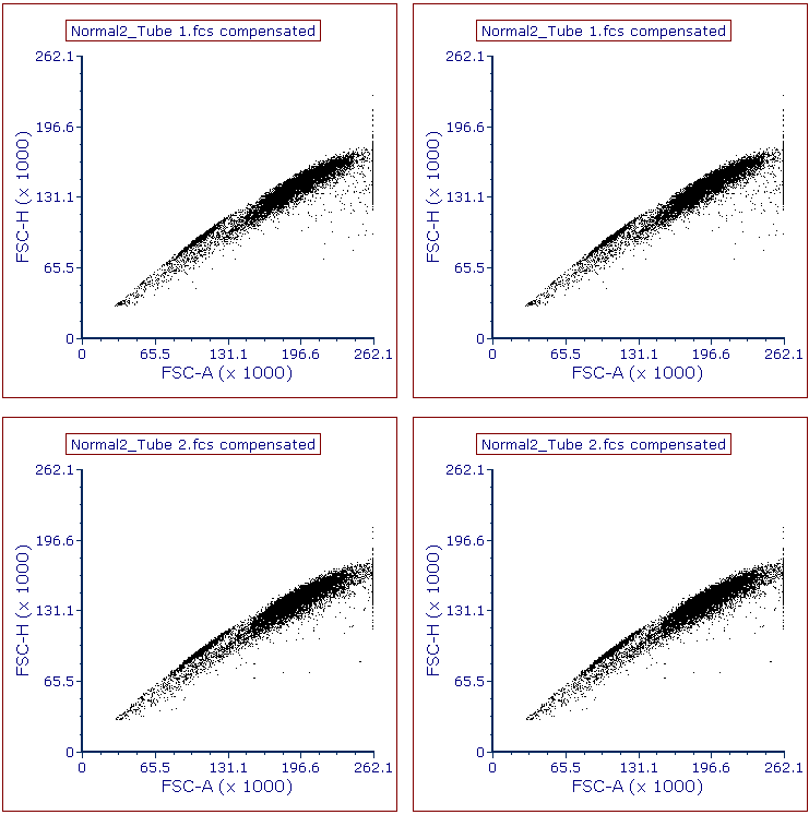
Figure T11.17 Plots Arranged on Page
We will now adjust the X and Y axis parameters, create gates, create statistics and create a Histogram to which we will add an overlay.
16. On the 1st plot in the upper left corner, click on the X axis label and choose V-500-A. Click on the Y axis label and choose SSC-A.
17. On the 2nd plot in the upper right corner, click on the X axis label and choose V450-A. Click on the Y axis label and choose PerCP-Cy5-5-A.
18. For the 3rd plot, in the lower left, set the X axis to APC-H7-A and the Y axis to V450-A.
19. For the 4th plot in the lower right, set the X axis to APC-A and the Y axis to PE-A.
20. The layout should resemble Figure T11.18.
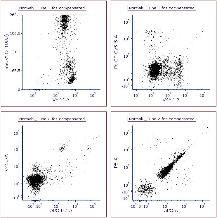
Figure T11.18 Plots after Changing Parameters on X- and Y- Axes
We will format the titles of the plot to display the Current Gate for that plot.
21. Click upper left plot to select it.
22. Click Format tab→Title command.
23. Click inside edit box to place cursor after grey highlighted text, which will resemble "Keyword: $FCSE_FILENAMENOPATH for plot text box is on (#2), overlay #1)."
24. Key Enter/Return key to create a second line of text if necessary.
25.Click Insert Token button (Figure T11.19, red outline).
26.Select Current Gate from the drop-down list (Figure T10.19, blue highlight).
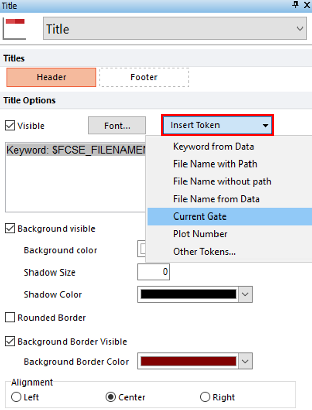
Figure T11.19 Selecting Current Gate Token for Plots' Titles
27.Repeat steps 21, 23-26 for remaining three plots.
Plots should resemble Figure T11.20.
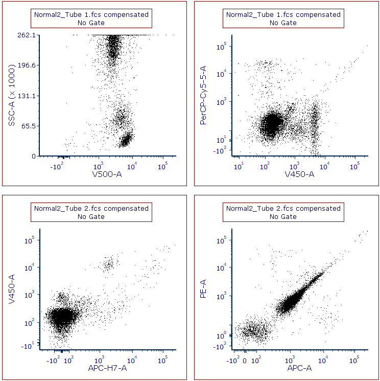
Figure T11.20 Plots Displaying File Name and Current Gate Tokens in Titles
We will now create gates. On the SSC/V500-A plot, we will create a polygon gate around the lymphocytes.
28. Click Gating tab→Create Gates group→Polygon command. Click on plot to place vertices of gate around the lymphocytes.
29. Click on first vertex or key space bar to create gate.
30. In Create New Gate dialog, enter Lymphs in Create a new gate named field (Figure T11.21, red outline).
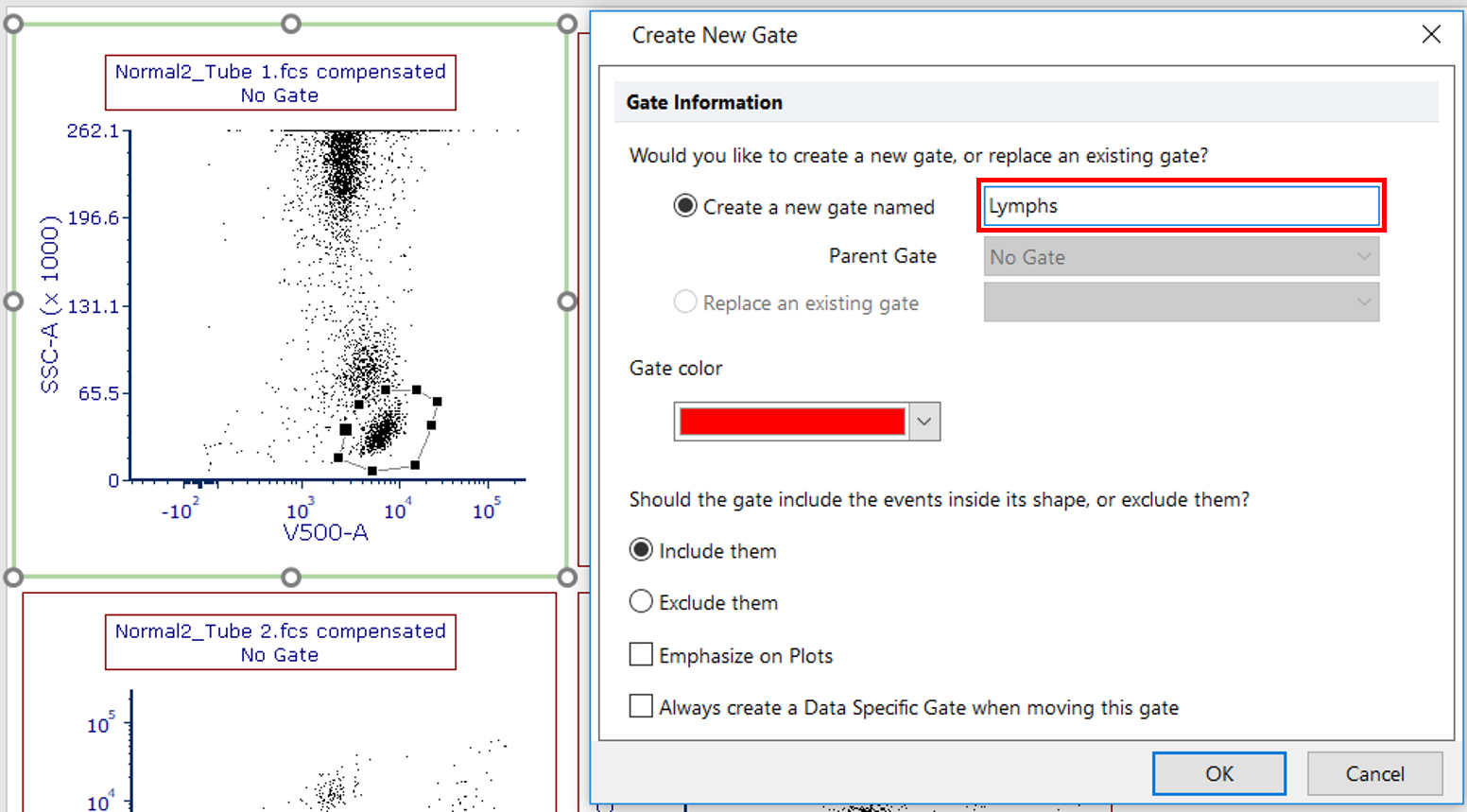
Figure T11.21 Creating and Naming Lymphs Gate
31. We will apply the Lymphs gate to the 2nd plot in the upper right by dragging and dropping the Lymphs gate on top of the 2nd plot. The Before and After is below (Figure T10.22).
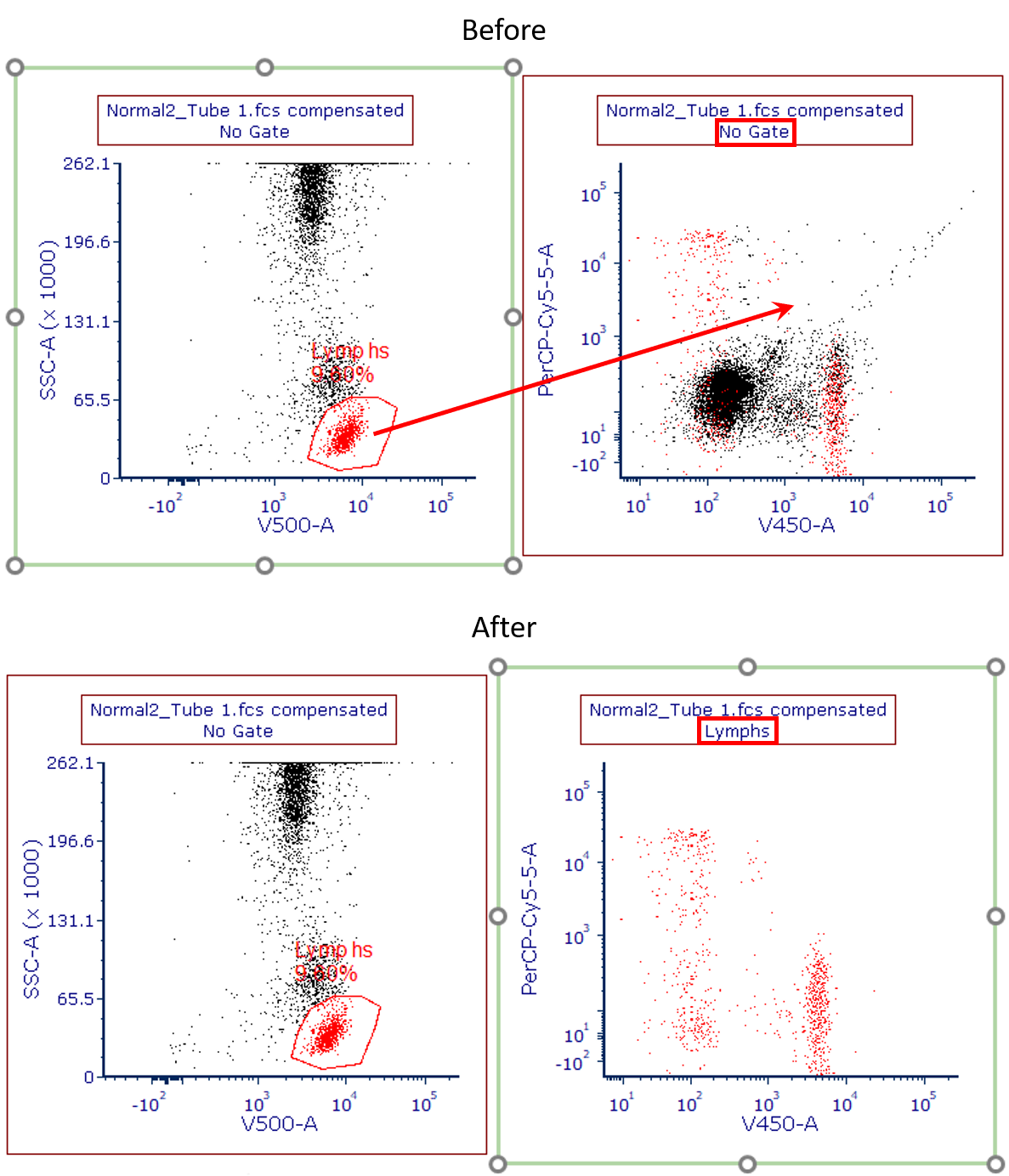
Figure T11.22 Before (upper) and After (lower) Dragging and Dropping the Lymphs Gate
32. Select the 2 plots at the bottom of the page. Click Gating tab→Current Gate drop down list→Lymphs (Figure T11.23).
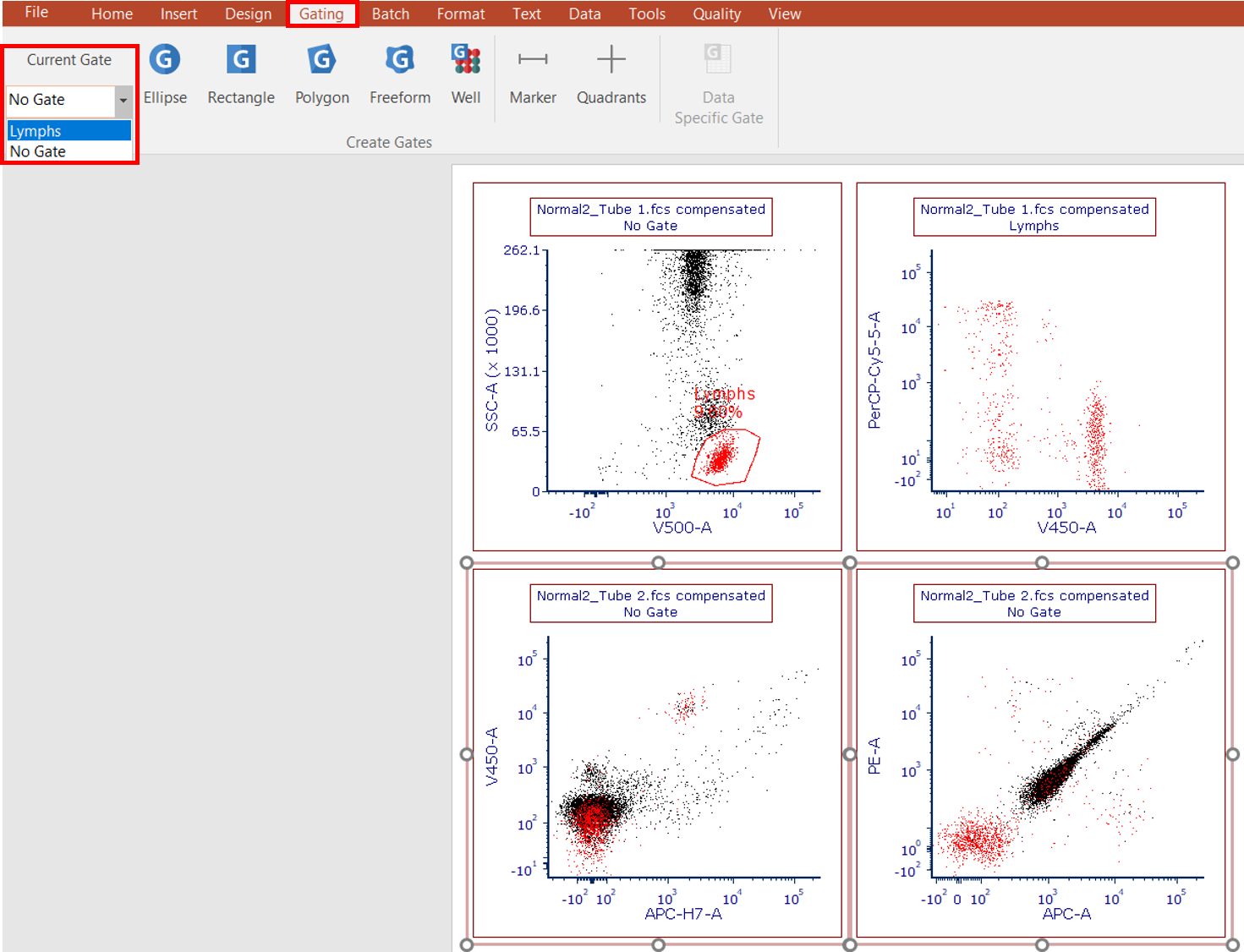
Figure T11.23 Applying Lymphs from the Current Gate Dropdown on Ribbon to Lower Two Plots
33. On the lower left plot, create a Rectangle gate around the cluster of cells that are APC-H7/V450 dual positive.
34. In Create New Gate dialog, name the gate Cells of Interest and click OK.
35. Drag and drop the Cells of Interest gate from the lower left plot to the lower right plot.
36. Multiple-select the top two plots
37. In the Formatting dialog docked to the right of layout, choose Gates to Display category.
38. Select Only the gates checked below option (Figure T11.24, red arrow).
39. Check box next to Lymphs (Figure T11.24).
40. Select the option Only if the gate was create on a plot showing the same data file as this plot (Figure T11.24, red outline).
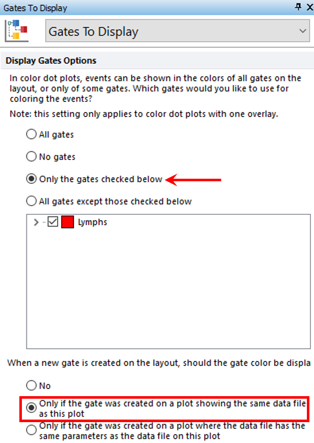
Figure T11.24 Editing the Gates to Display
41. Your layout should resemble Figure T11.25.
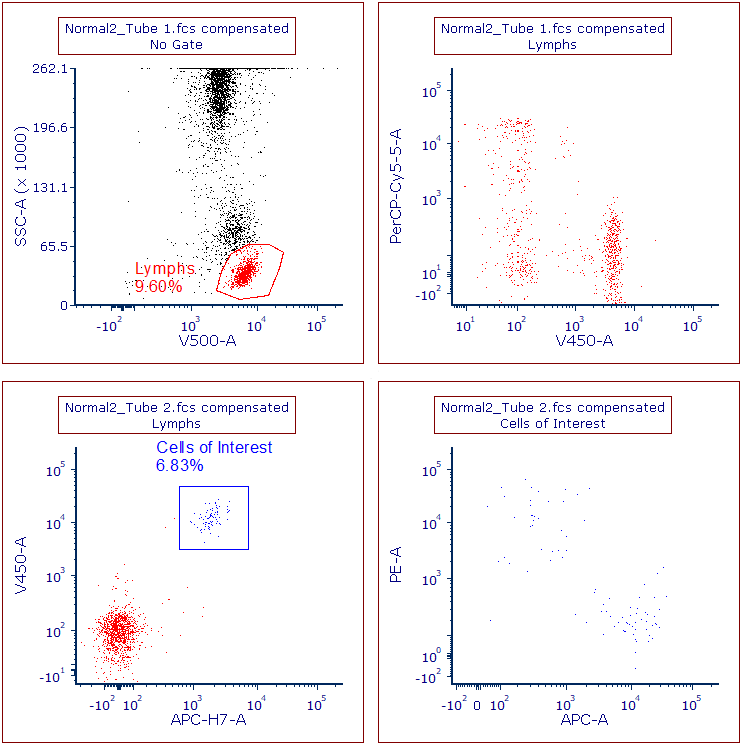
Figure T11.25 Layout After Editing Gates to Display
We will now add Quadrants to the upper right and lower right plots.
42. Click Gating tab→Create Gates group→Quadrants command; then, click on the V450 vs PerCPCy5.5 (upper right) plot. Quadrants can be moved by clicking on the central vertex of the quadrant and moving it to the desired position.
43. Repeat step 42 for the APC vs PE (lower right) plot.
44. Your layout should resemble Figure T11.26.
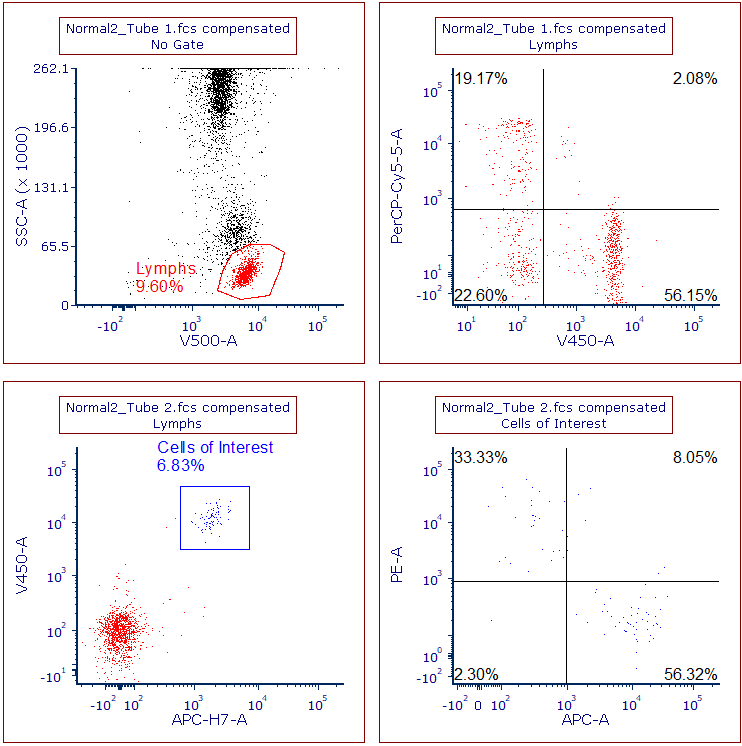
Figure T11.26 Layout after Creating Quadrants on Upper and Lower Right Plots
We now will add quadrant statistics for the 2 plots that contain quadrants.
45. Right-click the V450 vs PerCP-Cy5.5 (upper right) plot and click Statistics→Quadrant Statistics from pop up menu (Figure T11.27).
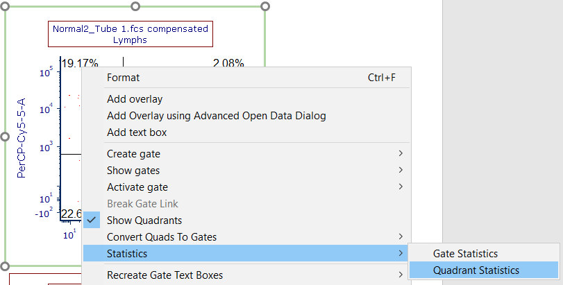
Figure T11.27 Accessing Quadrant Statistics for Plot
46. Click on statistics grid.
47. In Formatting dialog, select Statistics category if necessary, check boxes only next to Gate, # of Events, % of Gated Cells, and % of All Cells (Figure T11.28, red outlines), and click OK.
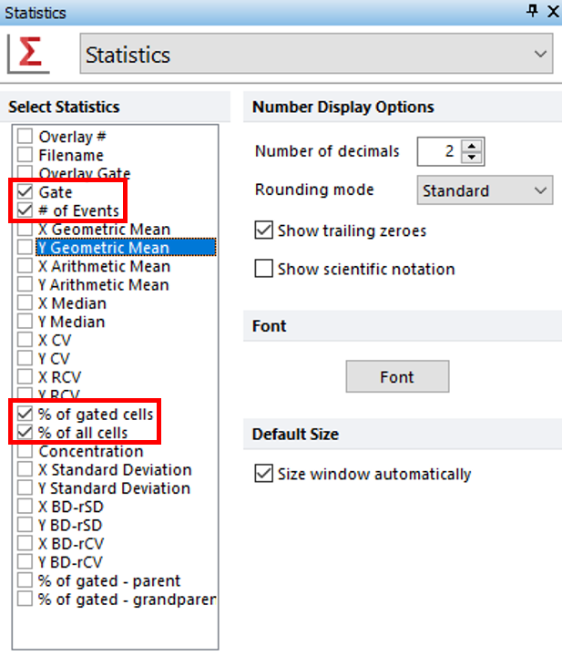
Figure T11.28 Formatting Statistics
48. Repeat steps 45-47 for the APC vs PE (lower right) plot.
49. You can also edit the FCS Express User Options to reflect these changes, so each element does not need to edited manually for every analysis.
We now will add another page and add a 1D histogram to this page.
50. Click the Home tab→Pages group→New Page command. We also can add a new page by selecting the "+" sign next to the Page 1 tab at the bottom of the layout (![]() ).
).
51. On Page 2, drag and drop the second tube of the first iteration (Normal2_Tube2.fcs) from the Data List to the blank, white space.
52. In Select Plot Types... dialog, check box only next to Histogram and click OK.
53. Change the X axis to PE-A and change the Current Gate to Lymphs.
54. Right-click the histogram and select Add Overlay using Advanced Open Data Dialog (Figure T11.29).
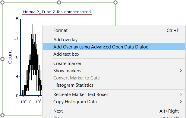
Figure T11.29 Adding an Overlay
55. In the Advanced Open Data File window, click the Data List tab and choose the second file: Normal2_Tube2.fcs. Click OK (Figure T11.30).
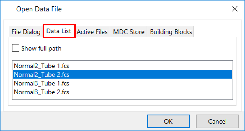
Figure T11.30 Selecting a Data File for Overlay
56. In the Add Overlay(s) dialog for the Parameter section, select APC-A. If not already chosen, select the Lymphs gate. Click OK (Figure T11.31).
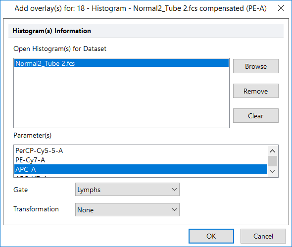
Figure T11.31 Adding Overlay
57. Your histogram should look similar to Figure T11.32.
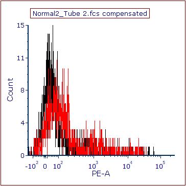
Figure T11.32 Histogram with Overlay
58. At this point, we will save the layout. Click File tab and select Save As. Once you have chosen a location where you can save your layout, choose Layout Files (with unlinked data) for the Save as type: field (Figure T11.33, blue highlighted text). This will save your layout as an empty template, remembering only plots, gates, and other existing objects, except for data files. Click Save.
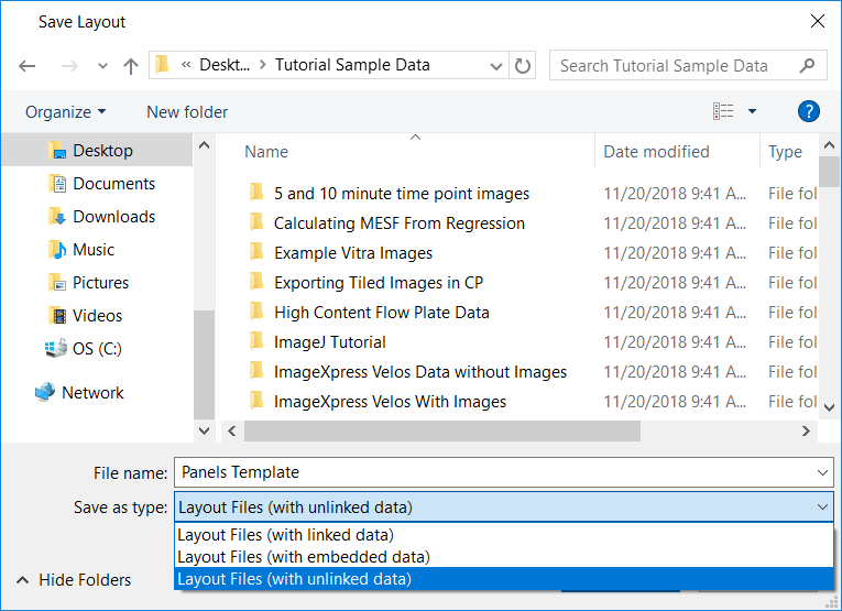
Figure T11.33 Saving Layout Unlinked
59. Close the layout.
In the next section, we will use the panel.
