Working with Spectrum Plots
In this section, we will now learn how to insert, format, and overlay Spectral plots with Cytek Aurora data files. We will use data that has already been loaded into an existing layout so you can focus on the features of spectrum plots. If you are new to FCS Express, please see the previous section of the tutorial for Loading Data and Creating Plots, Gates, and Statistics before you begin.
We will now learn how to insert, format, and overlay Spectral plots.
1. Open the Cytek Tutorial Part 2.fey layout from the "Cytek spectral data analysis" folder within the Tutorial Sample Data archive.
2. Choose the Insert tab→ Special Plots→ Spectrum command  from the Ribbon.
3. Click on a blank spot of the layout to insert the Spectrum plot. Like other plots in FCS Express, this is an object and as such, may be moved around and resized.
4. Change the x-axis to the Violet \ Blue \ Red-A parameter. The plot will now appear as shown in Fig. T34.17.
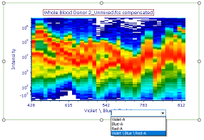
Fig. T34.17. Changing the axis parameter on the Spectrum plot
5. Double-click on the newly inserted Spectrum plot to bring up the Formatting dialog.
6. Choose Specific Options from the Category dropdown menu (Fig. T34.18, ![]() ).
).
7. Check the Interpolate Values box (Fig. T34.18, ![]() ).
).
8. Enter "8" or a similar value in the Interpolation Points field (Fig. T34.18, ![]() ).
).
The plot will now have a smoother appearance (Fig. T34.18, left) due to the graphical interpolation of points between each detector channel.
Note: Choosing a large number of interpolation points is computationally intensive, so use only the minimum required to achieve the desired plot appearance.
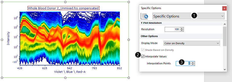
Fig. T34.18. Interpolating values on a Spectrum plot to achieve a smoother appearance
When inserting a Spectrum plot, the Display Mode defaults to Density as shown above. We will now explore the alternative Display Mode.
9. Click on the border of the plot so that it appears selected with a red border.
10. Press Ctrl+D on your keyboard to duplicate the plot. Move the new plot below or next to the original plot so that they do not overlap.
11. Click on the new plot to select it.
12. Choose "Color on Gated/Overlays" from the Display Mode dropdown menu of the Formatting dialog→Specific Options (Fig. T34.19, ![]() ) that you opened in Step 5.
) that you opened in Step 5.
The plot will now appear in as many colors as are defined for gates in the layout; spectra belonging to each gate are assigned that gate's color.
13. Check the Shade Based on Density box (Fig. T34.19, ![]() ). The plot will now appear as in Fig. T34.19, where areas of high event density are shaded in white.
). The plot will now appear as in Fig. T34.19, where areas of high event density are shaded in white.
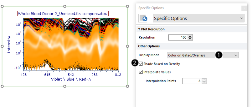
Fig. T34.19. Changing the Display Mode to Color on Gated/Overlays
We will now choose to show only colors from the gate(s) of interest on the plot.
14. Choose Gates to Display from the Formatting Category dropdown menu (Fig. T34.20, ![]() ).
).
15. Choose the Only the gates checked below radio button (Fig. T34.20, ![]() ).
).
16. Expand the gates by clicking on the down arrow next to lymphocytes.
17. Check the "CD3+" box. The plot will now appear as in Fig. T34.20, where the spectra belonging to the "CD3+" gate appear in green. The spectra from these events are easier to see now that colors from gates with more abundant events are no longer being displayed.
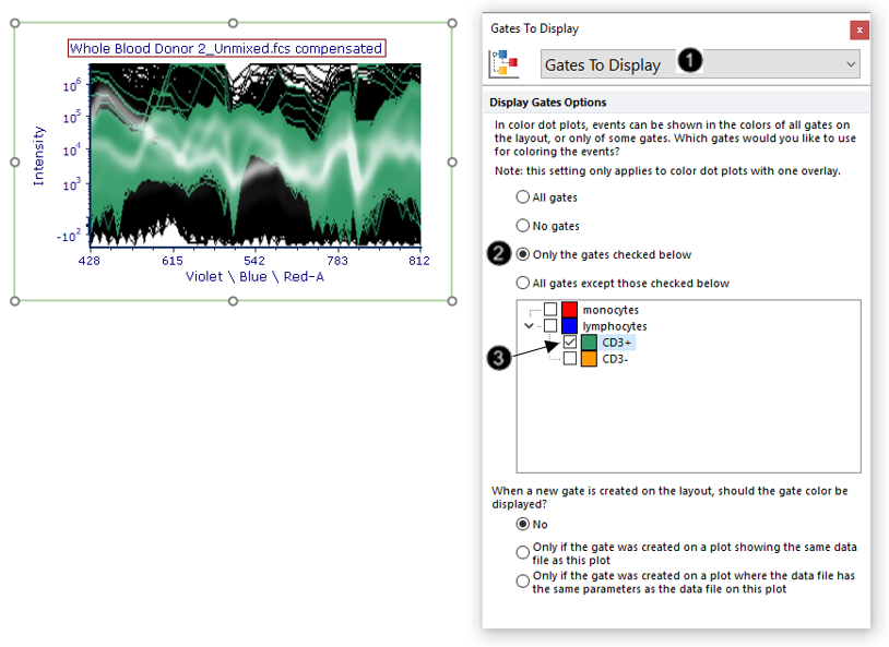
Fig. T34.20. Formatting the Gates to Display to show colors only from the gate of interest
We will now choose to show only the average of all spectra, as opposed to the current setting of all spectra.
18. Choose Overlays from the Formatting Category dropdown menu (Fig. T34.21, ![]() ).
).
19. Choose "Average" from the Overlay to show dropdown menu (Fig. T34.21, ![]() ). The plot will now appear as in Fig. T34.21, where all spectra have been averaged into one line.
). The plot will now appear as in Fig. T34.21, where all spectra have been averaged into one line.
Note: The line appears smooth due to the interpolation added in Steps 7-8. You may uncheck the Interpolate Values box if you wish to display the data as it was acquired in discrete detector channels.
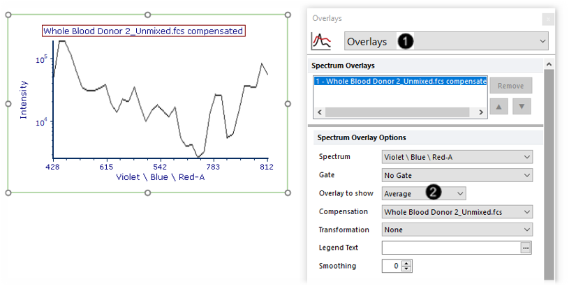
Fig. T34.21. Showing the average of all events on the Spectrum plot
We will now add an overlay on the Spectrum plot to compare two gated populations from the same datafile.
20. Drag and drop the second filename from the Data List (Whole Blood Donor 2_Unmixed.fcs) to the Spectrum plot (Fig. T34.22, ![]() ) pictured in Step 19 above.
) pictured in Step 19 above.
21. Choose add the files to the plot as new overlays from the Select Drag and Drop Action pop-up window (Fig. T34.22, ![]() ).
).
22. Click OK (Fig. T34.22, ![]() ).
).
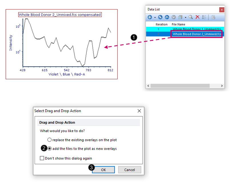
Fig. T34.22. Creating an overlay on the Spectral plot
23. Select both overlays in the Spectrum Overlays list box in the formatting dialog (Fig. T34.23, ![]() ).
).
24. Choose "Average" from the Overlay to show dropdown menu (Fig. T34.23, ![]() ). If Average is already selected, drop the window down and select it again to apply the choice.
). If Average is already selected, drop the window down and select it again to apply the choice.
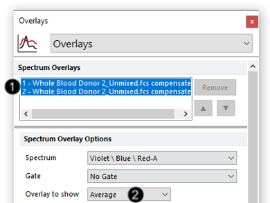
Fig. T34.23. Showing the average of all spectra on both overlays
25. Select the first overlay in the Spectrum Overlays list box (Fig. T34.24, ![]() ).
).
26. Choose "CD3+" from the Gate dropdown menu (Fig. T34.24, ![]() ).
).
27. Select the second overlay in the Spectrum Overlays list box (Fig. T34.24, ![]() ).
).
28. Choose "CD3-" from the Gate dropdown menu (Fig. T34.24, ![]() ).
).
The plot will now appear as shown in Fig. T34.24, bottom.
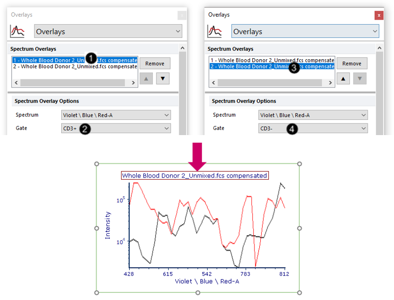
Fig. T34.24. Gating the two overlays for comparison of the "CD3+" and "CD3-" populations
We will now format the plot to display the Legend.
29. Select both overlays in the Spectrum Overlays list box (Fig. T34.25, ![]() ).
).
30. Click on the ellipsis beside the Legend text field (Fig. T34.25 ![]() ).
).
31. Choose Gate from the dropdown menu (Fig. T34.25, ![]() ).
).
32. Choose Legend from the Formatting Category dropdown menu (Fig. T34.25, ![]() ).
).
33. Check the Visible box (Fig. T34.25, ![]() ).
).
The plot will now appear with a Legend as shown in Fig. T34.25, bottom. The Spectrum plot will update in real-time as you move your gates, like any other plots in FCS Express. Try adjusting the "lymphocytes", "CD3+", or "CD3-" gates to see.
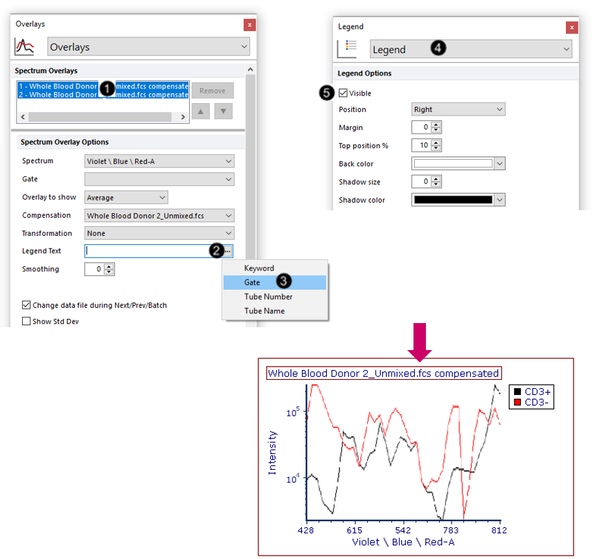
Fig. T34.25. Adding a legend to the Spectrum plot
Note: You may also create an overlay of both files. Though we will not perform the multiple file overlay workflow in this tutorial, the general procedure is to insert a new Spectrum plot and then drag and drop the other file from the Data List to this new plot to add a new overlay.
We saw above how to apply gates that were defined on a standard 2D plot to a Spectrum plot. We will now do the reverse: creating a gate on a Spectrum plot and applying it to a standard 2D plot. Learn more about bidirectional gating and backgating of spectral data in FCS Express.
34. Choose the Gating tab→ Create Gates→ Rectangle command from the Ribbon.
35. Use the mouse to click-drag on the Density-style Spectrum plot you made in Steps 2-4 to draw a gate around the population shown below (Fig. T34.26).
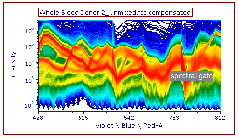
Fig. T34.26. A "spectral gate" drawn on the Spectrum plot
36. Name the gate "spectral gate" in the Create New Gate dialog window.
37. Click OK.
We will now apply the "spectral gate" created in the steps above, to the three standard 2D density plots at the top of the layout.
38. Select the three standard 2D density plots at the top of the layout by Ctrl+Clickthem, or by click-dragging your mouse cursor around them (Fig. T34.27, ![]() ).
).
39. Choose "spectral gate" in the Gating tab→ Create Gates→ Current Gate dropdown menu from the Ribbon (Fig. T34.27, ![]() ; Note - Additional icons from the Gating tab ribbon have been removed to create this image).
; Note - Additional icons from the Gating tab ribbon have been removed to create this image).
Notice that these three plots are now displaying a subset of their original events which corresponds to the "spectral gate". As you move this gate around, the three plots will update accordingly in real time on your layout. Note - Additional icons on the Gating tab ribbon have been removed to create this image
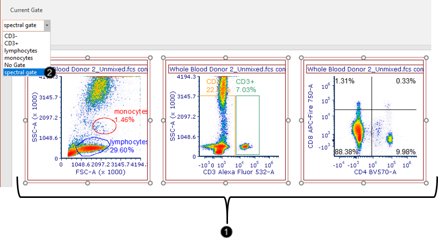
Fig. T34.27. Applying the spectral gate to standard 2D plots on the layout
We will now export the layout as a PDF file.
40. Choose the Batch and Export tab→ Single Export→ Export as PDF command.
41. Choose a destination directory and filename (Fig. T34.28, ![]() ).
).
42. Click OK (Fig. T34.28, ![]() ).
).
The PDF file will be generated and will exactly resemble your FCS Express layout.
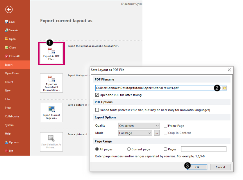
Fig. T34.28. Exporting the layout as a PDF file
As you continue to analyze your own Cytek Aurora spectral data files, make sure to contact support@denovosoftware.com if you need help. Please also see our full suite of Cytek spectral data resources on the De Novo Software website at https://denovosoftware.com/about-us/partnerships/partnership-cytek/cytekfcsexpress/.
