Loading Data and Creating Plots, Gates, and Statistics
In this section, we will create a standard flow cytometry data analysis workflow with Cytek Aurora data files. We will load data into the layout, create plots, gates, statistics, and batch process the results to PowerPoint. The following section of the tutorial is meant to help familiarize yourself with the standard flow cytometry analysis tools in FCS Express. Please jump to the Working with Spectrum Plots tutorial section if you are already familiar with FCS Express and would like to learn more about working directly with spectral data sets and spectrum plots.
To begin:
1. Open a new layout in FCS Express by clicking New Layout on the Startup Screen or by choosing the File tab→ New→ New command from the Ribbon.
2. Access the Data List via the Batch & Export (or Data) tab→Organize Data Sets→Data List command to bring up the Data List window. The Data List is a dockable window.
3. Drag and drop the two unmixed data files (files ending with the suffix "_Unmixed" from the tutorial sample data→Cytek spectral data analysis folder in Windows File Explorer or Mac Finder to the Data List, or use the blue plus (![]() ) to add them to the Data List (Fig. T34.2, top). When the files have been added, they will be visible in the Data List window (Fig. T34.2, bottom).
) to add them to the Data List (Fig. T34.2, top). When the files have been added, they will be visible in the Data List window (Fig. T34.2, bottom).
Note: In this tutorial we will be working with files generated from SpectroFlow 1.0 software. If your data files are generated by SpectroFlow 2.0 or greater please also see our additional information regarding the file structure for accessing unmixed data sets when working with your own data.
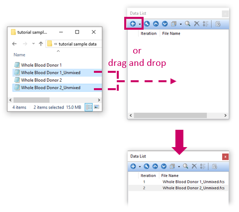
Fig. T34.2. Adding files to the Data List
4. Drag and drop the first filename from the Data List to the blank page on the layout. A Select Plot Types... dialog window will appear (Fig. T34.3).
5.
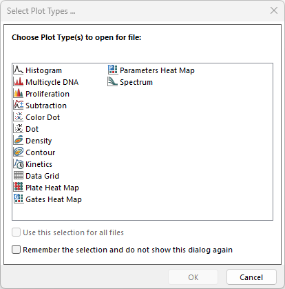
Fig. T34.3. The Select Plot Types dialog window
6. Check "Density" from the list of choices.
7. Click OK. A new plot will have been inserted on the layout. This plot is an object in FCS Express and as such, may be moved around and resized.
8. Click on the X- and Y-axes to change the parameters to FSC-A and SSC-A, respectively (Fig. T34.4).
9.
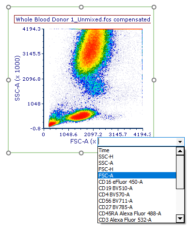
Fig. T34.4. Changing the plot axis to another parameter.
We will now create gates for multiple populations.
10. Choose the Gating tab→ Create Gates→ Ellipse command from the Ribbon (Fig. T34.5A).

Fig. T34.5A The Gating tab.
11. Use the mouse to click-drag on the density plot you created in Step 5 to draw a gate around the population shown below (Fig. T34.5B, ![]() ).
).
12. Name the gate "monocytes" in the Create New Gate dialog window (Fig. T34.5B, ![]() ).
).
13. Click OK.
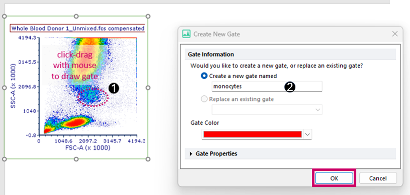
Fig. T34.5B. Drawing an ellipse gate around "monocytes"
14. Choose the Gating tab→ Create Gates→ Polygon command from the Ribbon (Fig. T34.5A).
15. Use the mouse to click once on each desired vertex of the polygon on the same plot to draw a gate around the SSC-low population shown below (Fig. T34.6, ![]() ). You may click again on the first vertex or press the Space Bar on your keyboard to close the shape and cause the Create New Gate dialog window to appear.
). You may click again on the first vertex or press the Space Bar on your keyboard to close the shape and cause the Create New Gate dialog window to appear.
16. Name the gate "lymphocytes" (Fig. T34.6, ![]() ).
).
17. Click OK.
The plot will now resemble that shown in Fig. T34.6, right.

Fig. T34.6. Drawing a polygon gate around "lymphocytes"
We will now draw a child gate of the "lymphocytes" gate.
18. Press and hold anywhere inside the boundaries of the red "lymphocytes" gate (Fig. T34.7, ![]() ).
).
19. Drag the "lymphocytes" gate out of the plot to an empty space in the layout while continuing to hold the mouse button down.
20. Release the mouse button when your cursor is on an empty part of the layout to the right of the original plot. A new plot gated on "lymphocytes" will have been inserted (Fig. T34.7, ![]() ).
).
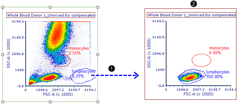
Fig. T34.7. Dragging and dropping the "lymphocytes" gate out of a plot to make a new plot gated on "lymphocytes"
21. Click on the X-axis to change the parameter to CD3 on the new plot.
22. Choose the Gating tab→ Create Gates→ Rectangle command from the Ribbon (Fig. T34.5A).
23. Use the mouse to draw two rectangular gates, around the CD3-low and CD3-high populations, naming the gates "CD3-" and "CD3+", respectively. The plot will now resemble that shown in Fig. T34.8.
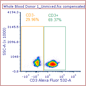
Fig. T34.8. CD3-positive and -negative gates defined on the new plot
We will now create one last plot on our layout.
24. Repeat Steps 16-18 for the "CD3+" gate (to drag and drop the CD3+ gate onto a blank spot in the layout). A new plot gated on "CD3+" will have been inserted.
25. Click on the X- and Y-axes to change the parameters to CD4 and CD8, respectively.
26. Choose the Gating tab→ Create Gates→ Quadrants command from the Ribbon (Fig. T34.5A).
27. Click on the plot to place the quadrants such that the four populations are delineated.
28. The Create New Quadrants dialog opens.
29.Click OK to accept the default quadrants name.
30. The plot should resemble the one depicted in Fig. T34.9).
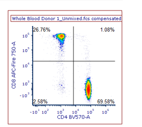
Fig. T34.9. Placing quadrants to delineate CD4 and CD8-positive and -negative populations
We will now add a Gate View, which is an interactive legend of our gates. Though it will not be covered in this tutorial, you may rename gates, redefine the gating hierarchy, and more using this object.
31. Choose the Insert tab→ General→ Gate View command from the Ribbon (Fig. T34.10A).
32.

Fig. T34.10A The Insert Tab
33. Click once on an empty spot on the layout to insert the Gate View object (Fig. T34.10B).
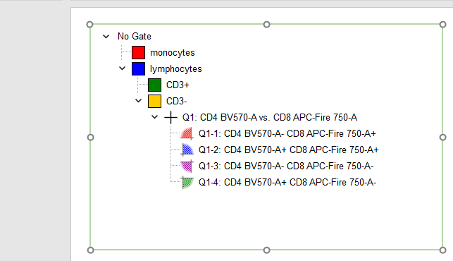
Fig. T34.10B. Inserting a Gate View, an interactive legend of your gates
We will now add statistics to an Integrated Spreadsheet our layout.
34. Choose the Insert tab→ Spreadsheet and Charts→ Spreadsheet command from the Ribbon (Fig. T34.10A).
35. Click OK.
A spreadsheet will be present on the screen as in Fig. T34.11B. We will now edit the spreadsheet to include statistics and labels.
36. Type "lymphocytes", "CD3+", and "CD4+" into cells A2-A4 of the Spreadsheet, respectively, and "%-gated" into cell B1 (Fig. T34.11).
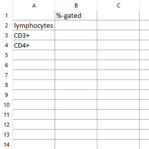
Fig. T34.11. Inserting and preparing a Spreadsheet for the addition of statistics
37. Press and hold anywhere inside the boundaries of the "lymphocytes" gate.
38. Drag the "lymphocytes" gate out of the plot while continuing to hold the mouse button down, and drop it into cell B2 of the Spreadsheet (Fig. T34.12, ![]() ).
).
39. Select % of gated cells from the Statistic box in the Create Statistic pop-up dialog (Fig. T34.12, ![]() ).
).
40. Click OK (Fig. x, ![]() ). The appropriate statistic will have been inserted (Fig. T34.12, bottom).
). The appropriate statistic will have been inserted (Fig. T34.12, bottom).
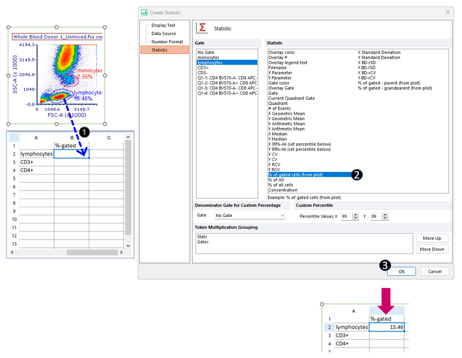
Fig. T34.12. Dragging and dropping a plot-based statistic to the Spreadsheet.
41. Repeat Steps 31-34 for the "CD3+" gate, dropping it into cell B3 of the Spreadsheet.
42. Drag the text box for the lower-right quadrant %-gated statistic from the last plot out of the plot and drop it into cell B4 of the Spreadsheet.
Note: Drag and drop the quadrant text box by its border when it is selected, as shown below (Fig. T34.13, top). The Spreadsheet will now contain the statistics pictured below (T34.13, bottom).
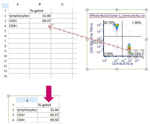
Fig. T34.13. Dragging and dropping a quadrant statistic to the Spreadsheet
We will now set up a Batch Process to PowerPoint.
Note: it is also possible to Batch Process your results to PDF and Excel, though in the interest of brevity, we will not do so in this tutorial.
43. Select the Batch & Export tab→ Batch Export to PDF, PowerPoint, Excel, Prism ... → Actions and Reports command from the Ribbon (Fig. T34.14A).

Fig. T34.14A The Batch & Export Tab
44. Move the Batch Actions window to the side of the page so that your plots are visible.
Note: You may also dock the Batch Actions window.
45. Click Save to PowerPoint in the Add Action category of the Batch Actions window (Fig. T34.14B, ![]() ).
).
46. Click on the yellow folder under Output File Options> Save to a New File in the Create Export to PowerPoint Action pop-up window (Fig. T34.14B,![]() ).
).
47. Navigate to a convenient save location on your computer and type a filename for the PPT file in the pop-up Save As dialog window (Fig. T34.14B, ![]() ).
).
48. Click Save in the pop-up Save As dialog window (Fig. T34.14B,![]() ).
).
49. Click OK in the Create Export to PowerPoint Action pop-up window(Fig. T34.14B, ![]() ).
).
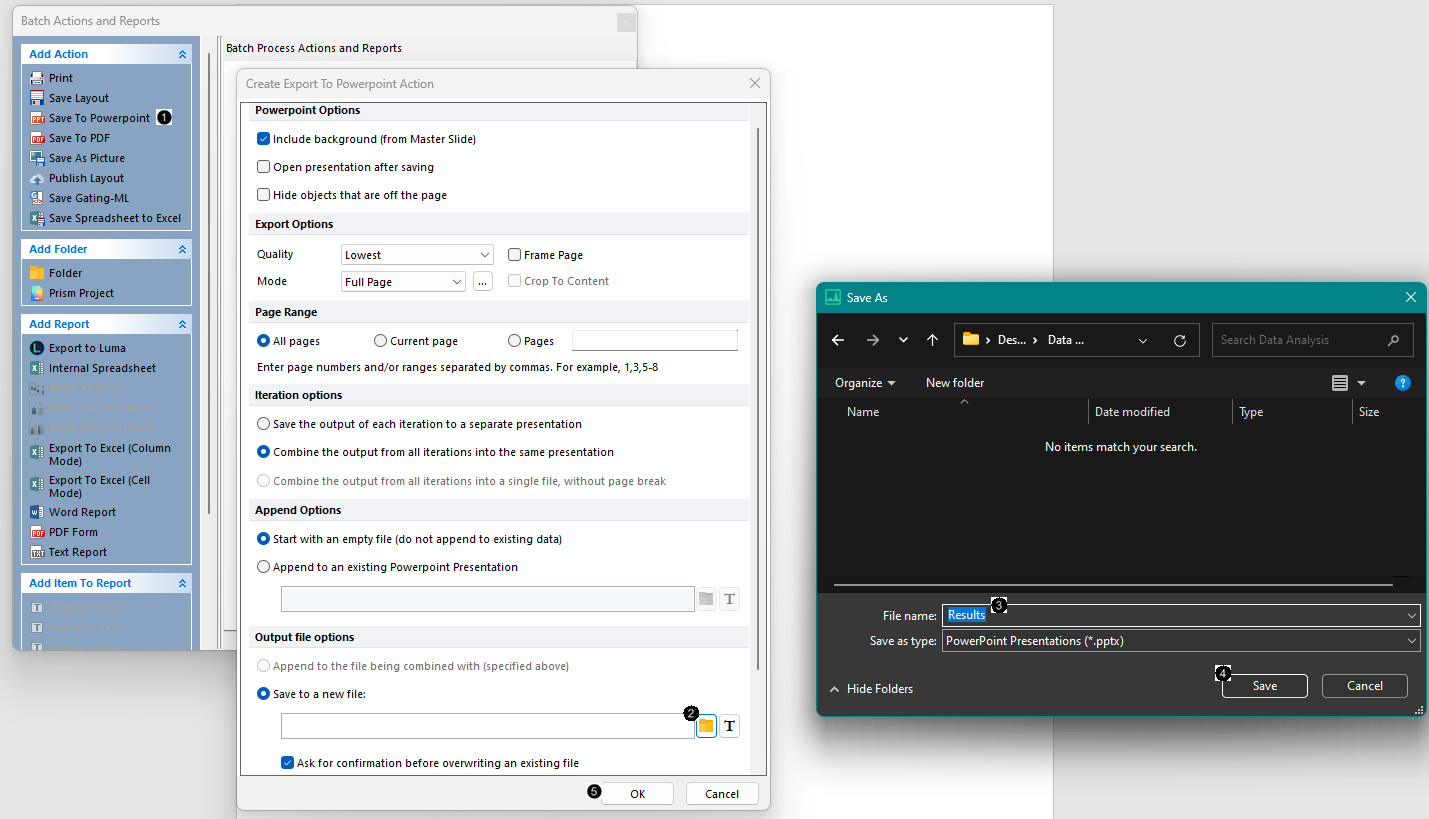
Fig. T34.14B. Setting up a Batch Action to PowerPoint
50. Select the Batch & Export tab→ Batch Export to PDF, powerPOint, Excel, Prism...→ Run command from the Ribbon (Fig. T34.14A).
A progress window titled "Run" will appear below (Fig. T34.16). When it disappears, you may open the PowerPoint file from the location you chose to save it to view the summarized results in visual form, for both files in the Data List. The PowerPoint slides will exactly resemble your FCS Express layout.
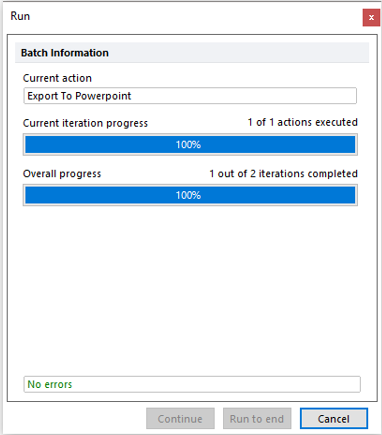
Fig. T34.16. Running the Batch Process
Continue to the Working with Spectrum Plots tutorial section to learn more about working directly with spectral data sets and spectrum plots.
