Creating Pie Charts in FCS Express is much like creating Bar Plots, in that they can be populated via a Custom Data Grid or by drag-and drop.
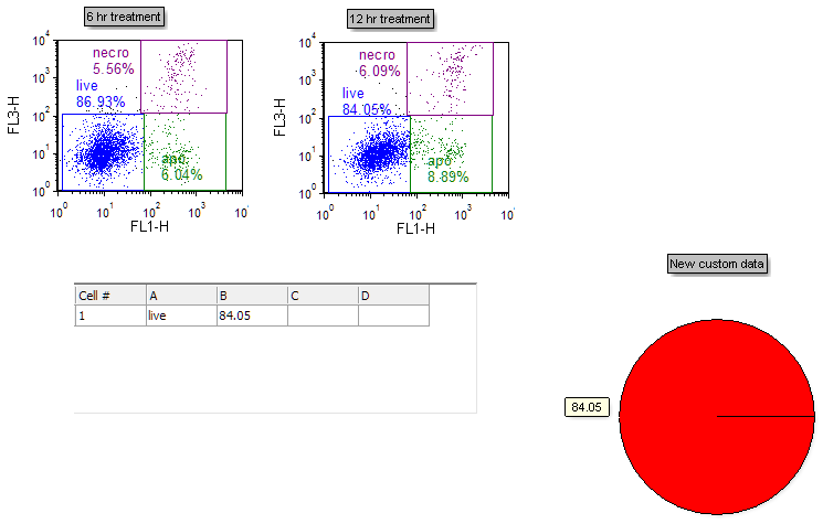
This layout contains Color Dot Plots and a Custom Data Grid that has already been filled with one row of tokens and freetext.
| 3. | Select the Insert tab → 1D Plots→ Pie command (Fig. 10). |

Figure 10. Inserting a Pie Chart
| 4. | Click on an empty space on the layout (e.g., to the right of the Custom Data Grid) to insert a Pie Chart (Fig. 11). |

Figure 11. A Pie Chart inserted on the layout
We will now use the drag-and-drop functionality of FCS Express 5 to add new sectors (slices) and replace old ones.
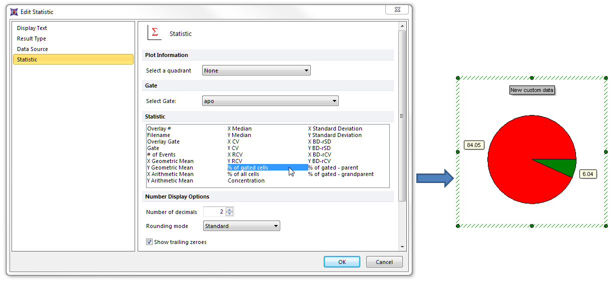
| 5. | Drag and drop the "apo" gate from the 6 hr treatment plot at left to an empty spot on the Pie Chart (not on the pie sector itself) (Fig. 12). |

Figure 12. Dragging a gate to a Pie Chart to create a new sector (slice)
| 6. | Select "% of gated cells" from the Statistic box in the Edit Statistic dialog (Fig. 13). |
| 7. | Click OK. A new sector (slice) displaying this statistic now appears as in Fig. 13, right. |

Figure 13. Choosing a statistic to plot on the Pie Chart after dragging a gate
| 8. | Repeat Steps 5-7 for the "necro" gate of the 6 hr treatment plot at left, so that the Pie Chart will have a total of three sectors (slices). |
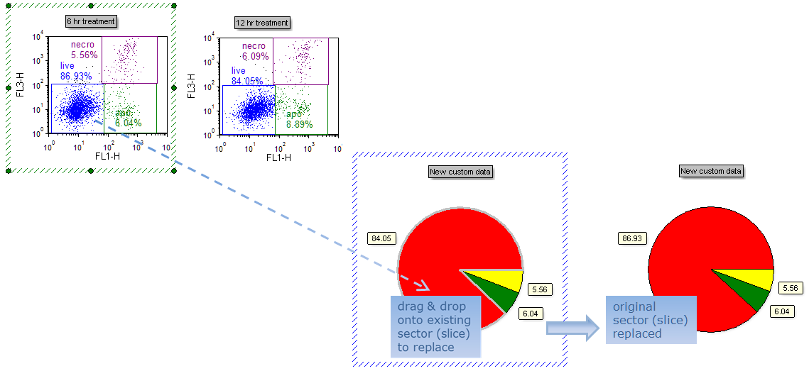
| 9. | Drag and drop the "live" gate from the 6 hr treatment plot at left to onto the existing red sector (slice) of the Pie Chart to replace it. Note the border of the sector (slice) to be replaced becomes gray before the new gate is finally dropped (Fig. 14, left). |
| 10. | Choose "% of gated cells" from the Statistic box in the Edit Statistic dialog (as in Step 6). The red sector (slice) has now been replaced with the "% of gated cells" statistic from the "live" gate of the 6 hr treatment plot (Fig. 14, right). |

Figure 14. Original red sector (slice) replaced by statistic derived from another gate (note value change)
We will now click directly on a sector (slice) Caption to edit it.
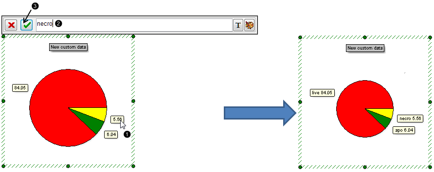
| 11. | Click on the Caption of the yellow sector (slice) (Fig. 15,  ). ). |
| 12. | Type "necro" into the Caption editing bar (Fig. 15,  ). ). |
| 13. | Click the green check button to accept the change (Fig. 15,  ). ). |
| 14. | Repeat Steps 11-13 for the Caption of the green sector (slice), typing in "apo". |
| 15. | The Captions for these sectors (slices) have now been annotated with freetext. Note: the Caption for the red slice has also been automatically annotated with information that resided in the first column of the Custom Data Grid when the layout was opened. |

Figure 15. Editing a Pie Chart Caption directly from the Pie Chart
We will now Format the Pie Chart.
| 16. | Right-click on the Pie Chart. |
| 17. | Choose Format from the pop-up menu (Fig. 16). |

Figure 16. Accessing Formatting options of the Pie Chart
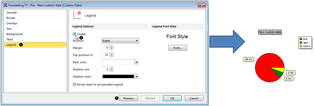
| 18. | Choose the Legend category (Fig. 17,  ). ). |
| 19. | Check the Visible box (Fig. 17,  ). ). |

Figure 17. Adding a Legend to the Pie Chart
| 20. | Click Preview (Fig. 17,  ). The Pie Chart will now display the name of each subset (listed in the first column of the Custom Data Grid) in the Legend (Fig. 14, right). ). The Pie Chart will now display the name of each subset (listed in the first column of the Custom Data Grid) in the Legend (Fig. 14, right). |
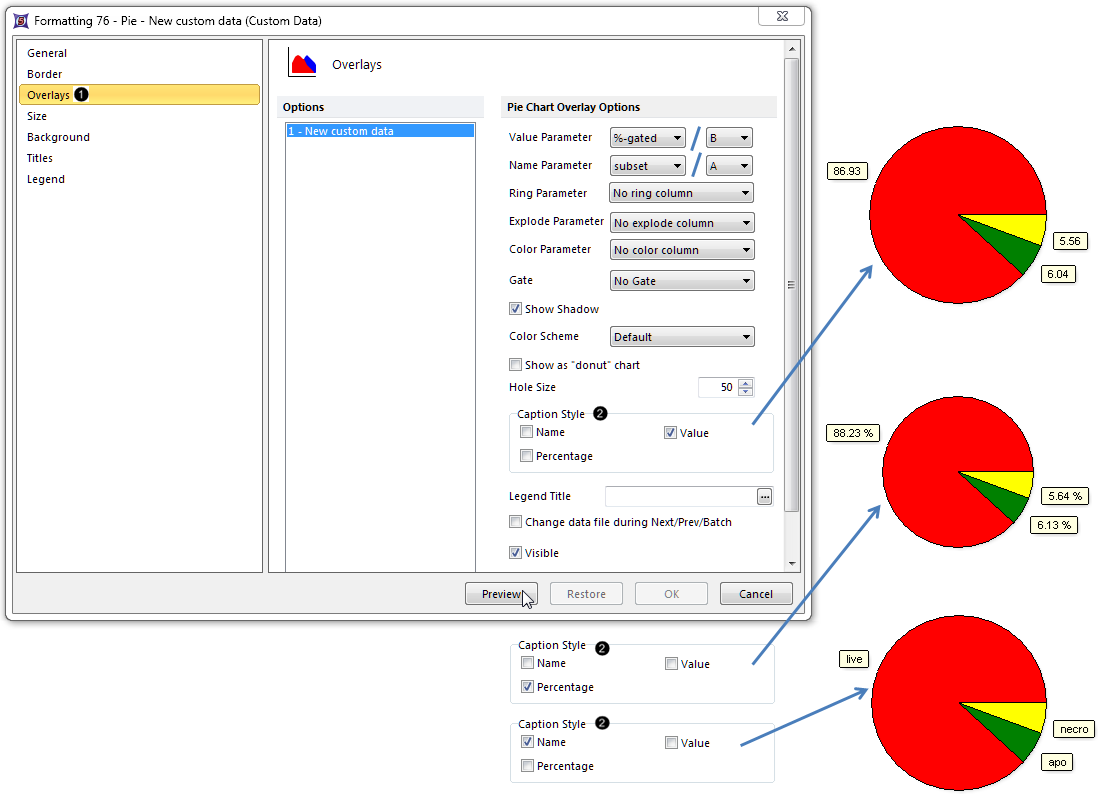
| 21. | Choose the Overlays category (Fig. 18,  ). ). |
The Name Parameter is derived by default from the first column of the Custom Data Grid on your layout. It appears as "subset" or as "A", depending on the appearance of your Custom Data Grid.
The Value parameter is derived by default from the second column of the Custom Data Grid. It appears as "%-gated" or as "B", depending on the appearance of your Custom Data Grid. It is displayed by default as a Caption for each slice of the Pie Chart (Fig 18, upper right). The Caption can be formatted to display any combination of Name, Value, or Percentage for each sector (slice) of the Pie.
| 22. | Check any combination of Value, Percentage, and Name from the Caption Style section of the Overlays category to customize the Caption with the desired information (Fig. 18,  ). ). |

Figure 18. Editing the Caption Style of the Pie Chart
| 23. | Click Preview to view the Caption Style change (Fig. 18, mouse arrow). |
Note: Clicking on the Caption in the Pie Chart allows for direct editing of the Captions with freetext or tokens of your choice. Pie shadow, donut vs. pie appearance, color scheme, and other attributes can also be customized. See the Formatting Pie Charts section of the manual for details.
| • | Click the Data tab→Change Data on All→ Next/Previous buttons to advance through the set of files in the Data List and watch as the Pie Chart updates with the new data. |
| • | Adjust the gates on the plots and watch the Pie Chart update in real-time. |
Optional: Explore Pie Chart color formatting options in Steps 25-35. Or, go to the Formatting section of this tutorial to learn how to Explode slices for emphasis and display an additional dataset as a Ring at the periphery of the Pie.
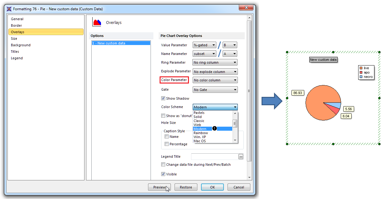
| 25. | Select Modern from the Color Schemes dropdown list (Fig. 19,  ). Note: there are many predefined color schemes that may be chosen for display. ). Note: there are many predefined color schemes that may be chosen for display. |

Figure 19. Changing the Color Scheme
| 26. | Click Preview (Fig. 19, mouse arrow). |
The Pie Chart colors have now been reformatted with the Modern color scheme. (Fig. 19, right)
| 27. | Select "C" from the Color Parameter dropdown list (Fig. 19, outlined in red). |
| 28. | Click OK in the Formatting Pie dialog. |
| 29. | Left click on cell C1 of the Custom Data Grid. |
| 30. | Type "purple" (Fig. 20,  ) in the cell. ) in the cell. |
| 31. | Press Enter on the keyboard or the green check button on the Custom Data Grid formula editor (Fig. 20, mouse arrow). |
The live sector (slice) of the Pie Chart is now purple (Fig. 20, right). Freetext from which sector (slice) color can be derived includes "red", "blue", "yellow", "green", "purple", "black", "gray", and "white".

Figure 20. Entering freetext into the Custom Data Grid to define sector (slice) color
| 32. | Click on the Color Palette icon on the right of the Custom Data Grid formula editor (Fig. 21,  ). ). |

Figure 21. Using the Color Palette to define sector (slice) color
| 33. | Click on any of the Basic colors (e.g., Aqua, Fig. 21,  ) or on the Define Custom Colors>> button to access the full color spectrum. ) or on the Define Custom Colors>> button to access the full color spectrum. |
| 34. | Click OK in the Color dialog (Fig. 21, mouse pointer). |
| 35. | Press Enter on the keyboard, or click the green check button on the Custom Data Grid formula editor to apply the color change (Fig. 21). |
The "live" sector (slice) of the Pie is now the color you chose from the Color Palette, e.g., Aqua in Fig. 21, right.
Go on to the next section to create a Scatter Plot from the same Color Dot Plots on this layout. Or, jump to the Formatting section of this tutorial to learn how to Explode Pie slices for emphasis and display an additional dataset as a Ring at the periphery of the Pie.

