Building your layout
In this section, we will:
•Load an .fcs file into the plots on the layout.
•Insert and format plots.
•Create and apply gates, markers, and quads.
Note: There are three Save Points in this section of the tutorial, so that you may save your progress and return to these Save Points in the tutorial later:
•Save Point #3 (Step 69, end of this section)
1.Select File tab→Open.
2.Open the layout Immunophenotyping Tutorial.fey found in the "Immunophenotyping Tutorial" folder within the Tutorial Sample Data archive.
The layout has been saved unlinked to any .fcs files, so the plots will appear empty (Fig. T29.1). Unlinked .fey files (layouts) are convenient to use as templates for similar experiments in the future. Learn more about the three options for saving layouts.
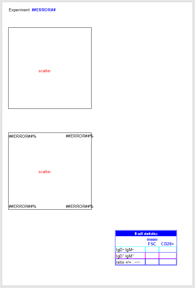
Figure T29.1 Immunophenotyping Tutorial.fey. Note that plots appear empty because the layout is saved as "unlinked".
We will first change our Default Options so that our .fcs file-derived Stain and Name keywords appear on our plot axes.
3.Follow the directions in the Changing Axis Labels section of the Changing Common Default Options tutorial.
| Now, your plots' axes for .fcs files subsequently loaded into this layout will be labeled with these descriptive keywords that were saved with your .fcs files at the time of acquisition. |
We will now load an .fcs file into the plots.
4.Select the Data tab→Change Data on All Objects→Select from the Ribbon (Fig. T29.2, ![]() ).
).
5.Navigate to the "Immunophenotyping Tutorial" folder within the Tutorial Sample Data archive, in the Select a Data File dialog box which appears (Fig. T29.2, ![]() ).
).
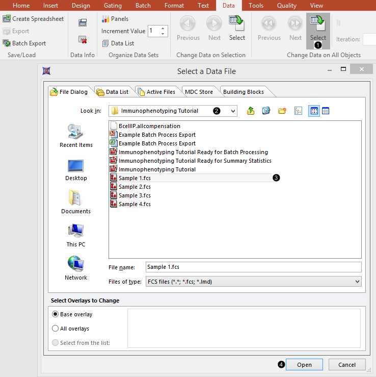
Figure T29.2 Loading .fcs files into the plots
6.Select "Sample 1.fcs" in the Select a Data File dialog (Fig. T29.2, ![]() ) (Note that the advanced open dialog is used in the above screen shot. The standard open dialog may be used much in the same way).
) (Note that the advanced open dialog is used in the above screen shot. The standard open dialog may be used much in the same way).
7. Click Open (Fig. T29.2, ![]() ).
).
| The plots now display the data from the Sample 1.fcs file with a predefined "scatter" gate and quadrants (Fig. T29.3). |
| Note that the Experiment keyword derived from the .fcs file is now displaying in the text box at the top of the Layout, as are the Current Windows User and Current Date. All of these were inserted into a text box as live-updating tokens. |
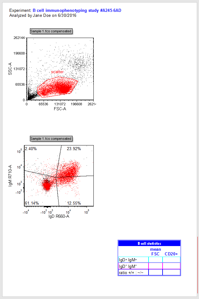
Figure T29.3 2D plots after changing file
8. Press and hold anywhere inside the boundaries of the red "scatter" gate (Fig. T 29.4).
9. Drag the "scatter" gate out of the plot to the empty space at right (Fig. T29.4, ![]() ), while continuing to hold the mouse button down.
), while continuing to hold the mouse button down.
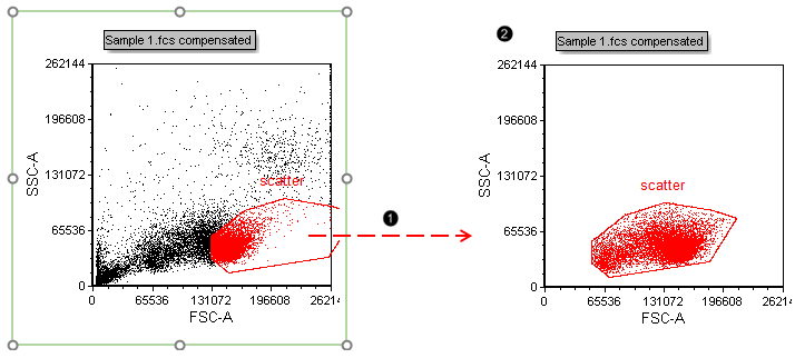
Figure T29.4 Dragging and dropping the "scatter" gate out of a plot to make a new plot gated on "scatter"
10. Release the mouse button when your cursor is on an empty part of the layout to the right of the original plot.
| A new plot gated on this gate will appear at the conclusion of the drag and drop action commenced in Step 8 (Fig. T29.4, |
11. Click the X-axis of the new plot.
12. Click "CD45 V800-A" to select it as the parameter from the pop-up list. You may also type CD45 V800-A in the empty field at the top of the list (Fig. T29.5).
The X-parameter of the plot has now been changed to "CD45 V800". Note that Step 3 of this tutorial permitted both the Stain (CD45) and Name (V800-A) keywords to appear on the axis. This change in your Preferences will affect all future layouts made under the current FCS Express User Profile.
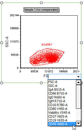
Figure T29.5 Changing the X-parameter of a plot
13. Repeat steps 11 and 12 for the Y-axis of the new plot, selecting "CD19 V655-A" as the new parameter. The plot will now appear as in Fig. T29.6.
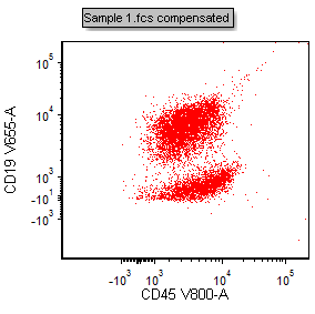
Figure T29.6 Plot with X- and Y-parameters changed to CD45 V800-A vs CD19 V655-A
14. Select the Gating tab→Create Gates→Polygon from the Ribbon (Fig. T29.7).

Figure T29.7 Selecting a gate shape from the Gating tab of the ribbon
15. Click once on each vertex to create a gate around the periphery of the CD45+CD19+ population (as in the figure below) in the plot at right (Fig. T29.8).
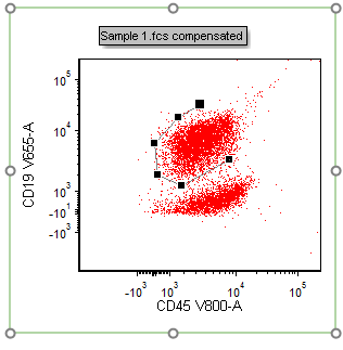
Figure T29.8 Drawing a polygon gate
16. Close the gate by clicking on the first vertex you defined (Fig. T29.9, ![]() ).
).
| A dialog box appears in which the gate name, color, and inclusion/exclusion property may be defined. |
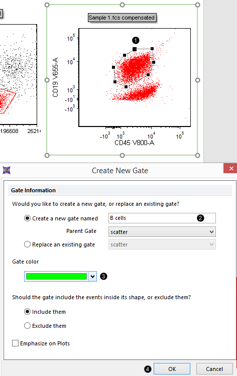
Figure T29.9 Closing and naming a polygonal gate
17. Type "B cells" in the Create a new gate name field (Fig. T29.9,![]() )
)
18. Select bright green from the Gate color drop down menu. (Fig. T29.9, ![]() ).
).
19. Click OK (Fig. T29.9, ![]() ).
).
20. Select File tab→Save As and save the layout linked (first option from drop down menu shown in Fig. 4.2). You may then return to this Step in the tutorial at a later time by clicking on Save Point #1 at the top of this page.

Save Point #1 (Step 21)
We will now examine the phenotype of the B-cell population in more detail by gating the plot in the lower-left corner on the "B cells" gate.
21. Press and hold anywhere inside the boundary of the green "B cells" gate (Fig. T29.10).
22. Drag the gate toward the plot in the lower-left corner. You will start to see a "ghost" of the gate outline move along the dragging path (Fig. T29.10, ![]() ).
).
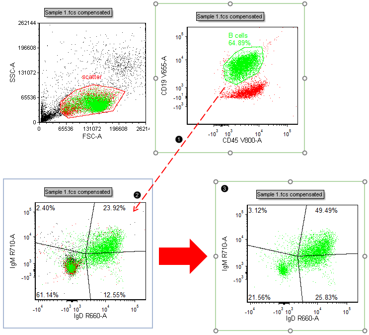
Figure T29.10 Gating a plot by dragging and dropping a gate from another plot
23. Release the mouse button when the recipient plot outline turns blue (Fig. T29.10, ![]() ).
).
| The recipient plot is now gated on "B cells" and appears similar to Fig. T29.10, |
| Note: Dragging and dropping the "B cells" gate from the Gate View to the recipient plot would achieve the same action. |
24. Select Format tab→Change→Change Plot Type from the Ribbon (Fig. T29.11) while the lower-left plot is still selected.
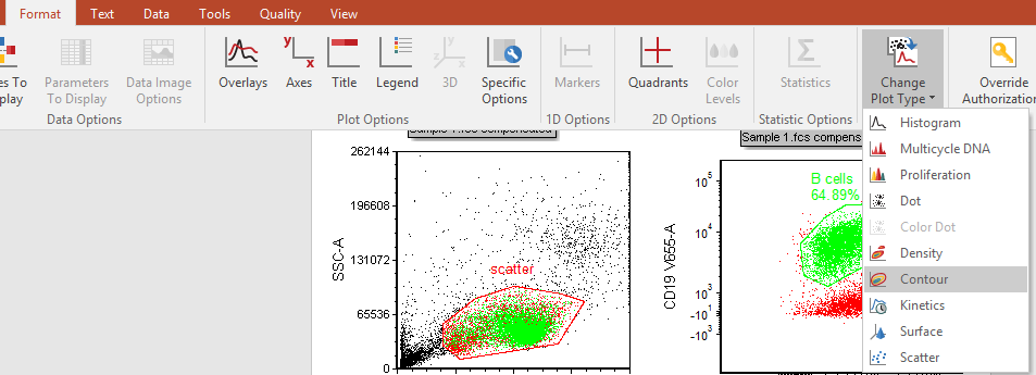
Fig. T29.16 Changing plot type
25. Click on Contour (Fig. T29.11).
| This plot now appears similar to the highlighted plot in Fig. T29.12. |
Optional: Add outlier dots to the Contour Plot, in Steps 27 to 32. Otherwise, proceed to Step 33.
26. Right-click on the Contour Plot.
27. Select Format from the associated pop-up menu (Fig. T29.12, mouse pointer).
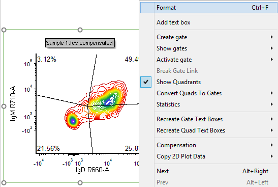
Figure T29.17 Right-clicking on a plot to reformat its appearance
28. Click on the Overlays category at the left (Fig. T29.13, ![]() ).
).
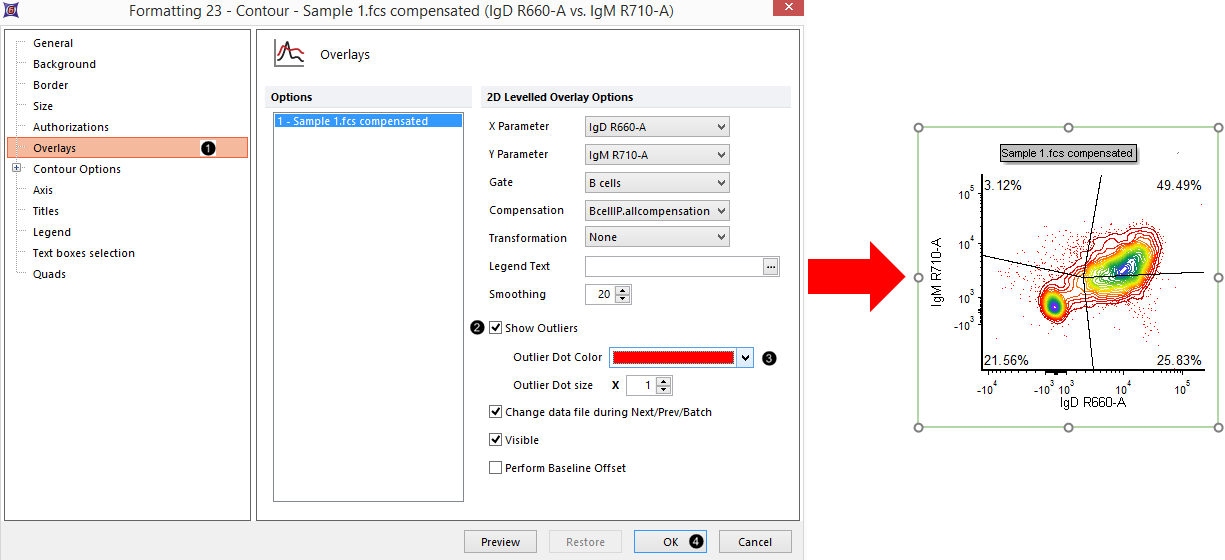
Figure T29.18 Adding outlier dots to a contour plot
29. Check the Show Outliers box (Figure T29.13, ![]() ).
).
30. Change the Outlier Dot Color to red (Figure T29.13, ![]() ).
).
31. Click OK (Figure T29.13, ![]() ). The plot now appears similar to Fig. T29.13, right.
). The plot now appears similar to Fig. T29.13, right.
We will now examine the phenotype of the IgD/IgM-double-negative and -double-positive populations of B-cells in more detail.
32. Press and drag the central Quadrant vertex (e.g., as shown in Fig. T29.14) to adjust its position so that the double-positive and double-negative populations are better divided.
| Note: Outer vertices of these Floating Quadrants may also be adjusted, if desired. |
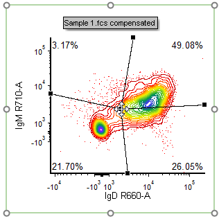
Figure T29.14 Adjusting the central quadrant vertex
33. Right-click on the contour plot (Fig. T29.15).
34. Select Convert Quads to Gates→Upper Right→Convert and Link (Fig. T29.15, mouse pointer).
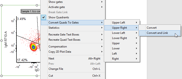
Fig. T29.15 Converting and linking the upper right quadrant to a gate
| A dialog box similar to that in Fig. T29.9 appears. |
35. Repeat steps 18-20 but name the gate "Double Positive" and assign it a turquoise color to match the pre-formatted text table in the lower right corner of the layout.
36. Repeat steps 34-36 in order to Convert and Link the Lower Left Quadrant to a Gate.
37. Repeat steps 18-20 but name the gate "Double Negative" and assign it a pink color to match the pre-formatted text table in the lower right corner of the layout.
38. Select File tab→Save As and save the layout linked (second radio button as shown in Fig. 4.2), or simply press Ctrl+S on your keyboard if you already saved this layout linked as in Save Point #1. You may then return to this Step in the tutorial at a later time by clicking on Save Point #2 at the top of this page.

Save Point #2 (Step 39)
39. Select Insert tab→1D Plots→Histogram from the Ribbon (Fig. T29.16, outlined in red).
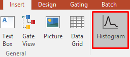
Figure T29.22 Selecting histogram from the Insert tab of the Ribbon
40. Press and hold on the blank space of the layout above the pre-formatted table (Fig. T29.17).
41. Drag the cursor until the histogram is of the desired size, while continuing to hold the mouse button (Fig. T29.17, ![]() ).
).
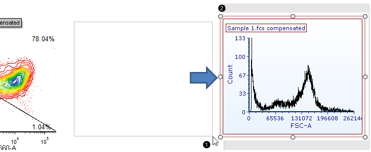
Fig. T29.17 Inserting a histogram onto the layout
42. Release the mouse button. A new histogram appears, similar to Fig. T29.17, ![]() .
.
We will now overlay the "double-positive" and "double-negative" populations onto the histogram to compare their CD20-expression.
43. Right-click on the histogram (Fig. T29.18).
44. Select Add overlay in the associated pop-up menu (Fig. T29.18).
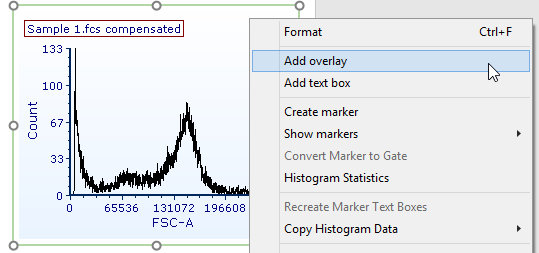
Figure T29.18 Adding an overlay to the histogram by right clicking on the plot and choosing "Add Overlay"
45. Repeat Steps 5-7 as in Fig. T29.2 to add "Sample 1.fcs" from the Data List tab as a second overlay to the histogram.
46. Click OK on the additional dialog box that appears (Fig. T29.19).
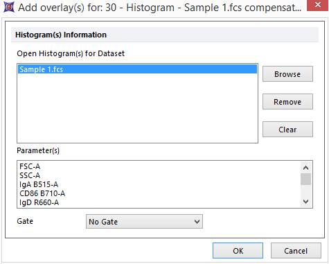
Fig. T29.19 Additional dialog box for adding overlays
47. Right-click on the histogram again (Fig. T29.20).
48. Select Format on the associated pop-up menu (Fig. T29.26).
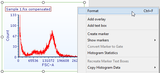
Figure T29.20 Right-clicking on the 1D-plot to access Format options
49. Select the Overlays category at the left (Fig. 29.27, ![]() ).
).
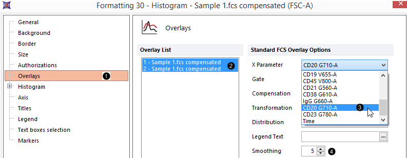
Figure T29.21 Formatting histogram overlays
50. Select both overlays by clicking on each while holding down Ctrl (Control) on the keyboard (Fig. 29.21, ![]() ).
).
51. Select "CD20 G710-A" from the X Parameter drop-down menu (Fig. 29.21, ![]() ).
).
52. Increase Smoothing to "5" (Fig. 29.21, ![]() ).
).
53. Click on the first overlay ("1-Sample 1.fcs compensate...") so it alone is selected (Fig. 29.22, ![]() ).
).
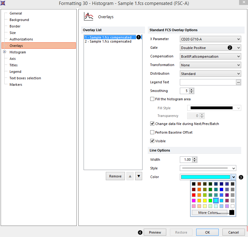
Figure T29.22 Formatting histogram overlays, continued
54. Select "double positive" from the Gate drop-down menu (Fig. 29.22, ![]() ).
).
55. Select turquoise as the Color under Line Options (Fig. 29.22, ![]() ).
).
56. Repeat Steps 54-56, but this time click instead on the second overlay ("2-Sample 1.fcs compensate..."), and choose "double negative" as the Gate and pink as the Color, respectively.
57. Click Preview (Fig. 29.22, ![]() ). (Note: Move the formatting window to the side to preview the formatting changes)
). (Note: Move the formatting window to the side to preview the formatting changes)
| The histogram now appears similar to Fig. T29.23. |
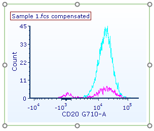
Figure T29.23 Preview of gates, colors, and smoothing applied to both histogram overlays
Optional: Normalize the histogram, in Steps 59-62. Otherwise, proceed to Step 63.
58. Expand the Histogram, on the category at left (Fig. T29.24, ![]() ).
).
 Figure T29.24 Normalizing a histogram |
59. Click on Histogram Specific Options (Fig. T29.24, ![]() ).
).
60. Select Peak Value from the Normalize to drop-down menu (Fig. T29.24, ![]() ).
).
61. Select the Based on Value radio button (Fig. T29.24, ![]() ).
).
62. Click OK to close the Formatting pop-up window (Fig. T29.25). Post-normalization, the histogram will appear similar to Fig. T29.30, right; if you chose not to normalize, it will appear similar to Figure T29.29.
 Figure T29.25 Clicking OK to accept the formatting changes. |
We will now look at the differences in CD20-expression between the IgD/IgM-double-positive and -double-negative populations by creating a marker on the CD20-positive population.
63. Right-click on the histogram (Fig. T29.26).
64. Select Create marker on the associated pop-up menu (Fig. T29.26).
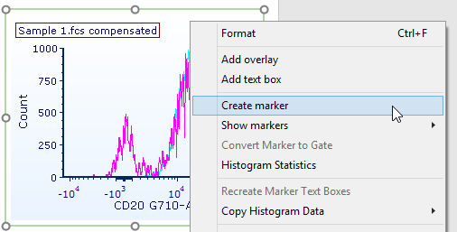
Figure T29.26 Right-clicking on the histogram to add a marker
65. Press and hold on the histogram to the left of the positive population peak (Fig. T29.27).
66. Drag the mouse pointer to the right until the marker spans the peak (Fig. T29.27, ![]() ).
).
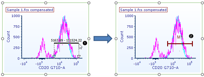 Figure T29.27 Creating a marker |
67. Release the mouse. The marker ("M1") has now been added to the plot (Fig. T29.27, ![]() ).
).
68. Select File tab→Save As and save the layout linked (second radio button as shown in Fig. 4.2), or simply press Ctrl+Son your keyboard if you already saved this layout linked as in Save Point #1 or #2. You may then return to this Step in the tutorial at a later time by clicking on Save Point #3 at the top of this page.

Save Point #3 (Step 69, end of this section)
We have now created a Layout with 2D-plots, histograms, gates, quadrants, and markers. Next, we will add summary statistics to our layout.
